

Editor’s Note: The following is a paper presented at the
Annual Joint Conference of the Retirement Research Consortium
.
Summary
1. Introduction
For more than a quarter century, the Social Security program has faced worsening long-run financial prospects. The estimated actuarial balance has declined from a small surplus in the immediate aftermath of the 1983 reforms to a deficit that is now estimated to be 2.7 percent of taxable payroll (about one percent of GDP). Much of this deterioration can be traced to the increased benefit cost of an aging population and the inclusion of additional years in the projection period in which expected outlays will far outstrip predicted revenue. The program has also been adversely affected on the revenue side by a steady deterioration in taxable wages as a share of both GDP and labor compensation. Since the last major reforms in 1983, the share of taxable wages in GDP has fallen by 6 percentage points, from 42 to 36 percent. This paper focuses on the role of increasing health care costs as a deduction from labor compensation in computing taxable wages. The United States spends a far larger share of its resources on health care– 18 percent of GDP in 2010–compared with other rich countries, yet health outcomes are equivalent to or worse than those of others. The goal of the study is to see whether there are lessons from other rich countries’ experiences that would guide the Social Security trustees in projecting trends in health care spending and predicting a future year in which the excess of spending above that of the nation’s income will end.
1. Estimating Excess U.S. Health Spending
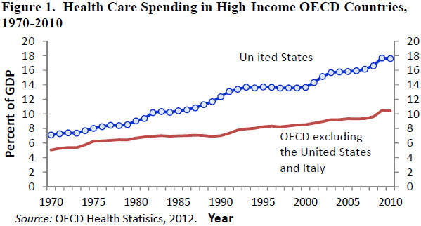
Figure 1 shows trends in aggregate health spending measured as a share of national output. In 1970 the United States allocated 7.1 percent of its GDP to health care, 2.1 percentage points more than the weighted average health spending of the other 19 countries. Since 1970 the share of U.S. GDP devoted to health spending has increased about 0.26 percentage points a year. In the other OECD countries, health spending as a share of GDP has increased about 0.12 percentage points per year. By 2010 we estimate that the spending gap had risen to 7.2 percentage points of GDP. If the United States had allocated the same proportion of GDP to health spending as the other 19 countries, American health expenditures would have been lower by about $1.05 trillion, or 41 percent.
One partial explanation for higher spending in the United States is higher income. Depending on the measure of purchasing power parity used, in 2009 the United States had an average income level that was between one-quarter and 40 percent higher than that of the median country in the comparison group. If the share of income devoted to health consumption increases with average income, we would expect the United States to spend a higher proportion of its income on health compared with other OECD member countries. Indeed, 2009 there was a positive correlation between countries’ average incomes and the share of their GDP devoted to health care. Most of the correlation, however, is due to the United States. The correlation between average income and the percentage of GDP devoted to health care is small in the other 20 countries in the sample.
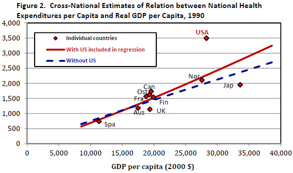
Figure 2 shows estimates of the relationship between health care spending per capita and GDP per capita in a small sample of countries. The chart presents OLS estimates of the health spending – income relationship in 1990. It shows health spending and GDP per capita for 10 of the 21 countries in our sample – Australia, Austria, Canada, Finland, France, Japan, Norway, Spain, the United Kingdom, and the United States. Incomes and health spending for each country are converted into constant U.S. dollars using purchasing power parity estimates for 2000 published by the World Bank. The sample of countries is determined by the availability of PPP estimates of GDP per capita, published by the World Bank, and estimates of the share of GDP devoted to health, which is published by the OECD. For each year, we estimated a simple cross-national equation: Ln(H) = α + β Ln(Y).
The equation was first estimated with all 10 countries in the sample, including the United States. It was then re-estimated without the United States. The exclusion of the United States from the estimation sample in the 1960s has little effect on the regression line. Before 1965 U.S. spending on health care is close to the level that would be predicted based on the cross-national relationship between spending and GDP per capita observed in the other nine countries. By 1975, however, U.S. health spending was considerably higher than predicted given its income and the relationship between health spending and income in the other nine countries. The gap was even wider by 1990 (see chart), when U.S. health spending measured in 2000 dollars was $3,500 per person. This amount is about $1,200 (54 percent) more than would be predicted by a regression that includes the United States, and it is almost $1,500 (74 percent) greater than predicted by a regression that excludes the United States. The absolute size of the prediction error is even larger in 2009, but the proportional gap between U.S. spending and the amount of spending predicted on the basis of the other countries’ experiences is not much greater than it was in 1990.
Another way to use the results is to derive an estimate of the U.S. health spending gap compared with spending levels in the other nine countries of the panel. In the full paper we develop estimates of the gap using this method as well as alternative methods that expand the number of OECD countries in the comparison group. A notable conclusion of the analysis is that the period of excess growth in U.S. health spending was mainly concentrated in a 15-year period starting in 1980. The same basic method can be used to identify countries that have seen slower growth in health outlays relative to the growth that would be predicted based on the experience of other rich countries and their own record of income growth. Among the countries we identify as having slower growth than expected are Canada, Finland, Denmark, Sweden, and Ireland.
2. Why Is U.S. Health Care Spending So High?
The issue of why the level of health care spending in the United States is so different has been the subject of considerable research, but without a clear resolution. In the early 2000s, the OECD health care data were used as a framework to argue that that the differences between the United States and other OECD countries were largely a reflection of higher prices in the United States (Anderson and others, 2003) since researchers could find little evidence that Americans consumed a larger volume of health services. However, Cutler (2003) and others have argued that such studies fail to reflect the intensity of patients’ interactions with the health care system and that the United States differs from other countries in the use of more intensive technologies for some diseases. The most significant barrier to cross-national comparisons is the lack of meaningful measures of the prices of health services. Reliable price measures would help us to answer the basic question of whether the greater amount of spending in the United States is largely a reflection of higher prices or the provision of more health services.
Some progress has been made and we report the results from three studies that focused on the comparison of prices for inpatient hospital services, pharmaceuticals and physician incomes. By following the cost of treatment within a narrowly-defined Diagnostic-Related Group (DRG) category, it is possible to develop price indexes for medical services that are comparable to the matched-model price indexes used in other sectors of the economy. International comparisons have followed a comparable approach with efforts to obtain cost estimates for medical treatments are that sufficiently similar across countries.
In a 2010 report (Koechlin, Lorenzon, and Shreyer 2010), OECD analysts described a comparison for inpatient hospital services in 2007 for 12 OECD countries that included the United States. They incorporated nine specific cases of medical services and 23 surgical procedures that they believed represented comparable medical treatments. The price comparisons were expressed as indexes with the average of the 12 countries set equal to 100. Thus, total inpatient services in the United States were 164 percent of the group average and were 45 (164/113) percent above the level of Canada. While the United States was not the highest cost reporter in all of the individual procedures, it was never lower that 4th, and it was first in two-thirds of the specific comparisons. Within this small sample, however, some of the price differences may be attributed to variations in the level of income per capita.
Kanavos and Vandoros (2011) used data on the top-selling 50 prescription drugs in 15 OECD countries in 2007. The price measures were inclusive of all discounts or rebates. The authors used statistical regression analysis to control for differences in VAT rates, the age of the drug, and the existence of a generic, and they concluded that U.S. prices were about 30 percent higher on average.
Laugesen and Glied (2011) indentified some of the sources of the cost differences for primary care physicians and orthopedic surgeons in six OECD countries (Australia, Canada, France, Germany, United Kingdom, and the United States). They obtained data for the average fee for an office visit and a hip replacement within the six countries, and developed volume measures based on the number of primary care office visits and the number of hip replacements. On a per capita basis, the United States had by far the lowest number of office visits, but the average fee per visit was the highest of the six countries, although fees in the United Kingdom and Canada were near the same level. For hip replacements, the United States performed fewer surgeries on a per capita basis than France, Germany and the U.K, but the fees were nearly twice as high.
While not all categories of medical care have been included in the comparisons, the recent international comparisons strongly suggest that differences in prices account for most of the international variation in health care expenditures.
References Gerald F. Anderson, Uwe E. Reinhardt, Peter S. Hussey, and Verduhi Petrosyan. 2003. “It’s the Prices, Stupid: Why the United States Is So Different from Other Countries,” Health Affairs, May/June 2003, vol. 22(3):89–105.
Cutler, David M., and Ernest R.Berndt, (eds.). 2001. Medical Care Output and Productivity, National Bureau of Economic Research Studies in Income and Wealth, Vol. 62, The University of Chicago Press, Chicago.
Kanavos, Panos, and Sotiris Vandoros. 2011. “Drugs U.S.: Are Prices Too High? Measuring International Pharmaceutical Price Differences,” Significance, the Royal Statistical Society, vol. 8: 15–18.
Koechlin, Franchette, Luca Lorenzoni and Paul Schreyer (2010), “Comparing Price Levels of Hospital Services Across Countries: Results of Pilot Study”, OECD Health Working Papers, No. 53.
Laugesen, Miriam J, and Sherry A. Glied. 2011.”Higher Fees Paid To U.S. Physicians Drive Higher Spending For Physician Services Compared To Other Countries.”Health Affairs (September) 30:91647-1656.