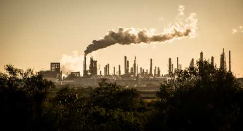
Global greenhouse gas emissions (GHG) for 2022 will be 58 gigatons (GT), the largest annual level ever recorded. If current economic growth, demography, and emissions intensity trends continue, the level of emissions will continue to rise, reaching 62 GT by 2030. The gap between actual emissions and what is needed to keep the Paris Agreement targets at or below 1.5 degrees above pre-industrial levels will be more than 30 GT. At a global level, we know what needs to be done. Emissions have to come down by about 3 GT each year for the next three decades. We missed the targets in 2021 and 2022, so now the rate of emissions reduction has to be even faster.
The World Data Lab’s World Emissions Clock (a new tool launched at COP27 in Sharm el-Sheikh), provides a snapshot of the global challenge. It presents two concepts to make climate action more quantitative and actionable: First, there is an implementation gap of 2.6 GT, reflecting the shortfall of actual emission reduction relative to annualized commitments made in countries’ Nationally Determined Contributions (NDCs). Second, there is an ambition gap of 5.3 GT reflecting the shortfall of NDCs relative to the annualized reduction needed to stay on course for a 1.5 degree trajectory. These estimates are based on a novel statistical model developed by researchers at Vienna University of Economics and Business and World Data Lab (WDL), aimed at creating realistic projections of GHG emissions under different assumptions.
In Figure 1 below, the top line shows an estimate of emissions based on an econometric Vector Autoregressive Model of five sectors (energy, industry, transport, buildings, and agriculture and forestry), and 24 sub-sectors, across 180 economies. There are no policy changes or other adjustments, just a continuation of past trends. It shows that aggregate global emissions are still rising. This can be compared with an estimate of what emissions will be if all the policy changes promised in countries’ NDC were to be realized.
Figure 1. With no change, the implementation and ambition gaps will keep growing
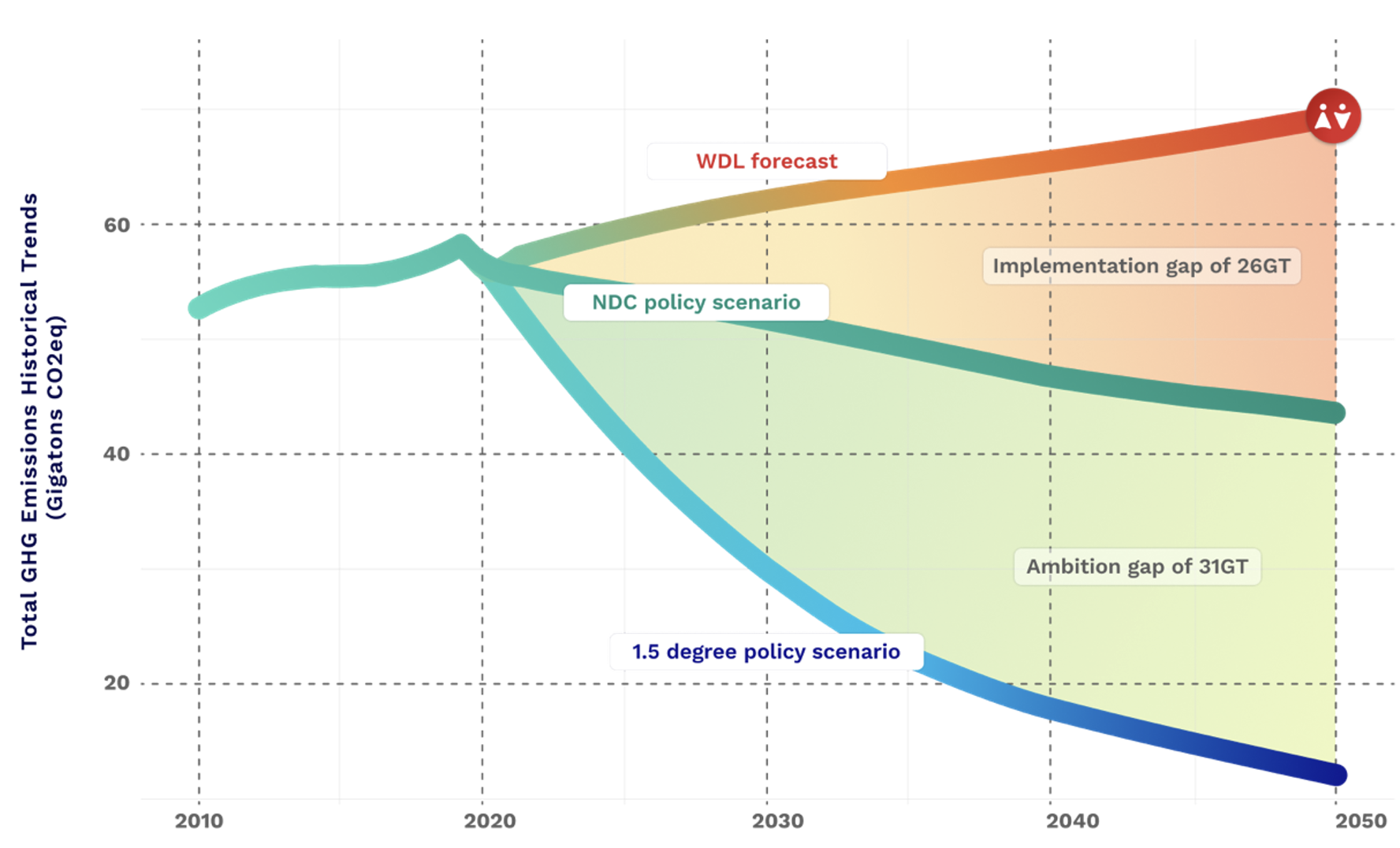
Source: World Data Lab, World Emissions Clock
According to World Emissions Clock projections, implementing NDCs would start to reduce emissions but only by about 0.4 GT per year, far too slowly to reach the Paris Agreement target. The third line shows numbers from Integrated Assessment Models, developed by the International Institute of Applied Systems Analysis in Vienna and their collaborators, for a scenario that would keep 1.5 degrees within reach.
This framing also helps to better understand the positions of developed and developing countries at COP27. Developed countries want developing countries to be more ambitious with their NDCs, while developing countries seek more financial resources to address loss and damages and to ensure a just transition.
Looking more closely at the data, however, suggests that categorizing countries as developed or developing is not very useful. Their individual differences are too large. Instead, much can be learned by comparing countries to their peers.
Figure 2 below shows the per capita emissions of selected countries broken down by major sector. Canada, Australia, the United Kingdom, and the United States have emissions far above global averages, but France and Italy have below-average emissions. Among developing countries, China is the largest emitter in aggregate, but not on a per capita basis (less than half of Canada, for example). India’s emissions are less than half the global average.
Figure 2. Among G20 economies, Saudi Arabia emits more than six times per capita than India
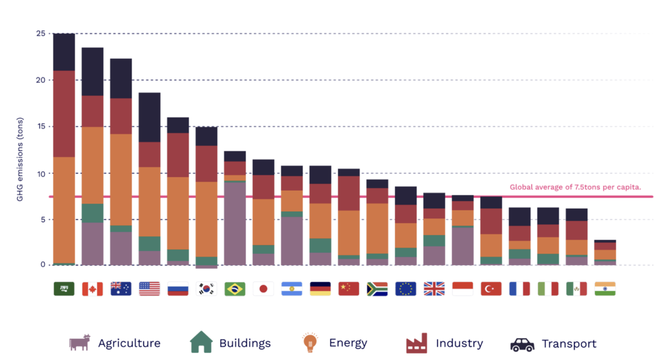
Source: World Data Lab, World Emissions Clock)
The three largest fossil-fuel producers in the world are the United States, Saudi Arabia and Russia, and the sector decompositions show that these countries have among the highest levels of emissions per capita from this sector. Saudi Arabia and Russia are large exporters, whereas the U.S. consumes its energy domestically. The United States’ per capita emissions in the energy sector are about 4 times those in the U.K. and 8 times those in France which relies heavily on nuclear power.
Many developing countries also have large emissions in energy. South Africa, where power outages are common and access to electricity is far from universal, emits more per person than Japan. India and Indonesia still consume very little power per person, but demands are increasing rapidly as their population grows more urbanized and richer. If they follow the path of South Africa, with a heavy reliance on coal, it will make global targets impossible to meet.
Agriculture, forestry, and land-use (AFOLU) is the other major sector where net emissions can be rapidly reduced. In Figure 2, large per capita emissions specific to this sector are seen in Brazil and Indonesia due to deforestation. The graph also highlights, however, that South Korea is already a net carbon sink in terms of AFOLU thanks to reforestation programs since the 1960s and climate-smart agricultural practices.
Other cross-country comparisons show what is feasible using current technologies. Sweden is a leader in technologies for reducing carbon emissions in buildings. On a per capita basis, it emits less than one-tenth the level of GHGs as the United States. The Netherlands is a leader in transport, with high utilization of mass transit and over 30 percent of personal trips taken by bicycle. The United States fares particularly poorly in transport because it relies on planes and road transport, with very limited use of rail. If high-income countries were to simply achieve the emissions intensity of the best-performer in each sector, they would cut their GHG emissions by almost two-thirds.
These kinds of comparisons have important implications for the way forward. A low-carbon prosperous future is possible without forgoing economic growth. Yes, there is considerable promise in new technologies, including solar and offshore wind. But existing technologies already offer a path that can yield high levels of prosperity with low levels of carbon emissions. The decoupling of economic growth and GHG emissions is perfectly feasible. The level of emissions from high-income countries has more to do with policy choices and lifestyles. They should emulate low-emitting peers, as well as take advantage of technological advances.
The World Emissions Clock is also a critical resource for governments and stakeholders working to align policymaking with their national climate action plans. Empowering global citizens with an easily accessible tool will enable them to make more informed decisions and push for required change. It can help inform the debate on how to reduce emissions and identify likely areas where rapid progress can be made. By seeing what other countries have done, useful lessons about practical solutions can emerge. That’s the power of granular, comparative data.
Related Content
Authors


-
Acknowledgements and disclosures
The authors are thankful for the leadership of Prof Jesus Crespo from the Vienna University of Economics for developing the economic foundations of the World Emissions Clock which has been made possible by the support of the German government (GIZ & BMZ) and the Patrick J. McGovern Foundation. Support by the Rockefeller Foundation for facilitating a high-level convening at Bellagio is also greatly acknowledged. Any questions on the expansion of the World Emissions Clock and the underlying data model should be directed to Reshma Sheoraj ([email protected]).
The Brookings Institution is committed to quality, independence, and impact.
We are supported by a diverse array of funders. In line with our values and policies, each Brookings publication represents the sole views of its author(s).
Commentary
Tracking emissions by country and sector
November 29, 2022