


In these final weeks of the presidential campaign the two candidates and their surrogates are bombarding the public with competing economic statistics. By careful selection of what economic statistics to emphasize and what beginning and ending years to use in calculating changes, each side has put together a set of data proving how well (poorly) the economy did when its (the other) party ran the government.
In the following pages, this Policy Brief seeks to help the interested reader peer through the fog of misused statistics by providing an unbiased depiction in words, figures, and charts of what has been happening to the major aspects of the economy.
From these data two main conclusions can be drawn about American economic performance. (1) After high inflation in the 1970s and a very deep recession in the early 1980s, the economy has recently performed well in simultaneously achieving low unemployment and low inflation. (2) Since the early 1970s under a variety of economic policies and administrations of both parties, output, productivity, and real incomes have grown very slowly and the distribution of income has become steadily more unequal.
POLICY BRIEF #6
I. Output And Productivity
By Charles L. Schultze
GDP
In cycles of prosperity and recession the nation’s actual output (GDP) fluctuates relative to its capacity or potential GDP, which grows more steadily over time (figure I-1). During a recession, workers and plants are temporarily idle due to lack of markets for the goods they produce. Once the economy turns around, however, employment and output can, for a while, grow rapidly as unemployed workers and plants are put back to work. But once actual GDP rises to match potential GDP, output can grow on a sustained basis only as fast as potential GDP. By choosing the right dates (for example, 1982 to 1989, or 1992 to 1996) partisans can attribute rapid growth rates to the administration then in office. Unless the growth of the economy’s potential is speeded up, however, the temporarily higher growth cannot be sustained.
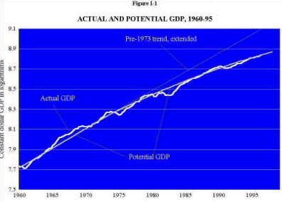
The most important thing to note about the slower rate of growth in potential GDP since 1973 is its bipartisan nature—the slowdown has persisted through numerous changes in economic policy and the administrations of both parties.
The growth of potential GDP depends on two things: first, the growth in the number of workers available for work and the number of hours they work; and second, the growth in output per worker hour (productivity). Starting in the early 1970s the growth of GDP slowed down because of a decrease in the rate of productivity growth. After 1980 the long-run growth of GDP was further slowed by a decline in the growth of the working-age population.
Productivity
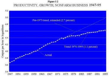
Figure I-2 highlights the slowdown in productivity growth (output per hour worked in the nonfarm business sector of the economy) from an average of 2.7 percent a year from 1947 to 1973 to 1.1 percent thereafter. Again, what stands out is that aside from minor year-to-year fluctuations the sluggish growth of productivity has persisted virtually unchanged for almost twenty-five years. While a decrease in national saving and investment (section VII) played a role in the productivity slowdown, the causes for much of it remain a mystery.
II. Income and Earnings
By Gary Burtless
Family Income
The most widely used measure of the economic position of middle class Americans is median family income. The family with median income is in the exact middle of the income distribution—one-half of families have income above and one-half below the median. In 1994 the median family received a little less than $38,800 in money income. Before 1973 median income adjusted for inflation displayed strong and fairly consistent growth, but since then it has fluctuated more erratically and grown very little if at all (figure II-1).

Median income is not a perfect measure of economic status. It ignores income not received in money, such as employer contributions to health and pension plans and Medicare reimbursements, which have grown in importance over the years. If nonmoney income sources were taken into account, median family income would show a small increase since 1973. Moreover, since 1959 the number of persons in an average family has decreased, so the same median income now supports greater consumption for each family member.
But even if we divide median income by the average number of persons in a family, the text table still shows a sharp fall in income growth after 1973.
| Change in Median Family Income, 1947-94 (percent per year) |
|||||||||||
|
|
|
|
||||||||
|
|
|
|
||||||||
|
|
|
|
||||||||
Compensation
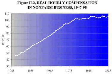
The typical American family derives most of its income from wages and other labor earnings, and wages depend heavily on workers’ productivity. When productivity growth slowed after 1973, wage growth inevitably slowed, too. Figure II-2 shows that average hourly compensation (wages and fringe benefits) in the nonfarm business sector, which rose about 2.8 percent a year from 1947 to 1973, edged up just 0.5 percent a year thereafter.
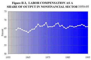
Contrary to a popular view, the share of national output and income received by business owners has not grown at the expense of workers (figure II-3). Hourly compensation, adjusted for consumer price increases, has risen a bit more slowly than overall productivity in recent years. But the main reason for the discrepancy was not a widening of profit margins but the fact that the prices of goods and services that workers typically consume have risen somewhat faster than the prices of the goods and services workers produce in the business sector.
III. Inflation and Unemplogyment
By Charles L. Schultze
Inflation
Several kinds of economic developments can launch inflation. It typically takes substantial unemployment to slow it. Between 1965 and 1983, under administrations of both parties, the country suffered three large inflationary surges (figure III-1). After 1965 the economic stimulus from Vietnam War expenditures was not sufficiently contained by tax increases, spending cuts elsewhere in the budget, or a tight monetary policy. The next two inflationary episodes arose from massive increases in world oil prices in 1973-74 and again in 1979-80, made worse in each case by a modest amount of economic overheating.
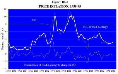
Each of these inflations was followed by a recession. But only in the last of the three recessions (1981-82) was unemployment pushed high enough to reverse a substantial part of the earlier inflation. After another minor episode of overheating and rising inflation (in 1988-90), the recession of 1990-91 finally drove inflation back down almost to its 1950s lows. During the subsequent recovery from that recession, economic overheating and renewed inflation have been avoided, which bodes well for a continuation of prosperity.
Unemployment
Economic recessions are characterized by large increases in unemployment, as shown in figure III-2. When high levels of economic activity push unemployment to very low rates, inflation starts to rise.
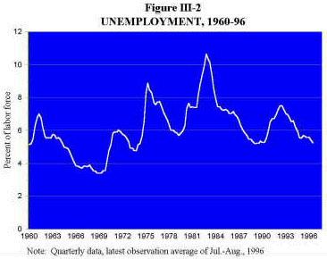
The level of unemployment at which this begins to happen has changed over time. Lately, most economists have been surprised at how low unemployment has fallen (it averaged 5.25 percent in July and August 1996) without so far triggering a rise in inflation.
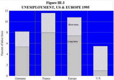
The United States has for some time enjoyed a substantially lower unemployment rate than most European countries, and a far smaller fraction of U.S. unemployment is relatively long term (figure III-3). But the wages of low-skilled workers in the United States have fallen sharply over the past two decades (see Figures IV-1, IV-2, IV-3 below), while they have not done so in Europe. In all the industrial countries the demand for such workers has shrunk in recent decades. In the United States, however, large wage decreases have made it possible for workers at the lower end of the skill ladder to find work; in Europe a more rigid wage structure has preserved the wages of low-skilled workers much better, but at the cost of having a larger fraction of them unemployed.
IV. Distribution Of Income And Wages
By Gary Burtless
Family Income
Over the past fifteen years the distribution of income in the United States has become strikingly less equal. By 1994 the average income of families in the top fifth (quintile) of the income distribution was 11 times greater than for those in the bottom fifth, compared with multiples of only 7 to 9 from 1950 to 1985 (figure IV-1).
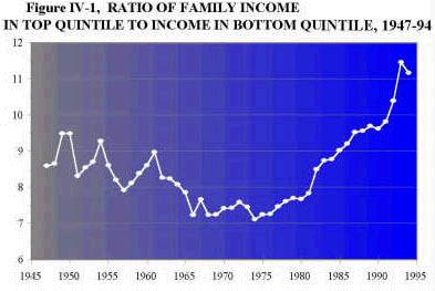
And comparisons involving those in the top 5 or 10 percent of the income distribution would tell an even more dramatic story. Contrary to widely held beliefs, changes in the tax system during the Reagan years had little direct impact on the trends in inequality. Indeed the increased inequality shown in figure IV-1 reflects changes in pre-tax incomes. Even though the tax burdens of affluent families did decrease somewhat in comparison with burdens on middle-income and poor families, the overall effect was small and would hardly be visible if the diagram were redrawn to measure after-tax income. The change in income distribution primarily reflects underlying developments in American society, not government policies.
Changes in household structure contributed importantly to the increased inequality. Families with only a single parent, which are much more likely to be poor than other kinds of households, are a rising percentage of American households. At the other end of the income spectrum, an expanding share of married-couple families contain two earners. If both earners hold professional jobs, their combined income can place the family far up in the income distribution. Since the mid-1970s the nation has seen particularly fast growth in employment, hours of work, and earnings among married women in affluent families, and this trend has contributed noticeably to the growing gap between high-income and middle- and low-income families.
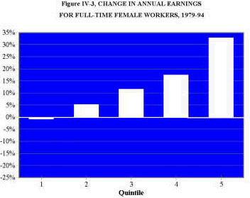
Wages
The single most important factor behind increased income inequality is the sizable increase in wage disparities. Figures IV-2 and IV-3 show trends in annual earnings from 1979 to 1994 for full-time male and female adult workers divided into five equal groups according to their earnings. Earnings of the lowest-paid male workers fell 20 percent, while men in the top fifth of workers saw their earnings climb 11 percent. Earnings gains among women were better than among men, but the trend toward greater inequality was just as powerful.
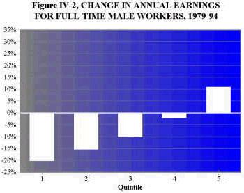
There is no consensus on the exact sources of greater wage inequality. But most economists believe technological trends have played a dominant role, boosting the demand for and wages of workers with higher skills and abilities while reducing the demand for and wages of less-skilled workers.
Greater immigration and trade liberalization have also contributed to the widening disparities, but only modestly. The trends toward greater wage inequality and reduced work opportunities for the less skilled are as strong in industries not affected by international trade as in those heavily affected, and in areas where foreign immigrants are uncommon as in areas with large numbers of immigrants.
V. Downsizing And Job Insecurity
By William T. Dickens
Polls reflecting rising public concern about job security, a flood of media reports, and accounts of thousands of jobs lost at IBM, AT&T, and other big companies suggest that chances of holding onto a job in the American economy have worsened. Yet statistical evidence on whether job security has deteriorated is decidedly mixed, and whether or not the incidence of job loss has increased, the change has been small. In the public’s eye, things are much worse and this disparity is puzzling.
Job Losses
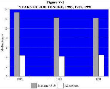
The federal government’s monthly Current Population Survey (CPS) every few years asks how long people have been with their current employer. Figure V-1 shows that for the work force as a whole job tenure did not decrease between 1983 and 1991 (the first and last year for which the data are available). Job stability among older male workers did decrease, but the decrease was offset by increases in job tenure among women and younger men.
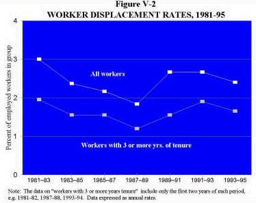
In early 1996 the fraction of workers who reported that they had lost a job during the previous three years was about the same as in the early 1980s (figure V-2).
Unemployment was higher then but adjusting for that difference does not make it clear whether displacement rates have risen. While the current proportion of unemployed workers reporting that they have been permanently laid off is high by historical standards, the monthly unemployment reports show that the rate of entry into unemployment due to job loss is somewhat lower now than during periods of similar unemployment rates in the past.
Whether or not there has been an increase in job loss, changes are small in comparison to the normal rates of destruction and creation of jobs, which have always been very high. At least 10 percent of all jobs (over 12 million) disappear every year and slightly more jobs are created.
Costs of Job Displacement
There are, nevertheless, grounds for the greater worry about job security. First, long-tenured employees who lose their jobs typically have to take a new one at significantly lower pay. In earlier years large and steady economywide wage gains, together with normal seniority increases on the new job, meant that displaced workers could restore their old earning power relatively quickly. But now, with much slower productivity gains and stagnant real wages, it takes far longer to recover, and many middle-aged workers who lose their jobs never do. One study showed that workers were three times as likely to suffer an income loss over a five-year period in the 1980s as during any similar period between 1967 and 1979. Second there has been a sizable increase in the fraction of job displacements accounted for by white-collar workers, who—unlike blue-collar workers—didn’t have to worry as much about job insecurity in the past. Moreover, as shown in figure V-3, the share of unemployment accounted for by white-collar workers has been growing faster than their share in the labor force.
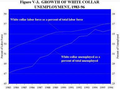
In sum, the incidence of job losses for tenured workers may have risen, but not by a large amount. White collar workers have experienced a notable increase in job insecurity, but the main problem for other workers is the much slower recovery of income losses after displacement.
VI. The Budget
By Robert D. Reischauer
Deficits
Federal deficits, the difference between the revenues and expenditures of the government during the year, have grown substantially over the past two and one-half decades. They averaged less than 1 percent of GDP during the 1950s and 1960s, increased to an average of 2.1 percent during the 1970s, and then rose to 4 percent in the 1980s. During the first six years of the 1990s, deficits have averaged 3.3 percent of GDP (figure VI-1).
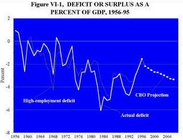
Recessions swell the deficit, lowering revenues and raising spending for unemployment compensation and food stamps. When the annual deficit is estimated in terms of what it would be each year if the economy were stable at high employment, the description of basic trends given above is not substantially altered, although part of the deterioration in the deficit in the early 1990s and the improvement since then are seen to have been due to recession and subsequent recovery. Both the Congressional Budget Office and the Office of Management and Budget expect the 1996 deficit to be around $116 billion or 1.5 percent of GDP. That would be the smallest nominal deficit in fifteen years (since 1981) and relative to GDP the smallest in twenty-two years (since 1974). However, if further measures are not enacted to cut spending or raise revenues, deficits will begin to increase again in 1997 and drift up to exceed 3 percent of GDP by 2006.
Expenditures
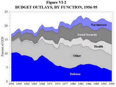
Over the past four decades, federal spending has grown faster than the economy—rising from 17.9 percent of GDP during 1956-60 to nearly 22 percent during 1991-95. But other than interest payments on the debt, all of the growth was accounted for by increased spending on social security and health programs, both of which are directed largely at the elderly (figure VI-2). Spending on the balance of government activities—defense, international affairs, and domestic programs other than health—has declined as a share of the GDP by almost one-third, from 14.6 percent in 1956-60 to 10.3 percent in 1991-95. Within this category of spending, defense has declined in importance significantly and fairly steadily from just over 10 percent of GDP in the last half of the 1950s to 4.4 percent in the first half of the 1990s. The other spending in this category—civilian spending outside of social security, health, and interest—grew relative to the economy until the last half of the 1970s when it averaged 8 percent of GDP and then gradually declined to a shade below 6 percent of GDP in the first half of the 1990s.
Receipts
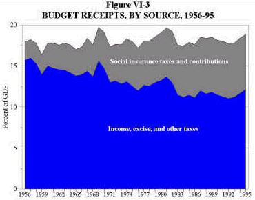
Federal receipts have remained a fairly steady 17 to 19 percent of GDP for thirty-five years (figure VI-3). This constancy masks significant changes in the importance of the two broad categories of federal revenue. Relative to the size of the economy, collections from income (personal and corporate) and excise taxes have shown a marked downtrend until quite recently, from 15.2 percent of GDP in 1956-60 to 11.4 percent in the 1991-95 period. Social insurance taxes and contributions, in contrast, have grown in importance. They amounted to 2.5 percent of GDP in 1956-60, but 6.7 percent of GDP over the past five years. The postwar growth in social insurance receipts kept up with the rising costs of social security, Medicare, and the other social insurance programs. But current social insurance tax receipts will soon begin to fall short of benefit payments due to the rapid growth of Medicare costs and, starting in the second decade of the next century, the large rise in the number of social security and Medicare beneficiaries relative to the number of workers paying social security taxes.
VII. Saving And Investing
By Barry P. Bosworth
Saving
Economic growth depends importantly though by no means solely on how much the nation invests. In turn, the amount we can invest is critically limited by how much we save. National saving is the fraction of the nation’s output and income that we do not consume either privately or publicly and is therefore available for investment either at home or abroad. It is also equal to what the private sector saves minus what is absorbed in financing government budget deficits (figure VII-1).
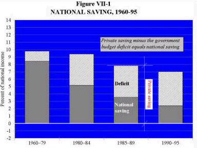
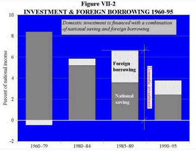
Private saving was roughly stable at 9 to 10 percent of national income from 1950 through 1980. That was sufficient to meet our needs for private domestic investment, finance a small government budget deficit of 1 to 2 percent of national income, and still allow for investing enough abroad to build up a sizable creditor position with the rest of the world (foreign investment is shown in figure VII-2 as negative borrowing; the United States on balance was lending to and investing in other countries). But in the second half of the 1980s and in the early 1990s private saving declined. Financing a substantially increased budget deficit absorbed a growing fraction of the saving that remained. As a consequence overall national saving fell sharply and in the first half of the 1990s amounted to only 2.5 percent of national income. By 1995 national saving had recovered a little, but still amounted to only a little over 4 percent of national income.
Investing
The decline in the national saving rate led to two consequences. First, domestic investment fell from a little over 8 percent of national income in 1950-80 to a little under 4 percent in the first five years of the 1990s. Second, even that reduced volume of investment could not be supported by our shrunken national saving. As a consequence we had to rely on importing foreign saving to make up the gap, running a sizable trade deficit in the process. The United States shifted from the world’s largest creditor nation to the largest net debtor. Although the reliance on foreign capital did limit the decline in domestic investment and moderate the harm to the nation’s productivity growth from the fall in national saving, the gain is a mixed blessing because in the future we will have to pay interest and dividends to foreign investors on the funds we acquired.
Deficit Reduction
Deficit reduction will increase national saving. By reversing the decrease in national saving, two consequences will follow: the nation will increase domestic investment in productivity-enhancing assets and reduce the reliance on foreign borrowing, lower the U.S. trade deficit, and decrease the amount of dividends and interest it has to pay abroad.
Sources And Notes
Section I. GDP is gross domestic product in 1992 dollars, from the Department of Commerce. The basic revisions to the national income and product accounts (NIPA) have only been published back to 1959. For 1947-59 the earlier unrevised data on GDP, productivity, and employment were spliced to the revised series in 1959. Potential GDP is based on Congressional Budget Office annual estimates, interpolated quarterly and adjusted to reflect a nonaccelerating-inflation-rate-of-unemployment somewhat lower than the CBO estimates after 1992, falling to 5.6 percent (from the CBO’s 5.8 percent). Productivity is output per worker in nonfarm business from the Bureau of Labor Statistics, reflecting the NIPA revisions after 1959.
Section II. Median family income is from the annual Census Bureau P-60 releases deflated by the CPI-U-X1 (which is the same as the published CPI-U from 1983 on). Compensation per hour in the nonfarm business sector is from the Bureau of Labor Statistics productivity data series, with the same splicing of pre-1959 data, deflated by the CPI-U-X1 rather than the CPI-W as in the published BLS series. Compensation share of national income in corporate sector is from NIPA, again with the pre-1959 unrevised data spliced to the later revised data.
Section III. Inflation. CPI data are from BLS. Before 1983 the Bureau’s CPI-U-X1 was used as the superior measure of consumer price inflation. Unemployment Rates. European unemployment. Database from the OECD Employment Outlook, July 1996. “Europe” includes continental Europe less the former socialist countries plus the United Kingdom.
Section IV. Family income by quintiles. Census Bureau P-60 reports, various issues. Real Earnings. Author’s tabulations of CPS tapes; earnings deflated by CPI-U-X1.
Section V. Job tenure. BLS tabulations are from answers in Current Population Survey (CPS). Displaced worker rates. “All worker” rates are from unpublished BLS tabulations derived from the CPS. three-year tenure rates through 1991-92 from April 1995 Monthly Labor Review; 1993-94 data estimated by author from unpublished BLS data. White-collar worker data. BLS published data from the monthly CPS. Job Turnover. Estimated by author from data in Stevens J. Davis, John Haltwanger, and Scott Shuh, Job Creation and Job Destruction, MIT Press (forthcoming), and Jonathon S. Leonard,”In the Wrong Place at the Wrong Time: The Extent of Functional and Structural Unemployment,” In Unemployment and the Structure of Labor Markets, K. Lang and J. Leonard (Eds.) Basil Blackwell (1987).
Section VI. Actual expenditures, revenues, and deficit. Office of Management and Budget, Historical Statistics. High-employment deficit, and deficit projections. Congressional Budget Office, The Economic and Budget Outlook: Fiscal Years 1997-2006.
Section VII. All data are from the NIPA. “Government” includes federal, state, and local governments. The annual surplus of state and local governments social insurance funds (principally the pension funds for their own employees) is classified as private saving. National saving and investment are measured net of capital consumption. National saving excludes the net investment of governments in civilian and military assets, and domestic investment is private investment only. The inclusion of net government capital accumulation in the saving and investment data would have made litle difference. Government investment averaged 2.1 percent of national income in 1960-79 and in the subsequent three periods shown in the figures that share was 1.2, 1.7, and 1.4 percent respectively.
The format of this Brief was inspired by that of The American Economy by Herbert Stein and Murray Foss, American Enterprise Institute, 1995.
The Brookings Institution is committed to quality, independence, and impact.
We are supported by a diverse array of funders. In line with our values and policies, each Brookings publication represents the sole views of its author(s).