“The master’s tools will never dismantle the master’s house,” penned poet and activist Audre Lorde. Pulled from a 1984 essay, the quote summarizes her larger argument that mainstream academic frameworks are incapable of permitting the disruption of their own status quo. “They may allow us temporarily to beat him at his own game, but they will never enable us to bring about genuine change,” wrote Lorde.
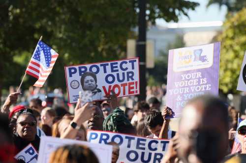
Over the last few months, several Democratic presidential hopefuls—namely Sen. Kamala Harris (Calif.), Sen. Elizabeth Warren (Mass.), and South Bend, Ind. Mayor Pete Buttigieg—have released housing proposals that utilize a curious vector to implement their respective remedies for historical discrimination: redlining maps.
Redlining was the practice of outlining areas with sizable Black populations in red ink on maps as a warning to mortgage lenders, effectively isolating Black people in areas that would suffer lower levels of investment than their white counterparts. The Democratic candidates hope that the contours of these old maps—once used by the government-sponsored Home Owners’ Loan Corporation (HOLC) from 1933 to 1977—offer the blueprint for closing the racial homeownership gap and increasing prosperity among largely Black and Brown Americans who were robbed of wealth for generations under redlining’s legal discriminatory policy.
Redlining was the practice of outlining areas with sizable Black populations in red ink on maps as a warning to mortgage lenders, effectively isolating Black people in areas that would suffer lower levels of investment than their white counterparts.
In each plan, redlining maps are used to determine eligibility for beneficiaries, to differing degrees:
- Harris’s plan would invest $100 billion in assistance for down payments and closing costs, to be made available to those who have lived in government or rental housing for 10 or more preceding years in a formerly redlined area that is low-to-moderate income today. Grantees must also earn less than a maximum annual family income.
- Warren’s plan would offer down payment assistance to first-time homebuyers in formerly redlined areas or low-income areas that experienced other forms of legal segregation, qualifying them for a grant applicable to a home anywhere in the country. The proposal is billed as a “first step towards closing the racial wealth gap,” and would be paid for by an estate tax.
- Mayor Buttigieg’s plan proposes the Community Homestead Act, which would purchase abandoned properties in select cities and allow residents to acquire them. Eligible grantees include residents who earned less than the area median income over the last five years and either have resided in the area for at least three years, or have resided in any historically redlined or racially segregated area for at least three years.
However, based on our analysis of who lives in these formerly redlined districts today, Lorde’s quote should be considered when it comes to these proposed remedies.
The University of Richmond’s Mapping Inequality project has digitized scans of the HOLC redlining maps held in the National Archives. Examination of the maps, numbering over 200, reveals that approximately 11 million Americans (10,852,727) live in once-redlined areas, according to the latest population data from the Census Bureau’s American Community Survey (2017). This population is majority-minority but not majority-Black, and, contrary to conventional perceptions, Black residents also do not form a plurality in these areas overall. The Black population share is approximately 28%, ranking third among the racial groups who live in formerly redlined areas, behind white and Latino or Hispanic residents.

While still a tremendously large population, the approximately 3 million Black residents in redlined areas account for just 8% of all non-Latino or Hispanic Black Americans. Given the demographic shifts that have occurred since the federal government started using color-coded maps to assess mortgage risk, and the relatively small share of the Black population currently living in these areas, proposals that center on these past tools to redress discrimination probably won’t “dismantle the master’s house.”
The past still haunts us
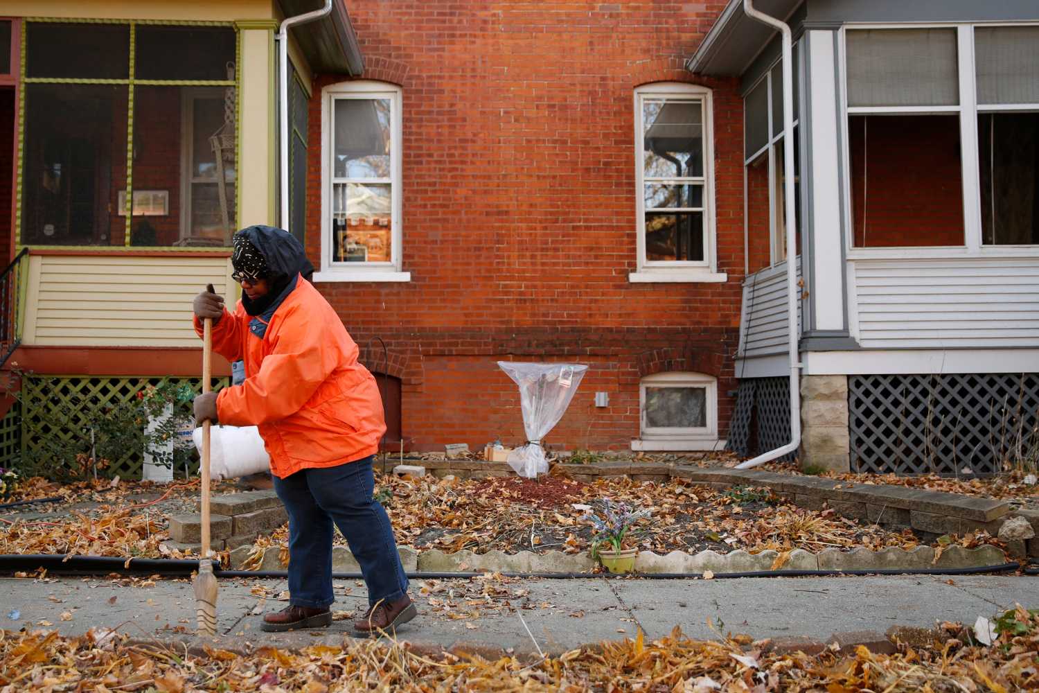
Together with racially restrictive housing covenants that prohibited Black Americans from buying certain properties, redlining prevented generations of families from gaining equity in homeownership or making improvements to homes already owned. These unjust practices form part of a long history of discrimination, which has contributed to the disparities in homeownership and wealth still observed between the Black and white populations of the country today.
Redlined neighborhoods are generally located near the center of urban areas, where Black people were concentrated when the government generated the maps used today for the Harris, Warren, and Buttigieg proposals. But since then, transformational demographic shifts have spread different populations throughout metropolitan areas and increased the size of those areas overall. To assess the relative residual social patterns across redlined communities today, we compare the aggregate of the census block groups that fall within the redlined areas of each city to the remaining non-redlined areas in the same cities, and measure ways the two areas differ.
These localized comparisons show that in cities with a history of redlining, the redlined areas today generally remain more segregated and more economically disadvantaged, with higher Black and minority shares of population than the remainder of the city. Additionally, they have lower median household income, lower home values, older housing stock, and rents which are lower in absolute terms (but often higher as a percentage of income). Similar studies have confirmed these trends for other social characteristics, as well as a clear correlation showing more positive current-day outcomes for areas that were “greenlined.”

The selected characteristics in the group of the ten most populous redlined areas diverge less sharply than in the remaining smaller areas, suggesting that for smaller areas, the residual effects of redlining are perhaps felt more clearly.
Redlined areas vary greatly
The population distribution of once-redlined areas skews heavily toward a handful of large cities. About half (49.8%) of today’s redlined population resides in the 10 cities with the most populous redlined areas: New York, Chicago, Los Angeles, Philadelphia, San Francisco, Boston, San Diego, Detroit, Milwaukee, and Baltimore.

This top-heavy slant of the population distribution poses an issue for policymakers who wish to use HOLC maps to address the legacy of past discrimination, as it is not the case that half of the homeownership and wealth gaps can be attributed to disparities among Black and white residents of those ten cities alone. Furthermore, Black-majority suburbs are on the rise, which are heavily underrepresented in HOLC maps due to their focus on urban centers.
Who now lives in once-redlined areas?
In some places, redlined areas track with conventional perceptions. For example, in Birmingham, Ala., the redlined portion has a much higher concentration of Black residents than the rest of the city, as well as lower incomes and property values. Formerly redlined Birmingham is majority-Black, and a large share of the Black citizens of Birmingham reside in formerly redlined areas.
The racial history of Birmingham is one of sustained aggression against the Black population. The persistence of demographic patterns in formerly redlined Birmingham is a testament to informal and formal enforcement of spatial placement by local, state and private forces. In cities throughout the South with a similar demographic makeup and history of racial violence, policies of targeted assistance in redlined areas could prove useful in closing the local racial homeownership and wealth disparities. However, at the regional and city level across the country, we find wide variations in the demographic makeup of who lives in formerly redlined areas (both in absolute numbers and relative to the cities in which they are found).
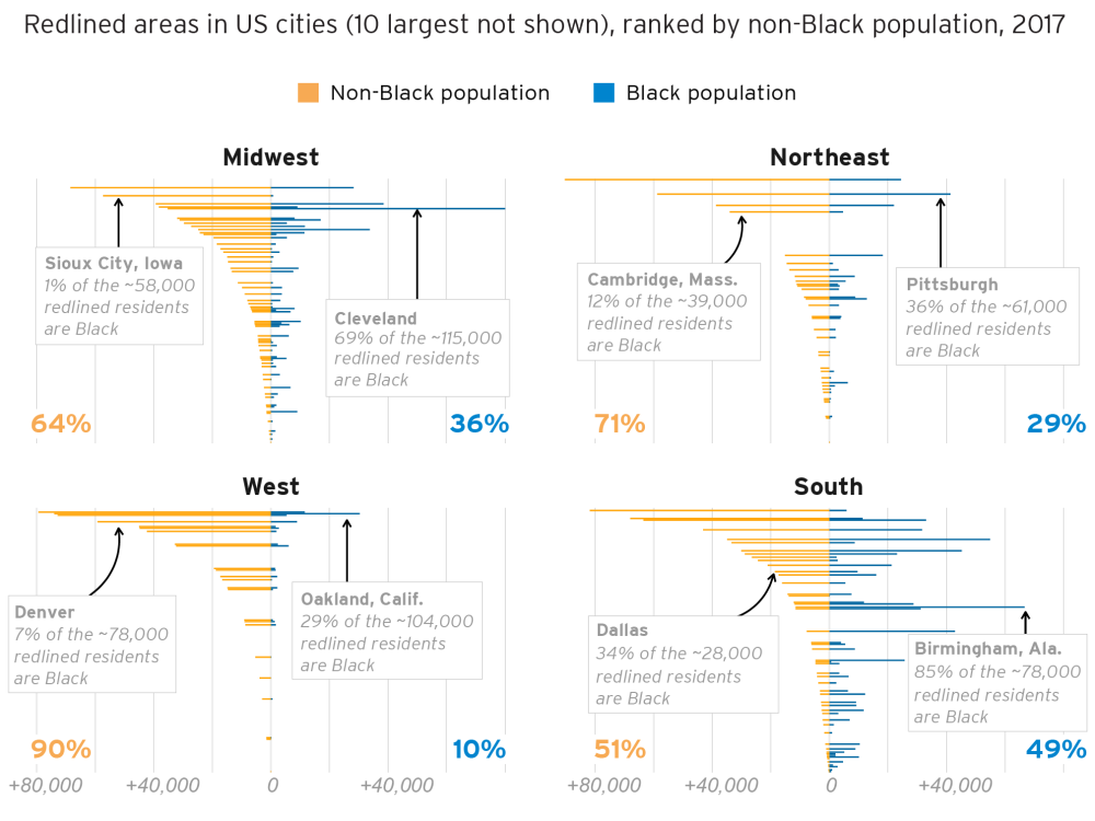
Some redlined areas have a lower Black share of population than the rest of the city
Theoretically, if the effects of redlining had faded completely over time, demographics and socio-economic outcomes between redlined areas and the surrounding city would be indistinguishable. Of course, this is not the case, but the degree to which the Black versus non-Black population of a given redlined area matches the area around it varies greatly across cities. Of the 174 principal cities in the comparison, 114 showed a statistically significantly higher concentration of Black population in the redlined areas than the rest of the city. In 26 more, the concentration was higher but not statistically significant.
Six of the 34 cities which inverted this trend (a redlined area with a lower Black share of the population than the rest of the city) are among those 10 large cities which are home to half the redlined population: Detroit, Baltimore, Milwaukee, Boston, Los Angeles, and Philadelphia. Each of the six have sizeable Black populations, and Black people form the largest racial group in Detroit, Baltimore, and Philadelphia. And despite a demographic shift, the redlined portions of these cities still exhibit negative economic outcomes.
Clearly, these areas have suffered from a legacy of divestment, and deserve attention from policymakers. But a strategy to close the racial wealth gap that focuses mainly on these now-diversified locations risks overlooking Black neighborhoods elsewhere.

Some redlined areas, especially in the West, have a small Black population relative to white or Latino or Hispanic residents
Los Angeles is home to the third-most populous formerly redlined area, encircling over 620,000 people. Today, 70% of this group is Latino or Hispanic, 12% is white, and 6% is Black.
In 1930, nine years before the HOLC map was produced, census data showed that the whole city’s population was 88% white, 8% Mexican (the closest proxy to the Latino or Hispanic population from the time), and 2% Black. Even so, language from the original HOLC map makes explicit reference to Black neighborhoods. An excerpt from a map encompassing today’s central Los Angeles neighborhood of Jefferson Park derisively writes:
This is the “melting pot” area of Los Angeles, and has long been thoroughly blighted. The Negro concentration is largely in the eastern two thirds of the area. Original construction was evidently of fair quality but lack of proper maintenance is notable. Population is uniformly of poor quality and many improvements are in a state of dilapidation. This area is a fit location for a slum clearance project. The area is accorded a “low red” grade.
While redlined areas in Los Angeles largely did and still do encompass far more Latino or Hispanic residents than Black residents, property appraisals and neighborhood assessments were constantly undertaken from a distinctly anti-Black point of view. However, the demographic reality of redlined Los Angeles today means that policies implemented here to close the Black homeownership gap would miss the target population. Of course, the country experiences a Latino or Hispanic homeownership gap as well, which merits intentional consideration from policymakers. But Latino or Hispanic Americans should not be merely an incidental benefactor of policy directed at addressing historic discrimination against Black people.
Other cities which display this pattern include Denver, Salt Lake City, Pittsburgh, and San Jose, Calif.
Some redlined areas are too small to be a useful target for policy
Dallas is a city with a long history of intense discrimination. Today, Dallas remains segregated along lines of race and income, but the HOLC map is surprisingly small. In the 80 years since the map was drawn, the city has grown five-fold. Today, the city of Dallas hosts over 1.3 million residents (including roughly 300,000 Black residents) but has a redlined population of just over 28,000. Policies to address redlining specifically would have little effect on racial homeownership and wealth disparities in Dallas.
Other cities which display this pattern: Sacramento, Calif., El Paso, Texas, Grand Rapids, Mich., and Phoenix, Ariz.
For many cities, there are no available HOLC maps
Washington, D.C. is noticeably absent from discussions of redlining. The reason is simple, and reveals one of the most intractable problems with using these maps to guide policy implementation: We simply do not have any record of a redlining map drawn for 1930s Washington. While it is difficult to imagine the District—long known as “Chocolate City”—being spared from a nationwide effort targeting Black residents, it is not hard to find examples of place-based discrimination that happened in the nation’s capital in the 20th century and continue today. Discriminatory lending at the local level does not require a federally commissioned map, but it helps.
If the 2020 presidential candidates and other federal policymakers wish to close the homeownership and wealth gaps, efforts cannot be considered complete without including the city of Washington. Without a map to guide them, a new system must be devised for implementing policy there. And if that can be accomplished for Washington, then it can be accomplished nationwide.
Other places which display this pattern: all but some 200 cities nationwide, including nearly every suburb and rural area.
Once-redlined areas are no longer a proxy for Black America
Redlining was a federally created—but locally implemented—form of discrimination. As such, redlined areas, and the cities in which they are located, vary widely in size, demographics, and location. Moreover, the racial makeup of the population in redlined areas has grown and evolved dramatically over the last eight decades, and the effects of the practice have spread beyond the confines of the original maps.
The practice of redlining was explicit in its targeting of Black Americans. While Latino or Hispanic residents, low-income white residents, noncitizens, communists, and other populations the federal government deemed “risky” were often included in redlining, they were not targeted in the same manner as Black residents. Today, neighborhoods that fall within once-redlined areas are more likely to have a higher concentration of Black residents, as well as lower incomes, lower home values, and other negative economic characteristics relative to the rest of their cities.
However, proposals that base their remedies primarily on formerly redlined areas paradoxically do not redress the main racial group that was explicitly targeted, exclude important Black neighborhoods and communities, and would skew impact toward a handful of large cities. Place-based discrimination—the practice of divesting in neighborhoods wholesale on the basis of race—has had adverse effects on both people and place. Policymakers should be intentional in ensuring that their proposed solutions can address both.
Consequently, redlining—the master’s tool—will prove to be insufficient in dismantling the legacy of racial inequities in homeownership and wealth in the United States.
Methods
We define formerly redlined areas as those geographies marked “Hazardous” or “Fourth Grade” and thus outlined in red via the University of Richmond’s Mapping Inequality project. We define cities as census “Places” and choose principal cities as our unit of comparison, rather than metropolitan areas, to better account for the general centrality of redlined areas around urban cores. Principal cities are defined by the U.S. Census Bureau. Population totals and characteristics are tabulated by aggregating all census block groups whose population-weighted centroids fall within any redlined area (including those areas outside of contemporary principal city limits), estimating aggregated medians and margins of error by linear interpolation. Block groups are the smallest geography for which the American Community Survey provides estimates for the latest dissemination period (2017). However, not all socio-economic characteristics which are available in the ACS at the census tract level are available for block groups. Block groups offer a finer approximation of the irregular geographies of redlined areas, at the expense of accessing fewer ACS estimates. As this analysis is based largely on demographic totals, which are available at the block group level, we choose to make the best possible geographic approximation instead of a broader socio-economic snapshot. Because we examine whether the complicated boundaries of these geographies should be followed closely today, we therefore deem it necessary to estimate the most accurate interpretation of those boundaries possible. At time of writing, 2010 population totals for census blocks are available (and would provide a finer resolution of irregular redlining geographies than block groups), but these figures are nine years old and do not include any socio-economic characteristics. After the 2020 census, block level population data will allow for finer demographic analysis of redlined areas using up-to-date figures. All margins of error and significance tests are calculated at a 90% confidence interval.
Related Content


Related Books
Authors


The Brookings Institution is committed to quality, independence, and impact.
We are supported by a diverse array of funders. In line with our values and policies, each Brookings publication represents the sole views of its author(s).