Efforts to stop the spread of the novel coronavirus—particularly the closure of nonessential businesses—are having an unprecedented impact on the U.S. economy. Nearly 17 million people filed initial claims for unemployment insurance over the past three weeks, suggesting that the unemployment rate is already above 15 percent[1] —well above the rate at the height of the Great Recession.
However, these aggregate statistics mask substantial variation across the country. Some cities, such as New York, are already experiencing full blown pandemics and non-essential business activity has been substantially halted. In other areas economic activity has slowed less. This variation represents the degree of spread of the virus, the timing and extent of the state and local response, and the sectoral mix of economic activity. Work by our colleagues suggests that metropolitan areas dependent on energy, tourism, and leisure and hospitality are likely to suffer greater slowdowns, while those that depend more on industry, agriculture, or professional services will suffer less.

Figure 1[2] displays the sum of initial claims for unemployment insurance filed during the weeks ending March 21, March 28, and April 4 for selected states as a share of the labor force[3]. As can be seen, in the hardest hit areas, the number of initial claims as a share of the labor force was double or triple that of the least affected areas. While some of the differential likely reflects variation in unemployment insurance systems across states, this explanation is unlikely to explain the entire differential. Since, as can be seen, the states with relatively more claims include those dependent on tourism (Nevada and Hawaii) and those which have been hard hit by the virus (Rhode Island, Pennsylvania, and Michigan), while those with few claims have low incidence of the virus. Hence, it does appear, at least to start, there has been an idiosyncratic aspect to how states, and implicitly metropolitan areas, are affected by the pandemic. Eventually, however, a shock of the magnitude of the novel coronavirus will certainly result in a national recession, affecting the entire country to a greater or lesser degree.
In this post, we examine how shocks to the economy, like the one we are experiencing now with the coronavirus, play out at the metropolitan level, with a specific focus on the unemployment rate. We use as our laboratory the Great Recession, which started in metropolitan areas that were most affected by the housing bubble and bust, but then spread nationally. In line with previous research, we find that there is persistence in the unemployment rate across metropolitan areas. Idiosyncratic shocks disrupt these persistent differentials, but over time local economies adjust, and metropolitan areas tend to re-sort back to their previous place in the distribution. Our results also suggest that negative macroeconomic shocks tend to affect high-unemployment rate areas most harshly, and that strong macroeconomic performance helps to ameliorate not only the aggregate shocks, but also the differences across metropolitan areas.
Metropolitan Areas Tend to Have Similar Unemployment Rates Over Time
As has been well documented, the economies of metropolitan areas vary in structural ways, for instance based on their industrial mix, geography, demographics, and infrastructure. These structural differences result in persistent differences in labor market outcomes, including unemployment rates[4].
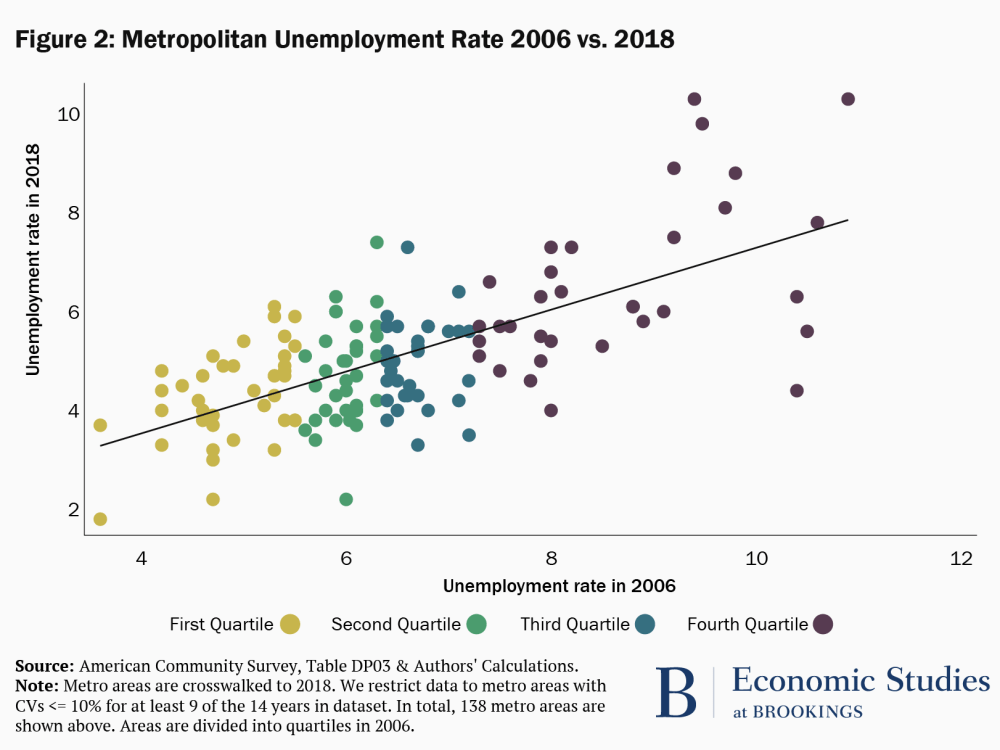
In Figure 2, we examine the persistence of the unemployment rate by metropolitan area. Each dot represents a metropolitan area, and dots are color coded according to their quartile in the distribution of unemployment rates in 2006. The x-axis denotes the metropolitan area’s unemployment rate in 2006 and the y-axis the area’s unemployment rate in 2018. These are both years at which the economy was near, but not at its peak.
Figure 2 shows a clear, positive relationship between unemployment rates in 2006 and 2018: lower unemployment rates in 2006 are associated with lower unemployment rates in 2018. Notably this relationship holds across the entire sample, and also within the unemployment rate quartiles. Our results suggest that a 1 percentage point higher unemployment rate in 2006 is associated with a 0.6 percentage point higher unemployment rate in 2018. Moreover, the unemployment rate in 2006 explains 44 percent of the variation in the unemployment rate in 2018.
Although Metropolitan Areas Experiencing Idiosyncratic Shocks Undergo Large Changes in Their Unemployment Rates, They Tend to Revert Back to Their Previous Place in the Distribution:
In addition to the persistent characteristics that shape the economies of metropolitan areas over long periods, idiosyncratic events specific to metropolitan areas can also have a significant impact. Examples of these types of shocks include storms, like Hurricane Katrina, which reshaped New Orleans, or technical changes such as hydraulic fracturing, which made it possible to extract oil and gas from areas where they were previously inaccessible. These idiosyncratic shocks may or may not have long-lasting impacts.
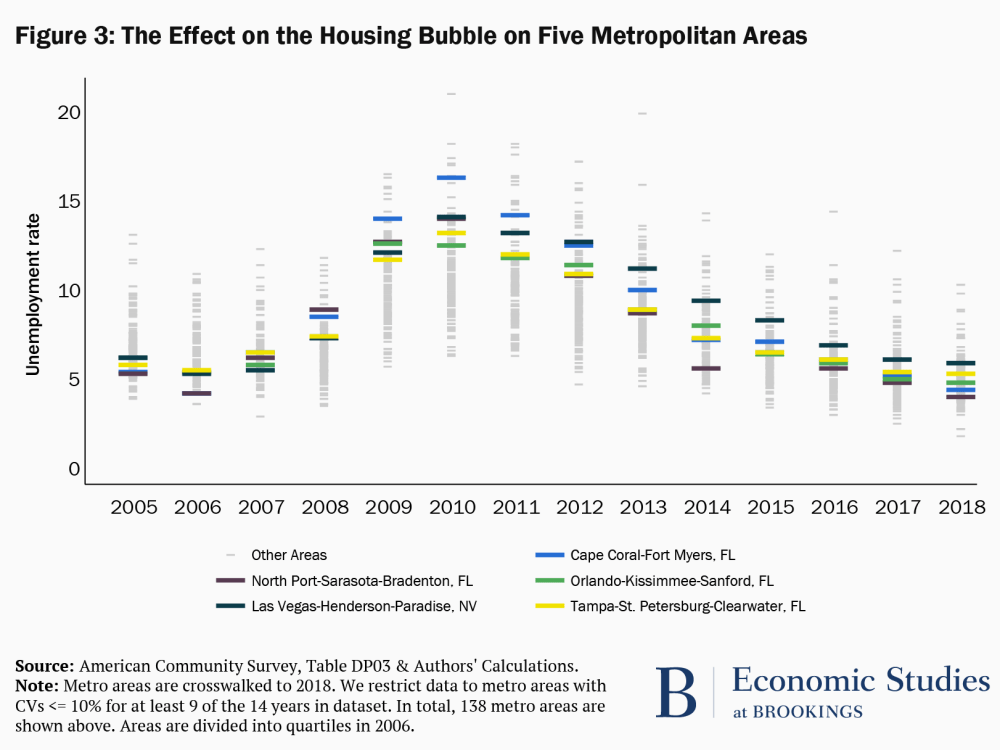
Figure 3 shows the distribution of metropolitan area unemployment rates over a fourteen-year period. The figure highlights five metropolitan areas. In 2006 these highlighted areas were in the first quartile of the distribution; meaning that these areas had lower levels of unemployment than 75 percent of the metropolitan areas displayed in the figure. By 2009, these five areas had unemployment rates that were in the top quartile of the distribution that year. While it is true that the unemployment rate on aggregate was also rising during this period (as can be seen by the fact that the unemployment rates of all the other metropolitan areas, represented by the light gray bars, move up), these areas were affected earlier and by more—a function of the fact that they were hit by a specific, negative idiosyncratic shock: the bursting of the housing bubble. These metropolitan areas are located in Florida and Nevada, states with large housing bubbles, and the specific metropolitan areas highlighted experienced large drops in local housing prices when the bubble burst in 2007[5].
Like the financial crisis, the current crisis also has an idiosyncratic component. As noted in the introduction, metropolitan areas first affected by the virus closed non-essential businesses earlier. Moreover, the economies of metropolitan areas reliant on tourism, leisure and hospitality, and energy slowed quickly as travel restrictions were imposed and global demand declined. Other areas with fewer cases of the virus and those with economies dependent on industry, agriculture, or professional services appear so far to have been less impacted.
Interestingly, Figure 3 also illustrates that by 2018 these metropolitan areas that faced a negative shock from the bursting of the housing bubble had largely recuperated, with unemployment rates returning to levels similar to 2005/2006. This finding is in line with Blanchard and Katz (1992) who show that state-level unemployment rates tend to recover approximately five to seven years after experiencing a negative shock to employment. Note, this isn’t to say that adjustment is automatic—indeed specific policies geared at addressing idiosyncratic shocks may be necessary to help local areas cope when they face a crisis.
A Strong National Economy Helps All Metropolitan Areas, Even Those with Persistently High Unemployment Rates
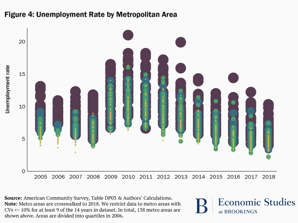
Figure 4 plots the distribution of the unemployment rate by metropolitan area from 2005 to 2018, with dots of different colors and sizes identifying the quartiles of the unemployment rate distribution in 2006, as in Figure 2. (We make the dots different sizes to make it possible to follow the movements in the unemployment rates of the metropolitan areas from year to year.)
There are several phenomena that can be observed in this graph. One is the central tendency of the metropolitan area unemployment rates—as a whole, are the unemployment rates relatively high or low in a given year—which reflects the state of the business cycle. The second is how disperse the unemployment rates are—are the unemployment rates across the metropolitan areas relatively similar (are they clumped together) or are they spread out, with some areas having high rates and others relatively low rates. And the third is the relative position of the unemployment rates of specific metropolitan areas—do metropolitan areas that have high or low unemployment rates to start remain in those positions over the entire time period. To help elucidate these points, we also show the mean, range, and variance of the unemployment rates for groups of years in Table 1.
The first thing to note in Figure 4 is the impact of the Great Recession across metropolitan areas. As the recession gained full force in 2009, metropolitan unemployment rates as a whole began to increase. Second, the differences in unemployment rates across metropolitan areas widened in years in which the economy was underperforming. And, metropolitan areas that started off relatively disadvantaged tended to experience the highest unemployment rates during the recession. This information is summarized in Table 1, where we can see that the mean, variance, and range of the unemployment rate all increase substantially during the recession from the pre-recession period.
Table 1: Spread of the Unemployment Rate
| Years | Mean | Variance | Range |
| 2005-2008 | 6.6 | 2.5 | 10.2 |
| 2009-2011 | 10.6 | 6.1 | 15.3 |
| 2012-2014 | 8.6 | 5.5 | 15.7 |
| 2015-2018 | 5.8 | 2.8 | 12.6 |
Of course, this aggregate phenomenon is being laid on top of the idiosyncratic shocks we discussed previously, in particular, the bursting of the housing bubble. For instance, the metropolitan areas that we identified as having been particularly hard hit by the bursting of the housing are among those metropolitan areas captured by the yellow dots, which rise much more than average during the financial crisis and recession. But, as the economy recovered, and the aggregate unemployment rate fell, metropolitan area unemployment rates began to converge again. Many areas that saw the largest deterioration in their unemployment rates during the financial crisis and the Great Recession experienced substantial improvement. This finding is consistent with prior research demonstrating that strong macroeconomic conditions are particularly beneficial for workers that are disadvantaged in the labor market.
Notably, the distribution of unemployment rates in 2018 looks fairly similar to that of 2005 and 2006. By this we mean that metropolitan areas with the lowest unemployment rates prior to the Great Recession (the yellow dots) tend to have lower unemployment rates in 2018 and metropolitan areas with the highest unemployment rates (the purple dots) tend to have higher unemployment rates. This is just another way of illustrating the result in Figure 2, showing the persistence of the unemployment rate across metropolitan areas over time, even in the face of significant idiosyncratic and macroeconomic shocks.
Policy Implications for COVID-19:
Metropolitan areas have high (or low) unemployment rates for different reasons. First, there are structural causes—such as average education levels or industry mix—which mean that some areas tend to have high or low unemployment rates over time. Second, there are local idiosyncratic shocks that might cause metropolitan areas to see large but typically transitory increases or decreases in their unemployment rates. Finally, metropolitan areas are buffeted by the business cycle—aggregate shocks that play out similarly, although not identically, across metropolitan areas.
The current crisis in which we find ourselves is no different. Before the pandemic reached our shores, metropolitan areas had distinct capacities to respond based on their structural differences. The impact of the virus will vary across metropolitan areas depending on their exposure and industrial mix. Finally, all metropolitan areas will experience the spillovers from the deep recession as economic activity is curtailed.
Policymakers should take into account these different types of shocks that are buffeting localities, because they suggest different policies. Our results indicate that policies aimed at ensuring liquidity in financial markets now and stimulating aggregate demand once it becomes safe to engage in non-essential economic activity will have a broad positive impact on economic outcomes across metropolitan areas and will reduce disparities between them. However, some localities will require more help, either because they face a particularly pernicious impact from the pandemic or because long-standing structural factors make it particularly difficult for them to weather the economic headwinds we face. Our colleagues Louise Sheiner and Sage Belz show that state tax revenues declined by about 9 percent during the Great Recession and argue that recently passed legislation—such as CARES Act and FFCRA—does not provide enough funding to prevent states and localities from cutting spending. Similarly, our colleague Matt Fiedler and Wilson Powell III make the case for increasing the federal match rate for Medicaid in proportion to the amount that the state’s unemployment rate exceeds some threshold. And the Metropolitan program discuss policies that would bolster metropolitan areas by supporting small businesses.
Becca Portman contributed to the graphics/data visualization for this blog.
[1] This is a back-of-the-envelope calculation which assumes all initial claims translate into spells of unemployment. We take the number of initial claims from the weeks ending in April 4, March 28, and March 21 (16,780 thousand); add the number of unemployed people in March 2020 (7140 thousand); and divide by the March 2020 labor force: (16,780 + 7140)/162913 = 14.68%. Although it is not always the case that initial claims translate into spells of unemployment, this calculation is, nonetheless, most likely an underestimate of the unemployment rate as not all people who become unemployed are eligible to receive benefits and not everyone who is eligible for unemployment insurance applies. Moreover, this estimate likely understates the number of people who have tried to file claims in recent weeks, due to limitations with the state unemployment insurance systems which have been overwhelmed. That said, there is currently less certainty about the relationship between insured unemployment and aggregate unemployment because of changes in the unemployment insurance eligibility rules.
[2] Note that the ratios in this graph should be interpreted with caution. We choose the total labor force as the denominator because recent legislation has changed the types of workers covered by unemployment insurance. However, this denominator likely overstates the number of people covered by unemployment insurance. The numerator is not without issues either. As mentioned above, it is likely to understate the number of people who have attempted to file claims, due to limitations with the unemployment insurance systems.
[3] Claims data by metropolitan area aren’t readily available.
[4] Katheryn Russ and Jay Shambaugh show that the persistence of the unemployment rate is related to the average level of education in a county. They find that counties with lower levels of education have higher levels of persistence. In other words, areas with lower, average education are more likely to get “stuck” with a high unemployment rate over time.
[5] We also examine metropolitan areas that were in the fourth quartile of the distribution in 2006 and subsequently moved to near the bottom of the distribution in 2009. We find that these areas are mostly located in places with positive energy shocks.
Related Content


Authors


The Brookings Institution is committed to quality, independence, and impact.
We are supported by a diverse array of funders. In line with our values and policies, each Brookings publication represents the sole views of its author(s).


Commentary
The unemployment impacts of COVID-19: lessons from the Great Recession
April 15, 2020