
The federal government is currently investing hundreds of billions of dollars to help regional economies rebuild in the wake of the COVID-19 pandemic. In addition to the American Rescue Plan Act’s $350 billion in flexible funds for cities, counties, states, and tribal governments, the Infrastructure Investment and Jobs Act and CHIPS and Science Act add another $80 billion in place-based industrial competitiveness programs. And all this public funding will leverage even greater sums of private capital investment.
This is welcome news for communities in need of investments, jobs, and income growth to address long-standing economic and racial inequities. Yet as government, business, and nonprofit leaders form regional coalitions to implement federally financed recovery strategies or compete for competitive federal grants, they must address several questions. How can these leaders develop a shared and specific definition of their biggest economic challenges and inequities? How can they address those challenges using this infusion of resources to make their region more prosperous and equitable? And how can they define a realistic expectation of impact so they can measure progress and shift strategy if needed?
Regional economic dashboards have become a ubiquitous tool to try to answer these questions. Many economic development organizations, community groups, philanthropies, civic organizations, and higher education institutions work together to compile key economic performance indicators to better understand their region’s economic trajectory—often operationalizing those indicators through online dashboards. These are time-consuming projects that involve extensive discussion and debate about which indicators to include and how to organize them. Some leaders dedicate their time to this work because they see metrics as a way to bring strategy and accountability to the messy, nonlinear, multisystem work that happens under the heading of “economic development.” Others do so because dashboards can help cement a region’s commitment to equity by formally elevating measures of economic inclusion to a position alongside more typical measures of economic growth.
Whatever their motivation, leaders believe this time is well spent because they expect metrics to not only serve as a statement of values, but as a tool that helps organizations and regions act and invest differently. They believe that—equipped with a set of metrics that articulate the region’s goals—the many individual organizations that make up a regional economic development system can make hard, strategic choices about which problems to focus on, coordinate on implementation, and fluidly adapt as the dashboard reveals changing conditions.
The reality, however, is that dashboards typically fail to fulfill this function. This report argues that regional leaders—especially in an era of new investment into their communities—need a more robust economic performance management system to not only monitor the right economic trends, but also to make strategic decisions about where and how to invest. We draw on a recent collaboration with the McKnight Foundation to illustrate how dashboards could evolve to be more robust strategy development and performance management tools. We conclude that modernized systems should be developed based on: 1) a shared theory of what drives inclusive growth; 2) the selection of good data with the right context; and 3) a set of principles that guide strategic decisions once key gaps have been identified.
Why dashboards fail as strategy tools
Dashboards are valuable tools in that they can organize stakeholders around a shared vision for what matters to a thriving, inclusive local economy. These stakeholders can then monitor progress over time, setting the stage for ongoing discussions about how regional strategy needs to respond to changing conditions. Yet most dashboards ultimately fail to meaningfully shape strategic decisions because they are not designed to help organizations navigate the area where most strategy happens: what the McKnight Foundation’s Director of Learning Neeraj Mehta calls the “messy middle” between high-level goals and day-to-day tactics. (Disclosure: The McKnight Foundation funded a collaboration with Brookings Metro that generated this analysis.)
Some of the shortcomings of dashboards reflect the fact that there is no data available to measure many of the trends that are fundamental to inclusive growth strategies. As we describe later, it is not possible to directly measure key outcomes such as the racial wealth gap at the local level. And in all but the very largest metro areas, it is not possible to reliably measure trends in key areas of strategic focus, such as business ownership by sector and race. But we also believe that as strategy-setting tools, most dashboards fall short due to three design flaws that regional leaders can address:
- It is not made clear which indicators within a dashboard represent desired ultimate outcomes and which are intermediate outcomes. Desired ultimate outcomes are almost always chosen because they are complex and can only be achieved if many systems change how they operate in fundamental ways. For example, the racial wealth gap is increasingly central to many regional initiatives not only because wealth inequities lie at the heart of many economic challenges that households of color face, but also because wealth is a much more multifaceted indicator than income. Generating wealth requires sustained increases in income over many years, relatively low increases in cost of living, and opportunities to acquire valuable assets such as real estate or businesses. These complex indicators that require sustained improvements across many systems are valuable in that they keep leaders focused on long-term, population-level outcomes. They prevent complacency that can sometimes set in after leaders see short-term improvements based on the economic cycle or small programmatic outcomes. But by the same token, such metrics create challenges in that they are unlikely to change quickly in response to a regional initiative, therefore making it difficult to track whether a strategy is working or focused on the right levers. (And, as we discuss later, the wealth gap in particular is not as easily measurable as is often assumed.)
Intermediate outcomes, on the other hand, are less complex and comprehensive—they merely indicate whether the conditions for progress on the desired ultimate outcome are improving. But by virtue of their relative simplicity, they are more sensitive to changes in policy and practice, therefore helping regional leaders understand whether strategies are beginning to work. College degree attainment is an example: It is clearly an important factor in wealth creation and more sensitive in the medium term to changes in public policy or nonprofit investments, but cannot alone be treated as a reliable sign that the racial wealth gap is closing. In many regions, fewer than one in three Black workers with a two-year degree earn a family-sustaining wage, so clearly, increases in educational attainment cannot be assumed to translate directly to a shrinking wealth gap.
Often, regions organize their metrics by theme (growth, talent, innovation, etc.), but rarely are metrics organized along this “ultimate” versus “intermediate” axis. This design flaw can hinder strategy in two ways. One way is that organizations unintentionally focus too much on improving what should just be considered an intermediate indicator, without questioning whether this is translating to progress toward the ultimate outcome. Conversely, organizations can also go astray by focusing too much on an ultimate outcome indicator not responding to interventions, and then prematurely abandon promising strategies.
- The intermediate indicators within a dashboard do not map to the systems that determine whether regions reach the ultimate outcome. A “system” is a group of organizations or policies that seek to affect the economy in a similar way (the economic development system, workforce development system, etc.). For indicators to inform strategy, they can’t just point to where the economy is worsening (which only increases urgency without providing direction) or even point to a specific bundle of problems that are worsening (which leaves people to draw different conclusions about the cause). Indicators need to help people pinpoint which part of a system is breaking down and therefore where investment would be most impactful.
For example, imagine a dashboard that identifies higher median incomes for the Black population as an ultimate outcome. For that identification to inform strategy, the dashboard then needs to help organizations assess the performance of the systems that contribute to higher incomes. If that topline number is stagnant or declining in a given year, organizations need to be able to ask: Are incomes stagnating because 1) there are not enough jobs; 2) there are not enough jobs that provide family-sustaining wages in particular; 3) Black educational attainment rates are low, so good jobs are inaccessible; or 4) employer hiring practices are biased, perpetuating inequities even when plenty of good jobs are available and educational attainment is not a factor. As described later, each of these outcomes is the focus of a somewhat distinct system.
While this is a simple diagnostic process, it is a valuable starting point for strategy development. But most dashboards do not enable this type of systems thinking because—to use the example above—they may contain three overlapping indicators related to the third point, one related to the first point, and none related to the second or fourth points.
- For either ultimate or intermediate outcomes, dashboards do not clarify what amount of progress is achievable. Most dashboards present a single number for each indicator that will hopefully improve over the following year. But to make strategic decisions and refine them over time, leaders need much more information than whether there was some improvement (absolute or relative) in the previous period. They need to know how far the region is from some realistic, medium-term benchmark. Take unemployment, for example: It is generally accepted that when unemployment rates are around 3%, an economy is at full employment and therefore attention should be turned toward inclusive growth challenges other than a lack of jobs (such as improving job quality or employer practices). But most regional leaders do not have a similar intuition for where the benchmark should be or what constitutes meaningful progress on other indicators. Three main strategic problems arise in the absence of this data.
- Imprecise strategy: People might identify the wrong problems as the most urgent—for example, how should users know if a 1 percentage point increase educational attainment from the previous year is meaningful progress or a flashing red light? It could be meaningful progress if the region is already among the highest-performing nationally and incremental gains will naturally be increasingly difficult. On the other hand, a 1 percentage point increase could be interpreted as a failure if the region is far from the frontier and could be making big leaps by doing the basics right. Some dashboards provide context by including peer comparisons, but that is different from defining what the equivalent of “full employment” is for any given indicator. Without that benchmark, it is difficult to identify where investments can have the biggest impact.
- Tension between organizations: The failure to illustrate what is achievable in the medium term on indicators can erode trust between partners that share a goal but have different assumptions about what constitutes meaningful progress. If one organization believes that unemployment rates can and should be close to 0%, it may question the commitment of an organization that appears satisfied with incremental improvements. And vice versa: An organization that believes that 3% unemployment is the ceiling for any region will celebrate a drop from 3.3% to 3.1%, and come to distrust organizations that are too idealistic to recognize this as meaningful progress.
- Erratic strategy: A room full of leaders can agree that a given indicator is important to improve, but half may expect to see the gap closed in five years while the other half may hope just to not let the status quo worsen (possibly because they believe that there are major structural headwinds at play or macroeconomic conditions are likely to deteriorate). This can lead to strategies being abandoned early—not because they aren’t effective, but because leaders do not understand how much any strategy can be expected to improve the situation in five to 10 years. Strategy requires knowing not just where gaps are biggest, but where the most progress is possible.
Brookings Metro has previously explored regional economic metrics and dashboards (including identifying some of these gaps), but we had not yet tried to design a solution to these challenges until we partnered with the McKnight Foundation’s Vibrant and Equitable Communities team. The team wanted to evolve what was already a sound Data Index into a tool to navigate strategic tradeoffs and choices. Importantly, given the limitations of available data, this quantitative tool is just one component of the team’s strategic learning work. It will complement other approaches, including learning directly with and from the experiences of their grantees, partners, and communities where they work.
Below, we explain how we worked with the team to transform a bundle of indicators into a tool for strategy creation and refinement, and how we think the team will apply it in their work. Though we developed this model with and for one team within one organization, that team serves as a microcosm of a regional coalition, in that it works on issues ranging from job quality to housing to democratic participation. Therefore, we believe this model is just as useful as a tool for multiorganization strategy development.
How the Data Index was constructed
The raw material for the Data Index was a set of indicators drawn from a variety of resources—including the Center for Economic Inclusion’s Indicators for an Inclusive Regional Economy and Minnesota Compass—that the McKnight team had determined were generally aligned with their ultimate goal (closing the racial wealth gap) and change-making pathways (the set of systems that the team sought to influence in service of that goal: economic mobility, fair and just housing, democratic participation, and community wealth). In other words, we began with the same raw material that many regions have in the form of existing dashboards. Here is how we recommend transforming this raw material into a strategy tool.
Distinguish ultimate goals from intermediate outcomes
The McKnight team’s ultimate goal was closing Minnesota’s racial wealth gap. But the wealth gap is not directly measurable by race at the local level. This is because wealth is an accumulation of many things: income from wages, homeownership, and ownership of other assets such as businesses, stocks, and inheritances. Wealth could even be measured more abstractly in the context of mental and physical health; these are all contributors to the overall wealth of people. There is no single, comprehensive measure of wealth to elevate as the key indicator for the ultimate goal of closing the racial wealth gap.
Therefore, we had to decide which set of indirect indicators could—taken together—best capture progress toward closing the racial wealth gap. We chose three: the median household income gap (which includes income from sources such as rental properties and trusts along with wages and salaries), the business ownership gap, and the homeownership gap. These are imperfect proxies, and only focused on monetary wealth—but they are tracked with regularity and granularity (by race and geography), have relatively low margins of error, and reflect the main ways that people accumulate wealth.
These three indicators were placed in a distinct category within the Data Index, making clear that they were in the team’s “sphere of impact” (population-level changes that might be expected to change over a 10-year period) but not its “sphere of influence” (systems that the team can influence with meaningful changes expected to emerge in five years or less). By distinguishing these three indicators as representing the ultimate outcome, the group not only further solidified their shared purpose but also clarified (for internal and external audiences) that these indicators are especially complex and shouldn’t be expected to respond to the team’s actions in the same way that other indicators might.
Identify and organize sets of key intermediate outcomes that relate to systems that need to change
Here is where “theory” is the driver of strategy as much as data. As discussed above, intermediate indicators need to map to the specific systems that contribute to improvement on the ultimate outcome. The McKnight team’s theory is that it can shrink the racial wealth gap by working through four pathways: accelerating economic mobility, providing fair and just housing, building community wealth, and enabling democratic participation. Each pathway implicates multiple systems, which are somewhat discrete groups of organizations working toward a broadly shared goal (systems also include the policies related to the work of these organizations).
For example, there are nearly limitless ways to measure “accelerating economic mobility,” but our approach requires choosing indicators that relate to the systems that make up the economic mobility pathway. Since McKnight wanted the Data Index to include only a few indicators related to each pathway for clarity’s sake, the systems that contribute to economic mobility were defined as follows:
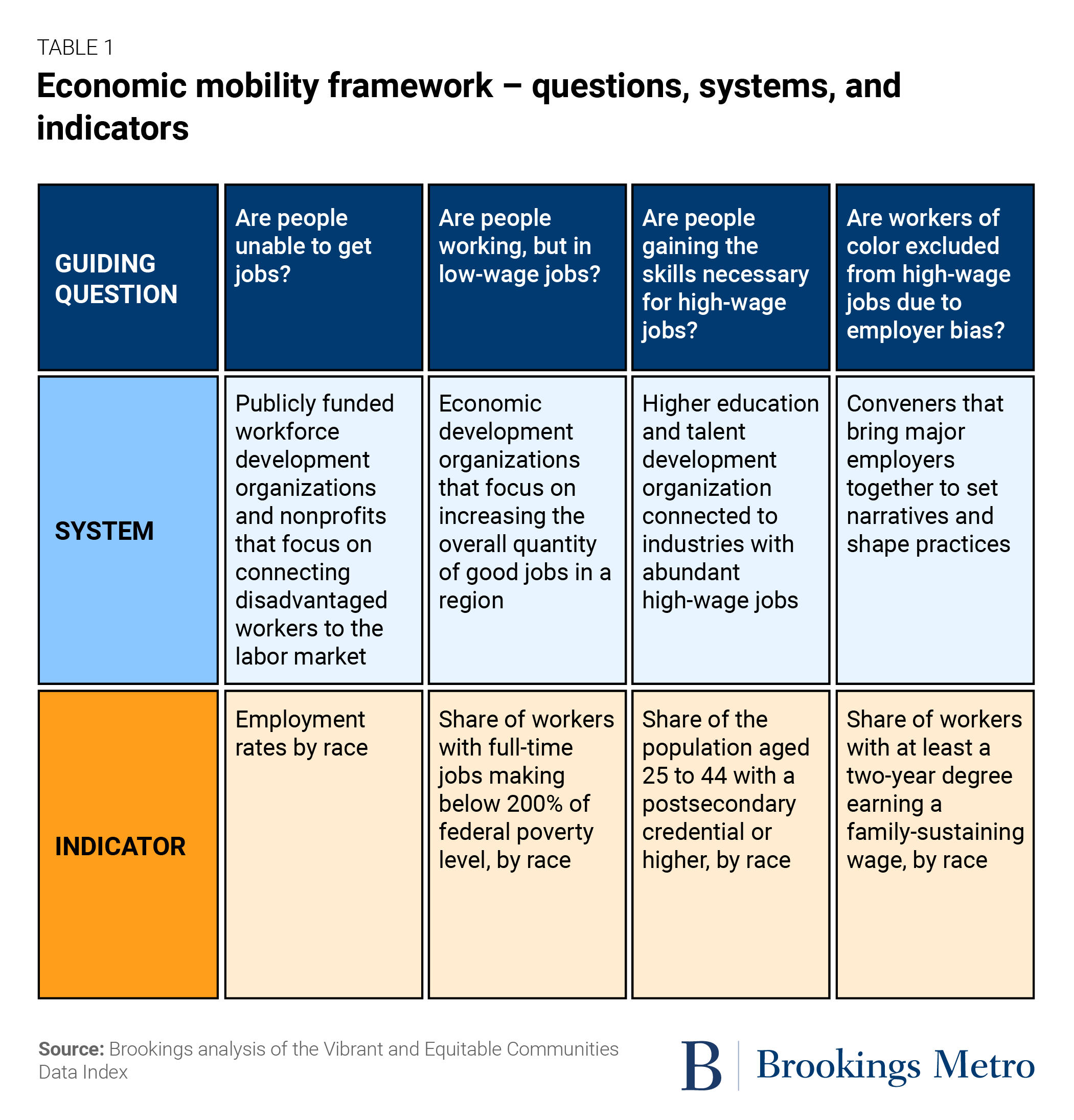
The key point is that economic mobility outcomes are shaped by a chain of four semi-distinct systems that engage with different workers, different businesses, and different goals in mind. These four indicators were chosen because we believe each is the best available measure of whether a specific system (in which the McKnight Foundation may want to invest) is achieving its goal. If the median household income gap (a component of the ultimate goal) is stagnant or worsening, staff can begin to pinpoint the source of the problem—is it because there aren’t enough good jobs available, or is it because employers are systematically excluding workers of color from good jobs through biased hiring practices? (The answer may of course be “all of the above,” but strategy is about choosing which of many worthy challenges to focus on given limited resources.)
In Minnesota, this set of indicators revealed that Black residents face some of the greatest barriers to economic mobility, and that gaps between Black and white residents are smaller at early stages (connecting people to jobs, measured by the employment rate) compared to later stages (employer practices paying workers with similar education rates). The employment rate for Black Minnesotans in 2020 was 62%, compared to 67% for the non-Hispanic white population. Further up the economic mobility pathway, the gap between Black and white Minnesotans widens. Holding education level constant (measured by the population with a two-year degree) only 10% of Black workers were making family-sustaining wages in 2020, compared to 27% of white workers.
This does not constitute a full-scale investigation of the functioning of the economic mobility system. But rather than simply providing a “check engine” light and leaving the team to wonder which component is malfunctioning, this approach at least suggests which system is struggling most.
Again, data alone cannot determine strategy. It is not a given that the team should invest resources where the gap is largest; an argument could be made that the difference between being unemployed and employed is so significant that even small gaps in employment rates are more important than large gaps in access to the highest-wage jobs. (And as we discuss later, an organization may choose to focus on raising employment rates because there are more proven models for doing so relative to changing employer practices—in other words, focusing on high efficacy is as justifiable as focusing on the biggest gaps.) But while data cannot answer these questions definitively, it provides the basis for informed, productive debates within and across organizations.
Define a medium-term ‘window of possibility’ for each indicator
As we described earlier, many regional leaders lack an intuition for what constitutes meaningful progress on most economic indicators, leading to imprecise or erratic strategies. To provide this insight to the McKnight team, we added two important pieces of context for each indicator: the recent trajectory in Minnesota and the “performance” of Minnesota’s best peer region (or another similar benchmark).
While most dashboards simply indicate whether a number went up or down from the previous measurement period, this approach adds three dimensions. First, what was the trend of the indicator for a decade prior to its most recent up or down movement (i.e., is the recent up or down movement a blip or the continuation of a trend)? Second, how is the region doing relative to its best peer region (i.e., is it already close to achieving what is possible given national policy and macroeconomic conditions)? And third, what does the evidence tell us about how effective existing models are for addressing these challenges (i.e., are there proven models that reliably generate a certain amount of improvement for a certain amount of spending)? Each dimension helps the Data Index shape the “where,” “why,” and “how” of strategy, as described in the next section.
An important feature of this approach is that the “windows of possibility” are expressed as gaps between the region’s current state and an ambitious but attainable future state, and these gaps are expressed in absolute numbers. The difference between saying that a region can increase the number of people with associate degrees by 5% and saying a region needs 25,000 more people with associate degrees may seem trivial, but it has several important implications for strategy. First, it allows the necessary investment to be approximated (assuming that there is evidence on the cost of enabling someone to attain a degree). Second, it allows groups of organizations to collectively assess their current capacity relative to the needed improvement, and articulate the additional investment they need to operate at the necessary scale. And third, it allows progress to be tracked more precisely, as organizations can report progress on graduation rates quarterly whereas federal data may be less frequent or lagging.
How the Data Index is beginning to shape the ‘where,’ ‘why,’ and ‘how’ of strategy
While the Data Index has not yet been fully tested, it is already showing signs of being useful as a strategy tool. As expected, it is helping to inform decisions about where to focus the team’s resources within a system—for example, reinforcing a shift from focusing on workforce development (because employment rate gaps are relatively low) to building worker power (because there are too few quality jobs and larger racial disparities in access to them).
But the Data Index has revealed its usefulness in another interesting way, which is that it also helps inform how the team works in those areas. Specifically, the Index helps identify whether a given problem should be responded to with lower-risk but incremental strategies versus higher-risk but potentially more transformative strategies. Like any team or coalition of organizations attempting to reshape the economy, there is a desire to be both effective and efficient by scaling proven best practices (working “within the system”) and also creating entirely new systems. The design of the Data Index helps those two impulses to coexist. If an indicator reveals that a gap is relatively small, and if a region is far from the frontier of what other regions or states have shown is possible even while working within the same macroeconomic and national policy conditions, then it is justifiable to work within the system and invest in proven (if incremental) interventions. On the other hand, if a gap is large and worsening and the region is already doing about as well as possible based on evidence from other geographies (and existing models have not proven effective), then it is justifiable to instead focus on “seeding alternative futures”—for example, by investing in efforts to shape beliefs and narratives in order to shape policy outcomes in the long term.
Finally, the Data Index will help the team explain why it chose the portfolio of investments it is making at any given time. What may previously have appeared to outside observers as a confusing bundle of tactics—with some parts of the team investing in experimental, transformative change and others investing in traditional organizations and systems—can now be understood as the logical response to a collection of fundamentally different problems. The Data Index allows the team to communicate how a varied and evolving set of tactics can emerge from a consistent set of principles.
Recognizing the power—and limitations—of data
The approach we took with the McKnight team demonstrates the power of data, but also its limitations. This is true in several important respects.
First, strategy cannot be solely driven by data. Any effort to use data to shape strategy must begin with a theory of how economic development occurs, as that theory determines which data points are selected as indicators. Data could only “drive” strategy if it were a foregone conclusion that a region should focus on the biggest gaps or most quickly deteriorating indicators. In that case, a dashboard could just include dozens of indicators, and the strategy would simply involve reacting to the worst ones. But there are many cases in which a region could justifiably focus on smaller gaps or on indicators that are improving if the indicator is understood as being more meaningful than a “worse” indicator. And any effort to use data to shape strategy must end with principles on what type of change a given group of organizations is capable of or responsible for. Even after choosing to focus on a certain area through a combination of data and theory, regional leaders need to decide whether to pursue incremental change by investing in existing systems or radical change by envisioning entirely new ones. Strategic decisions about risk tolerance—the value of incremental near-term change versus potentially radical long-term change—cannot be outsourced to data. Data can inform strategy, but cannot “drive” it alone, because theory is needed to make sense of data, and principles are needed to decide how to act when the data reveals that conditions are changing.
This brings us to another limitation of existing data. So far, we have focused on the data that can be used to measure various gaps, but data is also needed to understand how to close those gaps. Better data is needed not only in terms of problems, but also in terms of solutions. Regional leaders have little guidance when it comes to decisions about whether to pursue incremental or radical change, because there is a paucity of data on what outcomes can be expected for a given investment in existing systems. A few workforce development programs have been rigorously evaluated, such as ASAP or Year Up, and economist Timothy J. Bartik has provided valuable estimates of the cost per job created for manufacturing extension services and other broad local policies. And setting aside measurements of impact per dollar, most regions do not even have reliable data on the average cost to deliver a set of services to a household, worker, business, or student. This means that leaders who have used a dashboard to zero in on a given gap have little sense as to whether a $1 million investment in existing systems would likely close that gap entirely or imperceptibly bend the curve.
A final limitation of available data—and perhaps the most fundamental—is that many important economic outcomes are not measured regularly, precisely, and with detail related to race and place. In many regions, data on topics such as Black ownership of employer businesses in key industries is either not available or has such a large margin of error as to render it almost useless as a way of measuring progress in the near to medium term. Data on wealth by race is often only available at the national or state level, and in most instances is not published annually. The spottiness of the underlying data is often a surprise to regional leaders, since data seems so ubiquitous and it is relatively easy to create a dashboard that looks highly technical and comprehensive.
In sum, data can be used more powerfully than most regional leaders realize. But only by combining the right data with theory and principles can communities arrive at something resembling a performance management system for their regional economy.
One specific engagement with one regional philanthropy yielded these insights, but we think they are applicable to any local or state government, nonprofit entity, civic leadership group, chamber of commerce, or higher education institution that is interested in situating their organizational actions within broader regional economic change. Evolving how these institutions track their economic impact—and how it relates to inclusive growth in their regions—is even more critical in a decade in which the federal government is investing hundreds of billions of dollars in local communities. To guide and measure the impact of those investments, we need regional economic performance management systems fit for that purpose.
This brief was made possible through the support and collaboration of the McKnight Foundation. We also want to thank colleagues who provided valuable feedback on the brief: Nathan Arnosti, Alan Berube, Kiran Kaur Bains, and Neeraj Mehta. The authors also thank Michael Gaynor for editing and Carie Muscatello for layout and design support.
Authors


The Brookings Institution is committed to quality, independence, and impact.
We are supported by a diverse array of funders. In line with our values and policies, each Brookings publication represents the sole views of its author(s).