Subjective well-being metrics (which include happiness) are increasingly being used by academics, governments, and international institutions as complimentary gauges of economic and social progress. Measures of life satisfaction, reported mental illness, and/or daily moods and experiences—ranging from contentment to stress and anger—can help us understand a range of behaviors, as well as their welfare benefits or costs, across individuals, countries, and generations.
Over the past decades, numerous studies have found recurrent patterns between happiness and important life experiences such as employment, marital status, and/or earnings, which, in turn, lead to differences in investment profiles, productivity, voting incentives, and attitudes toward health.
Among these relationships, the one between age and happiness—often referred to as “the U-curve”—is particularly striking due to its consistency across individuals, countries, and cultures. Happiness declines with age for about two decades from early adulthood up until roughly the middle-age years, and then turns upward and increases with age. Although the exact shape differs across countries, the bottom of the curve (or, the nadir of happiness) ranges from 40 to 60 plus years old.
The turning point also varies depending on where in the well-being distribution people are. In other words, it varies depending on how naturally happy or unhappy people are (which is, in turn, linked to innate character traits). Based on Gallup data from around the world for 2005-2014, we find that the age at which the U-curve begins ascending for those in the happiest quantile of the well-being distribution is 47, those in the middle quantile is 58, and the least happy quantile is 61.
We explored how this relationship varies across countries throughout the world, based on nationally representative household surveys, again from Gallup data (2005-2014), with observations per country pooled over the years, with an average of 6,400 observations per country. We rely on a question that asks respondents to place themselves on an 11-step ladder in which their lives compare to the best possible life they can imagine, where the best life is on step 10 and the worst at step zero. We control for marital status, gender, employment, and education. Figure 1 shows the turning points for all the countries where data is available, where darker colors correspond to higher turning points.
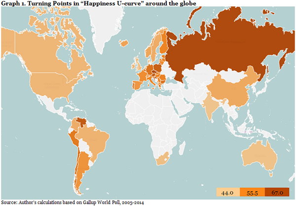
By looking at the different nadir points, we find that curves turn earlier in happier places. This means that in those places, people have more happy life years on average. Examples of this are Australia, the United Kingdom, or Denmark, where turning points are around 44 years old.
By contrast, countries that rank among the lowest in happiness, such as Russia, Poland, and Kosovo, have curves with higher turning points—from 61 to as high as 75 years in Russia! Even more worrisome is the fact that these countries also exhibit lower life expectancy (from 71 years in Russia and Kosovo to 77 in Poland), which means that there is just less happy life overall. (For a global ranking of countries on happiness, see the World Happiness Report.)
Interestingly, there are some places with relatively low levels of happiness and low life expectancy like India (66 years), South Africa (57 years), and Mongolia (68 years), where the curve turns relatively early (at 35, 45, and 51 years, respectively.) Understanding how life expectancy and the age curve relate is still work in progress; the earlier turn may be the result of earlier adjustment to middle age, of cultural traits, or something else we are not observing.
Studies trying to understand this U-curve (and its determinants) have gone well beyond life satisfaction. The studies cover topics ranging from the relationship between life satisfaction and late-life work, to the use of antidepressants and age in the U.S. and U.K., to reported mental illness and age in China, to the affective state (cheerfulness) of chimpanzees and orangutans as they age! The findings are remarkably consistent: there is always a U-curve related to age and life satisfaction, or cheerfulness, and an inverse U-curve at about the same point for reported mental illness or anti-depressant use and age.
We extended this approach in our worldwide data set and explored the relationship between stress and age according to levels of happiness. The happiest countries are those that are one standard deviation above the mean, the least happy are one standard deviation below the mean, and the less happy are in between these two groups. Again, we control for marital status, gender, employment, and education.
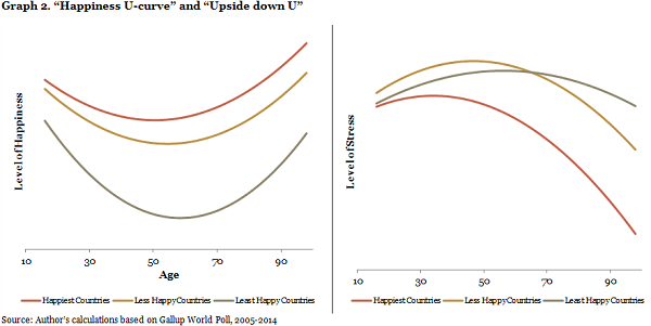
As shown in Figure 2, stress has a reverse U-pattern around the world, increasing up until a certain point (34, 47, and 56 years old, from the happiest to the least happy respectively) and decreasing thereafter, with lower overall levels of stress as we age. For the 52 countries under study, the age curve holds for all of them while the stress curve holds for 40 countries, or 77 percent of those we looked at.
There is still more research to be done before we fully understand the relationship between happiness and age. Still, the evidence from countries around the world suggests that the U-curve is remarkably consistent, albeit with some variance in the turning point. The many different research approaches that yield the same curve suggest that it is driven by a combination of biological, genetic, and environmental factors. For those above 40, it serves as a piece of good news: the best is yet to come. For those a little bit younger, it provides some wisdom: patience eventually pays off. And for those who are naturally happy, or who live in happier countries, the best is likely to last longer.
Related Content


The Brookings Institution is committed to quality, independence, and impact.
We are supported by a diverse array of funders. In line with our values and policies, each Brookings publication represents the sole views of its author(s).


Commentary
Is happiness just a matter of waiting for the right age?
November 9, 2015