An update on May 10, 2022 clarifies the original posting of this blog.
Addressing climate change is quintessentially a collective action problem. Individual actions will not make a difference if everyone else maintains their current lifestyles and behaviors; but if each of us waits for others to change, nobody ever will, and we will not make any progress. Climate change is such an overwhelming problem—arguably the greatest of our time affecting all areas of our life—that understanding exactly where emissions are highest and where the greatest opportunities for policy action are is important. Few individuals have this macro picture.
This is why we need to understand the details of climate change in a way that makes it clear that we all have a part to play and quantify priorities, so that we are empowered to act. In this blog, we attempt to outline the quantitative parameters to break down the problem.
The starting question is: How much are we emitting?
The question appears simple, but the answer is not straightforward. Where and how we live makes a huge difference on the size of our climate footprint.
In 2022, the global population is projected to release an estimated 58 gigatons (GT) of greenhouse gas emissions (including all forms of emissions—CO2 and non-CO2 gases—such as methane). One GT is one billion tons. If we divide 58 GT by 7.85 billion people, we get 7.4 tons per person per year, which is the climate footprint of the average world citizen.
In a Western economy, it is currently hardly possible to be climate neutral, i.e., to have zero net emissions. Even someone who drives an electric car (or no car at all), doesn’t travel by plane, and eats no meat, there will still be significant emissions. If that person lives and works in a building, showers several times a week, and uses public transportation, emissions occur in ways we typically don’t think about: the cement industry (for the material used to construct a building), the chemical industry (that produces soap and shampoo), or the steel industry (that supplied the material for the public buses and trains).
Broadly speaking there are five main drivers of our emissions. Here is how they add up to the average 7.4 tons a typical world citizen emits:
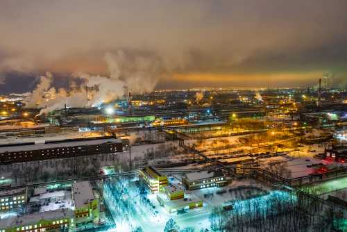
- Electricity (2.7 tons). More than a third of overall emissions are caused by the production of energy, mostly in the form of electricity. Coal is responsible for more than half of all electricity-related emissions.
- Industry (1.8 tons). This includes the fabrication of everyday products such as toiletries and newspapers, durables made of cement, or the metals used in buildings.
- Transport (1.1 tons). Road transportation—cars, buses, and trucks—causes the largest share of emissions in this sector, around 0.8 tons per person. The remainder comes from ships, planes, and railways.
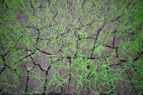
- Agriculture (1.5 tons). The production of food causes around 10 percent of global emissions, with meat production contributing the highest share, at 0.46 tons per person. Land conversion currently adds 0.7 tons per person, but it could be an important driver of emissions reductions in the future through afforestation and reforestation, for example.
- Buildings (0.4 tons). Outside of construction alone, buildings also need to be heated and cooled, causing additional and continuous emissions.
People in rich countries emit more than residents of poor countries. However, there are also significant differences between countries of similar incomes. For instance, an average French person emits four times less than an average Australian (see Figure 1). Among the G-20 economies, the largest emitters on a per capita basis are Australia (26 tons), Saudi Arabia (25 tons), Canada (24 tons), the U.S. (19 tons), and Russia (16 tons). Citizens of China, Germany, and South Africa are emitting substantially more than the world average, while residents of a number of European economies as well as Mexico are emitting slightly less than the global average; the average Indian emits less than half of it. And within these totals, the components also differ considerably across countries.
Figure 1. The average Australian emits around 8 times more than her Indian counterpart
 Source: World Data Lab projections based on data from Minx et al 2021.
The next question is:
Can we create a world with net zero emissions while maintaining strong economic growth so that everyone can thrive and prosper?
As highlighted by numerous Intergovernmental Panel on Climate Change (IPCC) reports and leading climate researchers, it will be extremely challenging to bring the world to a net-zero emissions path because it would require deep changes in our economic system and our individual behavior. Even under conservative projections, the global population is likely to reach about 9 billion people by 2050. On average, living standards will be higher in the future than today. This is good news for the fight against poverty, but potentially bad news for the climate—unless we make fundamental changes in how economies are organized.
So, coming back to our initial conundrum:
How do we begin to make change?
An important starting point is to generate better and more actionable data that allows each and every one of us to link individual and collective actions and choices to tangible results in our country. You may be wondering how data alone can help, so let us illustrate.
First, to prioritize action, we need to get on top of the main drivers of global emissions to understand the significance of key sectors in specific countries. We also need a better understanding of where emissions are still going up and where they are going down (some 40 countries have already started to reduce their climate footprint, albeit too mostly from a too high level). The World Emissions Clock will provide forecasts to compare how countries are doing on current actions, with the Nationally Determined Contributions they committed to and the pathways they should take under a globally efficient 1.5-degree Celsius scenario.
Second, new technologies and better data can be leveraged to tackle specific emission sources. For example, the World Resource Institute’s Global Forest Watch developed a sophisticated data model to monitor and react to forest fires in Indonesia in real time, showcasing the ability for actionable mitigation scenarios and response.
Third, better data can help us manage logistics better. Today, many resources are wasted because we produce, transport, and store products very inefficiently (to places where they won’t be needed or way in advance). Food loss and waste is a good example—over 30 percent of food grown never gets eaten.
Providing better climate data that can be visualized concretely to change our action is the fundamental ambition driving the development of the World Emissions Clock. We look forward to presenting it in a subsequent installment of our blog.
Related Content

Authors


The Brookings Institution is committed to quality, independence, and impact.
We are supported by a diverse array of funders. In line with our values and policies, each Brookings publication represents the sole views of its author(s).


Commentary
Getting people to understand climate data better
April 28, 2022