New analysis from Elizabeth Kneebone and Natalie Holmes of the Metropolitan Policy Program finds that between 2000 and 2012 the distance between people and jobs in America’s metropolitan areas increased. As they note in the report, “Proximity to employment can influence a range of economic and social outcomes, from local fiscal health to the employment prospects of residents, particularly low-income and minority workers.”
Their findings are displayed in a new two-part interactive. The first part maps the neighborhood changes within individual metropolitan areas throughout America and the second compares the trends of 96 large metropolitan areas. Keep reading for more details on the features of each part, or view the interactive here now.
Mapping neighborhood trends in the number of nearby jobs
The map interactive allows you to see trends in your own metro area between the years 2000 and 2012. At the top right of the interactive you can click and search for your own metro area using the box with light grey text within it that reads, “Search for a metropolitan area to map.”
By default, you will first see “Percent change in the number of nearby jobs, 2000-2012” for counties and census tracts in your selected metro area, with increases represented by shades of blue and decreases represented by shades of orange. The thick black lines represent boundary lines of census tracts that fall within the primary cities. For example, in the Washington-Arlington-Alexandria, DC-VA-MD-WV metropolitan area, shown below, the largest growth in the number of nearby jobs from 2000-2012 occurred in the suburban counties of Loudoun, Prince William, and Stafford, far from the area’s central city of Washington, D.C.
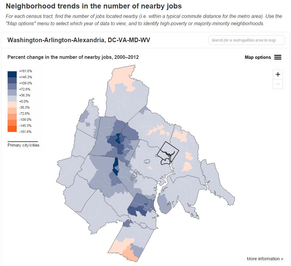
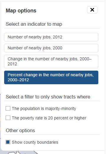
You can change the settings of the map interactive by clicking on the “Map options” drop-down icon to the upper-right (just below the metro area search bar). Options include selecting the total number of nearby jobs in 2000 or 2012 as well as the absolute and percent change between those periods.
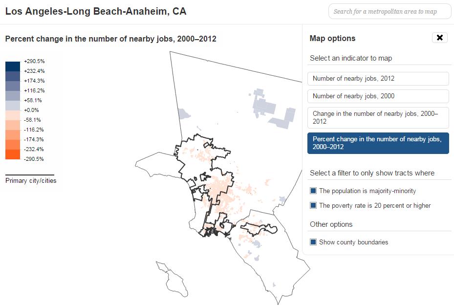
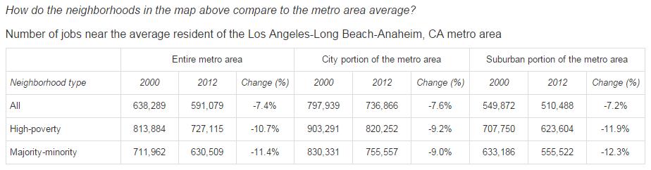
You can also filter the data to show just the neighborhood tracts where the population is “majority-minority” and/or “the poverty rate is 20 percent or higher.” If you select the “percent change in number of nearby jobs” and either of the two filters (as seen in the map of the Los Angeles are below), you will generally see that nearby jobs declined for high-poverty and majority-minority neighborhoods in metro areas throughout the country. Kneebone and Holmes found that in total, “61 percent of high-poverty tracts (with poverty rates above 20 percent) and 55 percent of majority-minority neighborhoods experienced declines in job proximity between 2000 and 2012.”
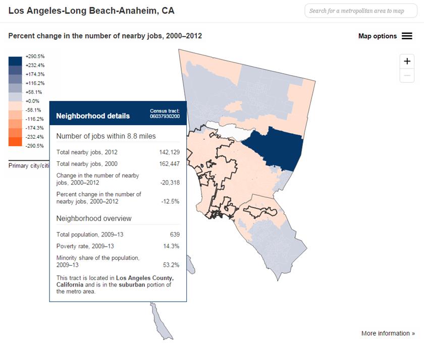
Once you’ve selected a map option that you want to explore on the map, roll your cursor over the map to see a box pop-up with statistics for each neighborhood tract in the metro area. The stats include a neighborhood overview detailing the total population, poverty rate and minority share of the population. To find a tract based on street address, visit the Census Bureau geocoding website.
Below the map, you will find a table that shows the overall numbers for the metro area you selected or for just the “city portion” or “suburban portion” of the metro area.
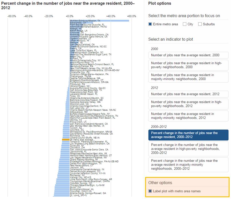
Comparison of the trends in the number of nearby jobs of 96 large metro areas
The chart interactive shows how individual metro areas compare with 95 others in the U.S. – as well as the average for all 96 large metro areas. The default chart shows “Entire metro area,” but you can change this at the top right of the map, under “Plot options,” to see numbers by “City” or “Suburb” instead. Similar to the map interactive, this one defaults to show “Percent change” of nearby jobs between 2000 and 2012 but you can also see the total numbers for the years 2000 and 2012. Nationally, Kneebone and Holmes find that nearby jobs fell by 3% for city residents but the declines were more than twice as steep (7%) in the suburbs.

You can also see the overall numbers of nearby jobs for “average residents in high poverty neighborhoods” and “majority-minority” neighborhoods in 2000, 2012, or the change within the time period.
Once you have selected the options you would like to explore, roll your cursor over the chart to see which metropolitan area corresponds to each bar on the chart, revealing their overall rank for each category. You can also see all of the metro area names included on the chart at once if you select the option to the bottom right of the chart under “Other options” to “Label plot with metro area names.”
For more details on the interactive, please refer to the “More information” section at the bottom of the interactive page.
And make sure to read the full report (available as a pdf download at the very top of the interactive page) which includes more analysis from the authors as well as charts and graphics highlighting national trends in the location of jobs and poverty in metropolitan America.
View the report and interactive showing “The growing distance between people and jobs in metropolitan America.”


Commentary
New Brookings interactive shows the distance between people and jobs in metropolitan America is growing
March 25, 2015