An earlier version of this essay appeared in the July 1, 2013 issue of National Review.
Assessing the severity of economic problems often requires choosing between different sets of analyses that reach disparate conclusions. While much lip service is paid to “evidence-based policymaking,” all too often it works the other way in Washington, with problematic “facts” serving as the basis for “policy-based evidence-making,” in the phrase of my colleague Richard Reeves. Instead of trying to discern why different analyses yield different conclusions, and whether one is better supported than another, partisans simply pick the results that support their beliefs. Sometimes the evidence really is unclear, and resolving the question requires further research. But other times, it is clear enough, and those committed to evidence-based policymaking should favor some conclusions over others.
Consider the state of the middle class. According to published Census Bureau figures, median household income (adjusted for inflation) was just 5 percent higher in 2011 than in 1979. But thanks to economists such as Cornell University’s Richard Burkhauser, the University of Chicago’s Bruce Meyer, and Notre Dame’s James Sullivan — all of whose work has recently been bolstered by Congressional Budget Office estimates — it has become irrefutably clear that, when properly measured, middle-class incomes actually rose by at least 30 percent between 1979 and 2007 (both business-cycle peaks), and possibly by 40 percent or more. The Census Bureau figures indicate only a 15 percent rise between these years.
Faced with the overwhelming evidence that household incomes have risen significantly, some observers have tried to rescue the theory of middle-class decline by pointing to evidence that earnings have fallen sharply among working-age men. Thus, the story goes, rising household income simply reflects the fact that women have gone to work in response to the deterioration of their husbands’ standing.
There are a number of problems with this claim, the main one being that, across the developed world, rising employment among women has coincided with their rising educational attainment, as well as deferred marriage, delayed childbearing, and lower fertility. This suggests that women today work more than their 1950s counterparts for reasons unrelated to men’s earnings. Less appreciated is that middle-class men are doing better than the most widely cited statistics indicate.
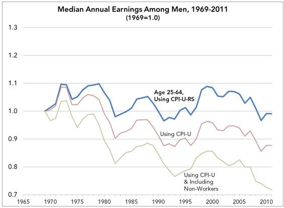
Commentators often cite estimates from Michael Greenstone and Adam Looney, my colleagues at the Brookings Institution’s Hamilton Project. Greenstone and Looney, whose work I generally admire, argue that the rise in labor-force dropout among working-age men masks frightful trends. People who spend the entire year jobless are not usually included in earnings statistics, but if these men, most of whom are less skilled, did work, they would be factored into the Census Bureau’s Current Population Survey (CPS). The result would be not the stagnation in male earnings seen in Census Bureau figures, but sharp decline. Taking this into account, the Hamilton Project reports that median earnings among men ages 25 to 64 declined by an astonishing 28 percent from 1969 to 2009.
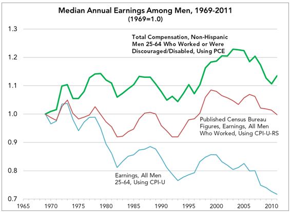
To be sure, measures of earnings trends ought to account for labor-force dropout. But the conclusion that men’s earnings have plummeted stems from inappropriate methodological decisions and inadequate contextualization. Two such decisions were especially consequential. The first was to rely on a cost-of-living adjustment that results in an understatement of real-earnings growth. The Census Bureau has used an inflation adjustment known as the CPI-U-RS since 2001, but the Hamilton Project analyses use the CPI-U. Though widely employed in policymaking to update benefits and tax brackets for cost-of-living increases, the CPI-U is known to overstate inflation. (This problem lies behind the push in Washington to switch to the chained CPI, yet another measure, in updating Social Security benefits and tax brackets. Doing so would cause benefits and tax brackets to rise more slowly over time, reducing government spending and increasing revenue.) For analyzing income trends, the CPI-U was abandoned over 20 years ago by not only the Census Bureau, but also the Bureau of Labor Statistics and the Congressional Budget Office.[1] Using the CPI-U-RS yields a 1 percent decline between 1969 and 2011 in median earnings among men ages 25 to 64, whereas using the CPI-U results in a 12 percent decline.[2]
In addition, the Hamilton Project counts all non-working men between 25 and 64 as below-median earners. This is a large group; according to the CPS, the share of men between 25 and 64 who went an entire year without working rose from 5 percent in 1969 to 18 percent in 2011. The share who reported being unable to find work rose from essentially zero to 3 percent, while the share who did no work and reported being sick or disabled rose from 3 percent to 8 percent.
This rise in reported sickness and disability mirrors an increase over the years in receipt of federal disability benefits — an increase that has not been accompanied by any deterioration in the health of workers. As Burkhauser and MIT economist David Autor have shown, this increase has basically constituted a rise in welfare receipt among men who would have worked in the past. The Hamilton Project is right that conventional figures should be corrected to account for these disappearing men, who, it may be assumed, are overwhelmingly lower-skilled and would therefore bring median earnings down if they worked. More to the point, to the extent these men have become more numerous, their inclusion in the data would cause the trend in median earnings to look worse than published Census Bureau figures convey.
Counting all non-working men as below-median earners — and using the CPI-U — yields the widely cited estimate that median male earnings declined by 28 percent from 1969 to 2009. Using the same method, I find a decline of 26 percent. The small difference likely reflects the fact that the Hamilton Project figures include institutionalized men, who are not interviewed in the CPS. Extending the trend beyond 2009, my figures show a decline of 28 percent from 1969 to 2011.
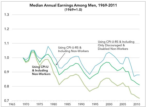
But the Hamilton Project’s assumption is far too sweeping. Among the non-working men it adds in, who are assumed to be below-median earners, are retirees and a smaller group including students, stay-at-home dads, armed-forces members who live in barracks, and men living in mental institutions or residential-care facilities. The retirees, in particular, were a growing group over the period in question, as the typical age at retirement moved steadily downward. It makes no sense to assume that all or even a majority of retirees or students would have earnings below the median if they were in the work force. The remaining groups should be thought of as mostly outside the population of interest in these analyses. In short, the Hamilton Project had a valuable insight about invisible men, but instead of throwing in all non-workers as below-median earners, it should have included only a subset.
If we accept the Hamilton Project’s correction but follow the Census Bureau’s practice of using the CPI-U-RS, the 28 percent decline through 2011 shrinks to 19 percent. If we then include as below-median earners only those non-working men who report being sick or disabled and those who report not being able to find work, median earnings fall just 12 percent. Finally, if we compare the peak year of 1969 with 2007, another peak year, rather than with 2011, a year in which the economy was recovering from the worst downturn since the Great Depression, there is no decline at all.
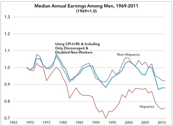
The picture gets brighter as the estimates are further refined. (I will keep focusing on men ages 25 to 64, including non-working men if they were sick or disabled or could not find work.) One change that has affected earnings statistics in recent decades is rising immigration. As the number of immigrants has increased, so too has the share of the work force with limited formal education. These workers are undoubtedly better off than they would be in their home countries, but if we add more and more below-median earners to the economy, we necessarily end up with a lower median.
It is impossible to identify immigrants in the CPS before 1993, but we can identify Hispanics as early as 1970. Other Census Bureau data indicate that the foreign-born rose from 5 percent of the population in 1970 to 13 percent by 2007. If we exclude Hispanics, however, the increase is only from about 4 percent to 7 percent.[3] This is surely an imperfect adjustment for rising immigration, but it gives a decent picture of what an ideal adjustment would show.
Assuming the 1969-to-1970 earnings change was the same as that for men in general, median earnings among non-Hispanic men declined from 1969 to 2011 not by 12 percent but by 8 percent. From 1969 to 2007, they rose by 2 percent. Among Hispanic men, earnings fell by 24 percent through 2011, but this decline is simply a more dramatic demonstration of how rising immigration pulls the median downward. Among non-Hispanics, the earnings increase for blacks was stronger than for whites, so this is not simply a story about non-Hispanic whites’ doing better than everyone else.
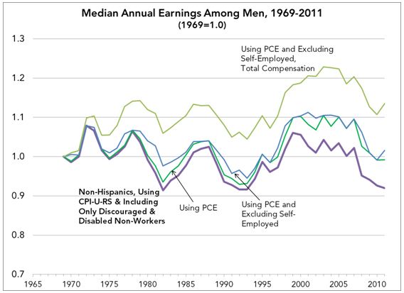
To this point, the analyses have assumed that the CPI-U-RS is an appropriate cost-of-living adjustment, but this index, too, overstates inflation. When particular goods and services become cheaper, consumers buy more of them and less of others. The CPI-U-RS only partly reflects such choices: It accounts for consumers’ ability to switch brands of coffee, for example, but does not recognize that consumers can switch from coffee to tea.
The chained CPI does a better job, but it goes back only to 2000. Another cost-of-living index, the PCE (personal consumption expenditure) deflator, accounts for this “substitution bias” and is available going back decades. The Congressional Budget Office and the Federal Reserve Board both prefer the PCE to other indices.[4] If we switch from the CPI-U-RS to the PCE, median earnings among non-Hispanic men fell by 1 percent from 1969 to 2011, instead of by 8 percent. From 1969 to 2007, they rose by 10 percent.
Finally, earnings are narrowly defined to include wages, salaries, and self-employment income. But for workers employed by firms, what ultimately matters is total compensation, including fringe benefits. My final analyses make two modifications. They drop men with self-employment income (which has essentially no effect on the results), since the self-employed do not receive employer-paid benefits. Then they incorporate an adjustment for non-wage benefits using Bureau of Economic Analysis figures. These benefits include employer contributions for pensions, group health and life insurance, and payroll taxes. They were 10 percent of compensation in 1969 but 20 percent in 2011.[5]
The adjustments yield the result that men’s compensation rose by 14 percent between 1969 and 2011. From 1969 to 2007, a peak year, the increase was 20 percent. These estimates reflect the change in what employers pay to the typical worker, though they may overstate the typical worker’s improvement in living standards. It may be that employees would rather receive cash than pensions or health insurance, in which case the increase in the enjoyment or satisfaction the median male receives from his compensation would be somewhat less than 20 percent. It would be strange, though, for employers not to recognize this preference.
Perhaps the favorable tax treatment associated with those benefits distorts employer decisions and prevents workers from attaining even higher living standards. It’s also possible that workers would rather receive cash than have their employers contribute toward their Social Security and Medicare benefits, in which case federal social-insurance programs also keep living standards lower than they would otherwise be. That, too, seems unlikely, given the political difficulty proposals to reform senior entitlements have faced. Some analysts may find my treatment of employee benefits inadequate and prefer the earnings estimates to the compensation ones. In that case, the increase, peak to peak, was 10 percent instead of 20 percent. That is still a more accurate conclusion than the claim that male earnings have plummeted, and a very different one. Careful empirical analysis does not always end debate, but in this case and others it should at least narrow its scope.
[1] For the well-known shortcomings of the CPI-U, see http://www.cbo.gov/sites/default/files/cbofiles/ftpdocs/112xx/doc11256/cpi_brief.pdf. Twenty-three years ago, the Bureau of Labor Statistics issued a statement recommending the use of a new index it developed, the “CPI-U-X1,” instead of the CPI-U. The Census Bureau stopped using the CPI-U and switched to the CPI-U-X1 in 1992, and it began using the CPI-U-RS in 2001. CBO abandoned the CPI-U for the CPI-U-X1 for income analyses as early as 1988, switched to the CPI-U-RS, and now relies on a different index, discussed below. The widely-cited inequality estimates of Thomas Piketty and Emmanuel Saez showing the share of income gains going to the top one percent also use the CPI-U-RS.
[2] All of my income estimates, for all of the years between 1969 and 2011, are available at https://www.brookings.edu/~/media/research/files/articles/2013/07/01-mens-rising-earnings-winship/full-earnings-results-1969-to-2011.xlsx. The estimates are based on Current Population Survey data (the Annual Social and Economic Supplement, or “March Supplement”), which I downloaded from the Unicon Research Corporation website (www.unicon.com). These data files were analyzed in STATA, and the statistical code is available at https://www.brookings.edu/~/media/research/files/articles/2013/07/01-mens-rising-earnings-winship/final-median-earnings-trends.do.
[3] For the original 1970 figure, see http://www.census.gov/population/www/documentation/twps0081/tables/tab01.xls. For the 2007 figure see Grieco (2010) at http://www.census.gov/prod/2010pubs/acs-11.pdf, page 3. For the 1970 estimate excluding Hispanics, I multiplied the 4.7 percent from the Census Bureau spreadsheet by .806, which is 100% minus the 19.4% estimate of the foreign born that is from Latin America in Figure 1 of Grieco (2010). That the “Latin America” estimate is a good proxy for “Hispanic” is confirmed by comparing the 2007 “Latin America” share of the foreign born in Figure 1 (53.6%) to the “Hispanic” share of the foreign born in Figure 2 (47.5%). For the 2007 estimate excluding Hispanics, I multiplied the 12.6% foreign born estimate on page 3 of Grieco (2010) by .525, which is the share of the foreign-born population that is not Hispanic in Figure 2.
[4] On the Federal Reserve Board’s preference, see http://www.federalreserve.gov/faqs/economy_14419.htm. On the CBO’s preference, see http://www.cbo.gov/publication/43373.
[5] See National Income and Product Accounts Table 2.1 at http://www.bea.gov/iTable/index_nipa.cfm.


Commentary
Wage Trends: Men’s Rising Earnings
June 28, 2013