Analysis of dozens of publicly created redistricting plans shows that map-making technology can improve political representation and detect a gerrymander. In 2012, President Obama won the vote in Ohio by three percentage points, while Republicans held a 13-to-5 majority in Ohio’s delegation to the U.S. House. After redistricting in 2013, Republicans held 12 of Ohio’s House seats while Democrats held four. As is typical in these races, few were competitive; the average margin of victory was 32 points. Is this simply a result of demography, the need to create a majority-minority district, and the constraints traditional redistricting principles impose on election lines—or did the legislature intend to create a gerrymander?
Crowd-Sourced Redistricting Maps
In the Ohio elections, we have a new source of information that opens a window into the legislature’s choice: Large numbers of publicly created redistricting plans.
During the last round of redistricting, across the country thousands of people in over a dozen states created hundreds of legal redistricting plans. Advances in information technology and the engagement of grassroots reform groups made these changes possible. To promote these efforts we created the DistrictBuilder open redistricting platform and many of these groups used this tool to create their plans.
Over the last several years, we have used the trove of information produced by public redistricting to gain insight into the politics of representation. In previous work that analyzed public redistricting in Virginia[1], and in Florida[2], we discovered that members of the public are capable of creating legal redistricting plans that outperform those maps created by legislatures in a number of ways.
Public redistricting in Ohio shows something new—the likely motives of the legislature. This can be seen through using information visualization methods to show the ways in which redistricting goals can be balanced (or traded-off) in Ohio , revealing the particular trade-offs made by the legislature.
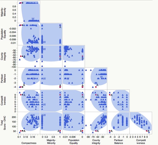
The figure below, from our new research paper[3], shows 21 plots—each of which compares legislative and publicly-created plans using a pair of scores—altogether covering seven different traditional and representational criteria. A tiny ‘A’ shows the adopted plan. The top-right corner of each mini-plot shows the best theoretically possible score. When examined by itself, the legislative plan meets a few criteria: it minimizes population deviation, creates an expected majority-minority seat, and creates a substantial majority of districts that would theoretically be competitive in an open-seat race in which the statewide vote was evenly split.
Figure 1: Pairwise Congressional Score Comparisons (Scatterplots) – Standardized Scores

In previous rounds of redistricting, empirical analysis would stop here—unless experts were called in to draw alternative plans in litigation. However, the large number of public plans now available allows us to see other options, plans the legislature could readily have created had it desired to do so. Comparison of the adopted plans and public plans reveal the weakness of the legislature’s choice. Members of the public were able to find plans that soundly beat the legislative plan on almost every pair of criteria, including competitive districts.
So why was the adopted plan chosen? Information visualization can help here, as well, but we need to add another criterion—partisan advantage:
Pareto Frontier: Standard Criteria vs. Democratic Surplus

When we visualize the number of expected Democratic seats that was likely to result from each plan, and compare this to the other score, we can see that the adopted plan is the best at something— producing Republican seats.
Was Ohio gerrymandered? Applying our proposed gerrymandering detection method, the adopted plans stands in high contrast to the public sample of plans, even if the overall competition scoring formula is slightly biased towards the Democrats, as strongly biased towards the Republicans on any measure of partisan fairness. Moreover analyzing the tradeoffs among redistricting criteria illuminate empirically demonstrates what is often suspected, but is typically impossible to demonstrate—that had the legislature desired to improve any good-government criterion—it could have done so, simply by sacrificing some partisan advantage. In light of this new body of evidence, the political intent of the legislature is clearly displayed.
However, when politics and technology mix, beware of Kranzberg’s first law: “Technology is neither good nor bad; nor is it neutral.”[4] Indeed there is an unexpected and hopeful lesson on reform revealed by the public participation that was enabled by new technology. The public plans show that, in Ohio, it is possible to improve the expected competitiveness, and to improve compliance with traditional districting principles such as county integrity, without threatening majority-minority districts simply by reducing partisan advantage—this is a tradeoff we should gladly accept.
[1] Altman M, McDonald MP. A Half-Century of Virginia Redistricting Battles: Shifting from Rural Malapportionment to Voting Rights to Public Participation. Richmond Law Review [Internet]. 2013;43(1):771-831.
[2] Altman M, McDonald M. Paradoxes Of Political Reform: Congressional Redistricting In Florida. In: Jigsaw Puzzle Politics in the Sunshine State. University Press of Florida; 2014.
[3] Altman, Micah and McDonald, Michael P., Redistricting by Formula: An Ohio Reform Experiment (June 3, 2014). Available at SSRN: http://ssrn.com/abstract=2450645
[4] Kranzberg, Melvin (1986) Technology and History: “Kranzberg’s Laws”, Technology and Culture, Vol. 27, No. 3, pp. 544-560.
The Brookings Institution is committed to quality, independence, and impact.
We are supported by a diverse array of funders. In line with our values and policies, each Brookings publication represents the sole views of its author(s).


Commentary
Using Crowd-Sourced Mapping to Improve Representation and Detect Gerrymanders in Ohio
June 18, 2014