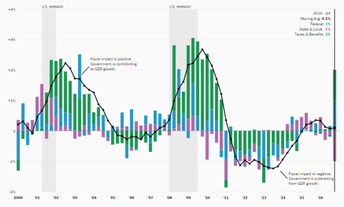
How much does the average tax filer in your county pay in income taxes, and how does your county stack up to the rest of the nation? Use our interactive map to explore income tax rates at the county level nationwide. Click a county to zoom in, and click it again to zoom out. Darker colors indicate higher values; grey shading indicates unavailable data.
For more, read the blog post “The U.S. income tax burden, county by county,” by Ben Harris »
Note: On Jan. 28, 2014, the map data was updated to display weighted instead of non-weighted values.
The Brookings Institution is committed to quality, independence, and impact.
We are supported by a diverse array of funders. In line with our values and policies, each Brookings publication represents the sole views of its author(s).


