The topic of inequality has been trending globally for the past several years. Attention has focused especially on the very top of the income distribution in each country, which traditional measures of inequality, drawn from representative household surveys, struggle to capture accurately. In place of surveys, researchers have made use of tax data, which provide a more robust account of incomes of the richest segment of society. In a handful of countries, analysis reveals that the share of income accounted for by the top 1 percent has grown sharply. This presents a quandary. The more new information we uncover about top incomes, the less faith we have in traditional survey-based inequality measures, and the less knowledge we can claim to have about the distribution of income across an economy’s entire population.
Missing top incomes in household surveys is a long established problem in both developed and developing economies. It has two causes: the tendency for richer households to refuse to participate in surveys, and the high probability of missing high-income households through sampling error. A number of studies (here, here and here) in the United States have shown that survey response rates correlate negatively with incomes, and that more effort is required in contacting households with higher incomes. A study of Latin American economies found that in several countries, the income of the richest survey participant fell short of the local salary of a manager in a medium- to large-sized firm.
This has important implications for the reliable measurement of inequality within each country. When top incomes are missing from a survey, the right tail of the distribution is measured with error.1 Contrary perhaps to intuition, the resulting inequality measures may bias upward or downward, as the error affects both the distribution and mean of income in the survey sample—see here for details. (It is worth noting that missing top incomes has a more benign effect on the measurement of poverty, which focuses on the bottom of the distribution—see here for details.)
Ideally, the results from survey and tax data would be reconciled to obtain accurate measures of inequality across the full population. Attempts to do this for the U.S. (here, here and here) indicate that levels and trends in the Gini coefficient may differ markedly from those reported in official data. However, such efforts are fiendishly difficult to carry out in practice and fail to deliver a singular answer, since the two sources employ different income definitions and different units of observation. Moreover, outside of rich economies, tax data rarely have sufficient population coverage to capture top incomes accurately, if the data exist at all.
Instead, various survey methods have been developed to mitigate the problem of the missing rich ex-ante or to attempt to correct for it ex-post. These include persistent attempts to contact households that do not respond, oversampling rich households, and the re-weighting of participating households using estimates of the relationship between response rates and income. These methods are undoubtedly useful but cannot fully resolve the problem.
A solution via national accounts
One more enterprising solution comes via another measurement problem: the tendency for household surveys to obtain lower estimates of national income and income growth than national accounts. In their seminal paper on the changing global income distribution, economists Christoph Lakner and Branko Milanovic argue that the two issues are closely related, and use the missing income between surveys and national accounts as a proxy for missing top incomes in surveys. In practice, this means adding the shortfall in income between surveys and national accounts to the income reported by the top 10 percent of the survey population.
This solution has obvious appeal. Unlike the reconciliation of tax and survey data, it can be applied to virtually all countries and implemented with relative ease. And there is certainly good reason to believe that the problems of missing top incomes and the discrepancy between national accounts and surveys are linked. However, attributing the entire discrepancy between national accounts and surveys to the missing rich is harder to justify, as there are other known factors that contribute to the discrepancy.2
First, just as surveys and tax records employ different definitions of income, so do surveys and national accounts employ different definitions of income or consumption. Two items that appear in national accounts but that surveys miss are the imputed value of financial services to households, and consumption by nonprofit institutions serving households. A study from India found that these two items could together explain 22 percent of the difference between survey and national account aggregates. An additional item that income surveys often overlook is the implicit rent for homeowners and occupiers. Another study from India estimated that this might account for half of the difference between surveys and national accounts. In the U.S., studies show that about half of the difference between survey and national account aggregates are due to differences in concepts and comprehensiveness. These definitional differences affect the measurement of welfare for a range of different households—not just those with high incomes.
Second, some participating households in surveys underreport their income or consumption. If underreporting is limited to the richest households, then the attribution of the entire discrepancy between national accounts and surveys to missing top incomes remains valid. Higher incomes are associated with underreporting to the extent that they entail more diverse consumption patterns and sources of income. For instance, in the U.S. underreporting is especially egregious for consumption of irregular purchases, which is more prevalent among rich households, and respondents who are frustrated with long questionnaires often lie in response to embedded screener questions in order to skip entire sections of a survey. However, underreporting has also been shown to be a significant problem among the poorest households in the U.S. And a range of other evidence points to underreporting that is not correlated with income. For instance, it is well established that the self-employed tend to underreport, and underestimate, their income. U.S. households significantly underreport their consumption of demerit goods, such as alcohol or gambling. Finally, survey design choices can contribute to underreporting: in the U.S., the diary method has been found to suffer from underreporting of consumption compared to an in-person questionnaire, despite being considered the gold standard of survey design in the developing world.
A more measured approach would be to attribute a portion of the discrepancy between national accounts and surveys to missing top incomes. This has some direct empirical basis: one study of India estimated that depending on the period under study, between 20 and 40 percent of the difference between national accounts and surveys could be explained by the missing rich.
An alternative set of Ginis
We take this approach in the exercise below. Our purpose is to explore how our understanding of inequality within countries changes if adjustments are made for missing top incomes. To do so, we generate an alternative set of over 1000 Gini coefficients covering the vast majority of the world’s economies spanning the past 25 years. In each case, we attribute half of the missing income between surveys and national accounts to missing top incomes.3 We assign the missing income to a new, elevated class that we append to the top of the distribution, rather than supplementing the income of those in the top 10 percent of the survey population. In other words, our methodology corrects for the exclusion of income from missing rich households but not for the unreported income from households included in the survey.
We determine the size of the new class and their incomes using a Pareto distribution whose shape we derive from the distribution of the top decile of the survey population and the discrepancy between survey and national accounts.4 This method ensures that our adjusted Ginis exceed those derived from surveys in all countries where income reported in national accounts exceeds that reported in surveys. For technical details, see the appendix and accompanying code.
On average, the appended new class accounts for 1 percent—the top 1 percent—of the population after our adjustment. In other words, our approach implies that the problem of missing top incomes in household surveys is typically restricted to a country’s richest 1 percent.
We interpret our revised Ginis as a plausible upper bound of the true value in each country and year. In 73 percent of cases, the share of income accounted for by the top 10 percent of the population after our adjustment remains under 50 percent, which is the maximum observed from tax data.
Figure 1 illustrates the current Gini coefficient for all countries, based on the most recent available survey results, alongside our alternative Ginis after adjusting for missing top incomes. On average, our adjustment pushes the Ginis up by 9 percentage points. This raises the average within-country Gini from 39 percent to 48 percent.
Figure 1: Ginis before and after adjustment for missing top incomes
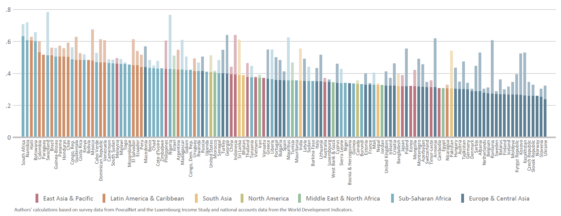
Our alternative Ginis imply a large reshuffle in the rankings of countries by inequality. The ten countries in the world with the highest Ginis include five new entries: Nigeria, Mexico, Indonesia, Georgia, and Guatemala. Whereas the U.S. (0.41) and China (0.40) report very similar levels of inequality, when we adjust for missing top incomes the U.S. appears considerably more unequal than its rival (0.51 versus 0.44). Meanwhile, India has the dubious honor of leapfrogging both countries under our adjustment, as its Gini skyrockets from 0.36 to 0.56.
Our adjusted Ginis support the existing evidence that Latin American countries are, on average, the most unequal in the world, followed by countries in sub-Saharan Africa, although the gap between them has narrowed. Furthermore, it is unclear whether this different is robust given that Latin American countries use income (as opposed to consumption) as their survey welfare measure, which tends to generate higher measures of inequality. South Asia, once considered among the world’s most equitable regions, now ranks third with our adjusted Ginis, driven by the large discrepancy between surveys and national accounts in India. We find that the region with the lowest inequality is the Middle East and North Africa (0.37), contrary to the popular narrative of high inequality fueling the Arab Spring. However, we view this finding with particular caution given the woefully poor survey coverage in that region.5
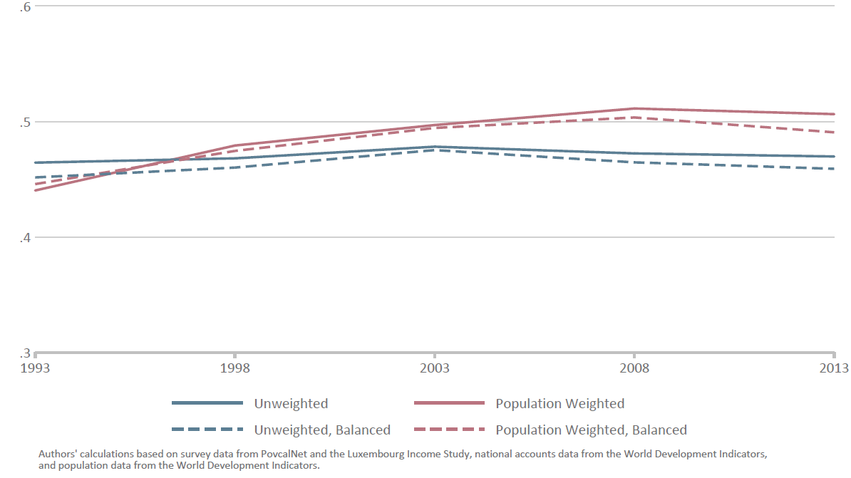
The possibility that inequality is, on average, much higher than reported is cause for alarm. But is inequality within the average country worsening? This is a complicated question to answer, as there are many ways to average Gini coefficients across countries. A recent World Bank study provides a useful approach for us to follow. Given that Ginis are not available every year in each country, we group country Ginis around five-yearly benchmarks. We then generate four different trends depending on whether we use population weights to average country Ginis, and whether we use the same sample of countries in each benchmark year.
Figure 2 illustrates the results using our alternative Ginis. Under all four trends, inequality trended upward in the 1990s but since the turn of century, inequality has either stabilized or fallen. This mirrors the trends reported by the World Bank using official Gini coefficients. The stable or downward trend in inequality in the 2000s even after we adjust for missing top incomes is especially remarkable as the growing discrepancy between national accounts and surveys should force our alternative Ginis upward.
Figure 2: Average Gini across countries, adjusted for missing top incomes
How much do we really know?
The method we employ for adjusting Ginis for missing top incomes is one of many alternatives and is not beyond reproach. We are confident others could improve upon it. Its purpose is not to arrive at a definitive measure of inequality that includes top incomes but rather to highlight the fallibility of inequality narratives based on official survey data. We submit that we know far less about how inequality compares across countries than is commonly assumed. Ironically, perhaps the most robust stylized fact about inequality within countries—that it is not rising—is the least well known.
The use of tax data by inequality researchers has been a powerful force in expanding our understanding on the concentration of income among the top one percent in several countries. At the same time, it has exposed how little we know about the overall distribution of income.
Related Content


Authors

-
Footnotes
- By contrast, any error in the measurement of the left tail of the distribution is likely to be less egregious given the lower bound at zero. This means concerns about missing bottom incomes (e.g., here) should not be interpreted as having equivalent impact on inequality measurement as missing top incomes.
- In practice, Lakner and Milanovic avoid attributing the entire discrepancy between national accounts and surveys to the missing rich in all cases by imposing a threshold for the adjusted income share of the top decile.
- Our calculation of the discrepancy between survey and national accounts uses household final consumption expenditure as the variable of interest from national accounts. We consider this the most relevant counterpart to survey measures of both income and consumption, following the rationale presented by Deaton and Anand and Segal. Following Lakner and Milanovic, we only make an adjustment for missing top incomes where total income or consumption measured in surveys falls short of national accounts. No adjustment is made in the minority of country surveys where surveys exceed or exactly match national accounts.
- Milanovic provides many examples where the Pareto coefficient clearly varies across a given distribution, supporting our decision to derive the Pareto parameter (or slope) from the distribution of the top decile of the survey population.
- Our regional measure includes only seven of the 21 countries in region. For more debate on the measurement of top incomes in the region, see here, here and here.


Commentary
Op-edHow much do we really know about inequality within countries around the world? Adjusting Gini coefficients for missing top incomes
February 17, 2017
Standard measures of inequality are derived from household surveys that often fail to capture top incomes. This raises serious questions about their reliability. To gauge the scale of this problem, we treat the missing income between surveys and national accounts as a proxy for missing top incomes in surveys to generate an alternative set of over 1000 Gini coefficients for 134 economies spanning the past 25 years. The adjusted country Ginis are higher than those reported in surveys—on average, by 9 percentage points—and bring about a significant reshuffle in the rankings of country inequality. By contrast, trends in inequality within countries remain unchanged using the adjusted Ginis: on average, inequality rose in the 1990s but since the turn of century, has either stabilized or fallen. This exercise exposes how little we know about the overall income distribution within countries.