While education is largely oriented toward teaching reading, writing, and arithmetic—and other academic subjects—we also hope that schools warm our melting pot by bringing together members of different racial and ethnic groups. Though having students of differing backgrounds attend school together does not guarantee an increase in inter-group harmony, having schools segregated by student background pretty much guarantees no increase in harmony. I’ve taken a look at who goes to school with whom at both the K-12 level and in four-year colleges. The results were not really what I was expecting—nor were they very encouraging.
I thought I would find that colleges are pretty well integrated, while finding this to be much less true for K-12. We know that many elementary and secondary schools are not terribly diverse. Some of this is an accident of geography, and some of this is an “on-purpose” of geography. (You will likely remember recent stories about race-based school district secessions. For research on the subject check out “Brown fades: The end of court-ordered school desegregation and the resegregation of American public schools.”) The bottom line from my investigation into segregation is that colleges are not so diverse either. That surprised me—and, as a college professor, disappointed me.
To measure “getting together,” I’ll use a tool called the dissimilarity index. Given a list of schools and the number of students from each of two groups in each school, the dissimilarity index can be interpreted as the minimum percentage of students in one group that would have to move from one school to another to make all the schools exactly representative of the overall population. For example: If we had two schools, the first with 10 black students and the second with 90 white students, what is the share of students in the smaller group (the black students in this illustration) that would need to switch to the other school to achieve perfect integration while moving the fewest students? In this extreme example, the math calls for shuttering the first school and moving all the black students to the second, which would then be perfectly integrated. In this case, the dissimilarity index for the initial distribution of students would be calculated to have a value of 100 percent, since all 10 black students had to move in order to achieve an integrated school. (Remember this just an interpretation of the math. No one is suggesting that minimizing the number of students moved is the only criterion or even that a perfect balance is necessity.) What really matters is that situations with high dissimilarity indices are much less diverse than situations with lower dissimilarity indices.
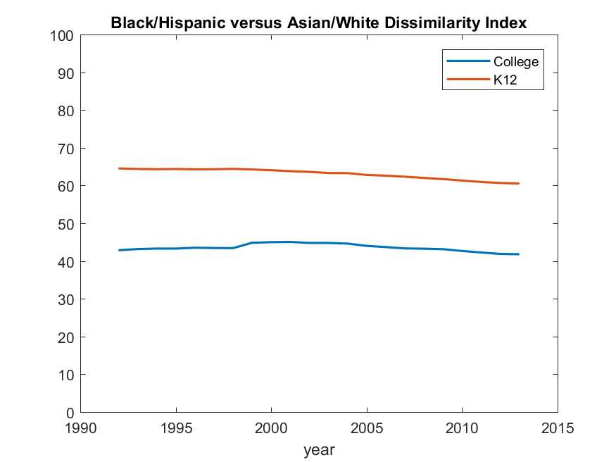
Let’s begin with an oversimplified view of segregation in higher education, grouping students into “minority” (black and Hispanic) and “majority” (white and Asian). In the chart below, the dissimilarity index is shown separately for K-12 public school students (data is from the Common Core of Data) and for four-year college students, including all public, private, and for-profit institutions (data is from IPEDS). The chart illustrates three stylized facts:
- Mixing of students within schools is nowhere near proportions of the underlying student population. If the racial distribution of students within K-12 schools were to look like the distribution in the entire K-12 population, the number of students who would have to be shuffled to different schools is equivalent to more than 60 percent of all black and Hispanic students.
- The dissimilarity index for four-year colleges is better than for K-12, but still isn’t very good. A 40 percent dissimilarity index brings us closer to a true melting pot than does the K-12 60 percent, but closer isn’t close. And do keep in mind that the dissimilarity index only measures diversity among the subset of students who do go to college. Four-year colleges are also somewhat more white and Asian than is the population of high school graduates and, the fraction of white and Asian high school graduates is somewhat higher still than is the fraction of white and Asian secondary school students.
- Both lines are shockingly flat. Essentially, nothing has changed in the last 25 years.
In this overview graph, I’ve grouped black and Hispanic students together and Asian and white students together—not because this necessarily makes a lot of sense but rather because that’s what’s so often done. The next set of graphs shows dissimilarity indices across four groups: Asian, black, Hispanic, and white. None of these groups is monolithic either, but it’s as far as the data will take us.
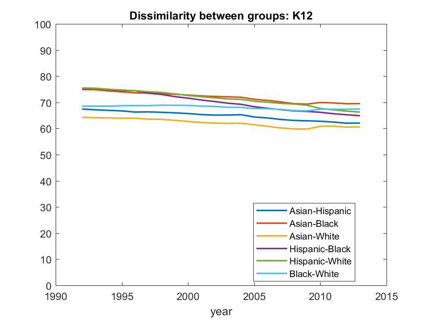
This first graph shows dissimilarity indices for K-12. The first lesson is that there’s not much mixing of any of the four groups. The second lesson is that, though a slight declining trend is evident, little has changed over more than two decades. The most mixing occurs between Asian and white students (probably no surprise). Note that the second-to-the-most mixing, the second line from the bottom, is between Asian and Hispanic students. The least mixing is between Asian and black students. But fundamentally, none of the groups mixes much with any other group.
One thing the graph illustrates is that thinking of “minorities” as a group, or putting Asians and whites together as a group, isn’t really supported by the data—at least not if we’re interested in which students go to school together. Note that Hispanic and black students are essentially no more mixed than are Hispanic and white students.
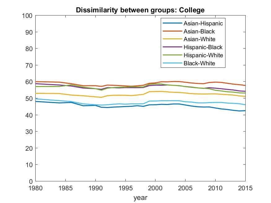
Turn now to the breakdown for four-year colleges. The college dissimilarity indices are lower than the indices for K-12—but not all that much lower. And again, there’s been not much change over 35 years. The lowest dissimilarity is for Asians and Hispanics; the highest is Asian and black. Once again though, the dissimilarity indices just are not that different among the various combinations of groups.
I have to be honest, I was expecting that colleges would be much more melting-pot like than K-12. That’s because K-12 is so geographically constrained, whereas colleges draw from larger catchment areas. Colleges do a little better, but not that much. I was also expecting to see a real downward trend at the college level over recent decades given the emphasis all colleges I know put on diversity. The downward trend is not there.
Getting students of different ethnic and racial backgrounds together on each campus does not guarantee an improvement in inter-group understanding. And apparently it’s not easy to arrange. Still, I was hoping to see different numbers for colleges in the 21st century. Colleges generate our next generation of leaders. We’d be better off if our future leaders experienced more diversity instead of just reading about it in class.
UCSB undergraduate and Gretler Fellow Isabel Steffens provided research assistance for this post.
The Brookings Institution is committed to quality, independence, and impact.
We are supported by a diverse array of funders. In line with our values and policies, each Brookings publication represents the sole views of its author(s).

