Every month on “jobs day” the Bureau of Labor Statistics releases information about national employment growth and overall labor market health. One important feature not in the headline numbers is where these jobs are emerging. Are employers hiring in places that are thriving or in places that are struggling? How has employment growth varied across these places during the recovery from the Great Recession?
To examine these questions, we compare job growth across places since the depths of the recession, grouping places by how economically successful they were prior to 2011. We find that employment is growing faster in thriving places than in struggling places, but it is particularly lagging in struggling rural places.
In previous work, The Hamilton Project assessed which places are thriving and which are struggling by creating a Vitality Index at the county level. The index combines the following components into a single measure of “vitality” for a county (listed in order of their weights in the index): median household income, the poverty rate, life expectancy, the prime-age employment rate, the housing vacancy rate, and the unemployment rate. Because the Vitality Index includes the employment rate—implying that places with high employment growth will tend to move up the vitality ranks—we calculate the index for counties over the 2006–10 period, then examine employment growth patterns over the 2011–18 period to see if job growth was spread across different types of places or concentrated only in a set of booming counties.
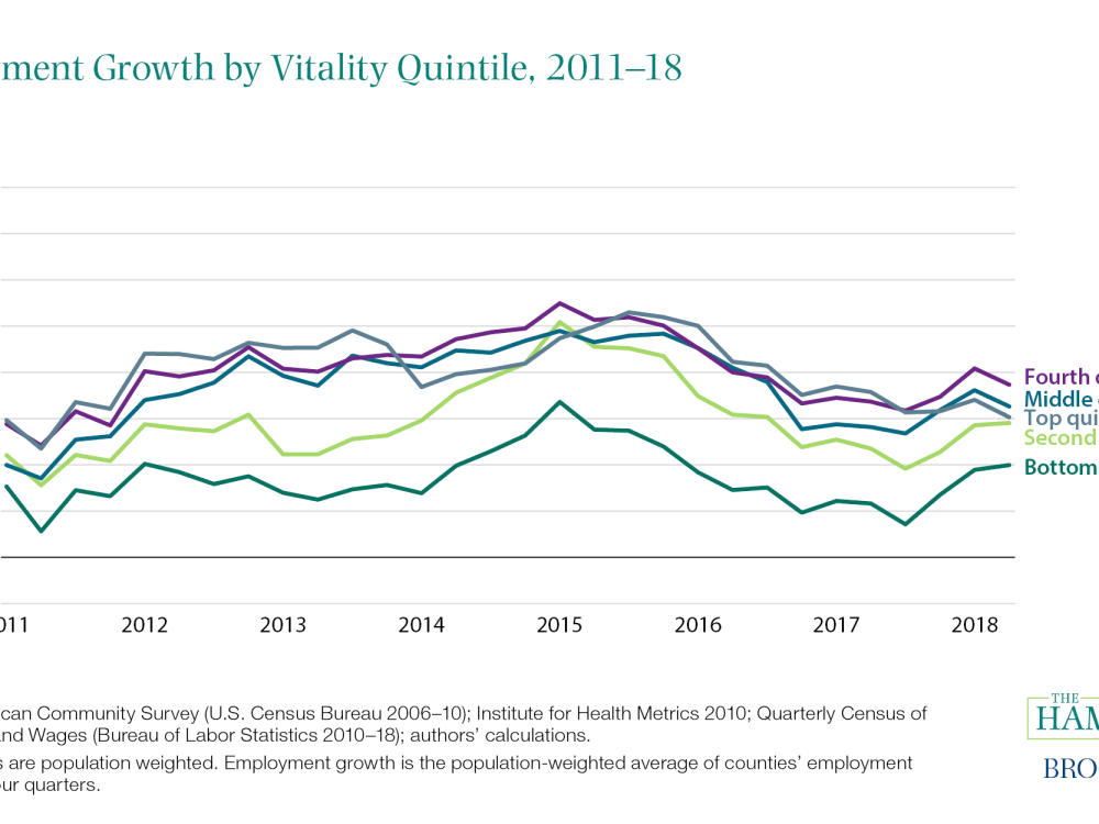
Although employment is growing faster in thriving places than in struggling places, we find it is not that the top-performing places are dramatically out pacing the rest of the country when it comes to job growth. While growth in the top quintile did recover the most quickly from the Great Recession, figure 1 shows that job growth in the top 20 percent of counties has fluctuated between 1.5 and 2.5 percent along with the next two quintiles (i.e., the middle and upper-middle parts of the distribution). Even the top 5 percent of counties do not appear to have substantially different job growth rates than the rest of the top half of counties.

Rather, the bottom quintile (and to a lesser extent the second-to-bottom quintile) is trailing the rest of the country by a substantial margin. Annual employment growth in those counties has averaged only 0.85 percent from the first quarter of 2011 to the first quarter of 2018, compared to the average 1.85 percent growth in the middle quintile over the same period. These averages are weighted by population, so it is not simply a matter of a few very small counties dragging down the average.
If this job growth represented people seeking out better opportunities in more successful counties, it might suggest a reallocation of labor towards higher productivity places. On the other hand, as noted in a recent Hamilton Project analysis, mobility is lower than in the past and in particular, people are not always moving from struggling counties to booming ones. Unfortunately, the lower job growth in the bottom quintile is more likely a reflection of their struggling job markets rather than upward mobility. As detailed in a recent Hamilton Project analysis, places in the bottom quintile of employment have a prime–age employment rate of just 67 percent compared to 83 percent in the highest-employment counties.
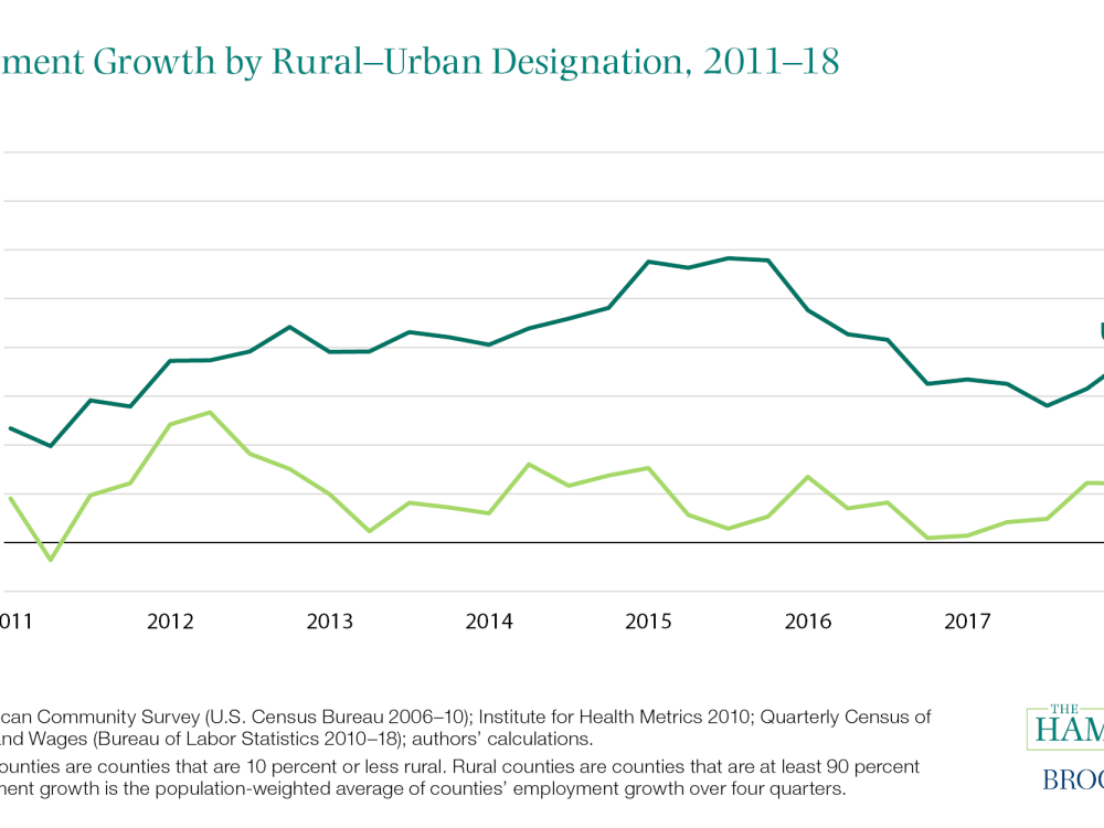
As work and economic activity have changed, many researchers have emphasized the importance of so-called agglomeration effects for determining where in the country that economic activity occurs. Relatively urban counties have tended to be more prosperous, though there are many counterexamples. Looking across the 760 counties that were at least 90 percent rural, almost half are in the bottom vitality quintile. Conversely, the most urban counties (252 counties that are 10 percent rural or less) are spread relatively evenly across the distribution. Changes in the urban/rural nature of employment may therefore complicate the patterns shown in figure 1. Indeed, urban counties have experienced more hiring throughout the 2011–18 period. Starting in 2013 rural county employment growth has been treading water (figure 2). The large number of rural counties in the bottom quintile may be driving those trends such that the apparent divide across vitality quintiles is more accurately a rural–urban divide.

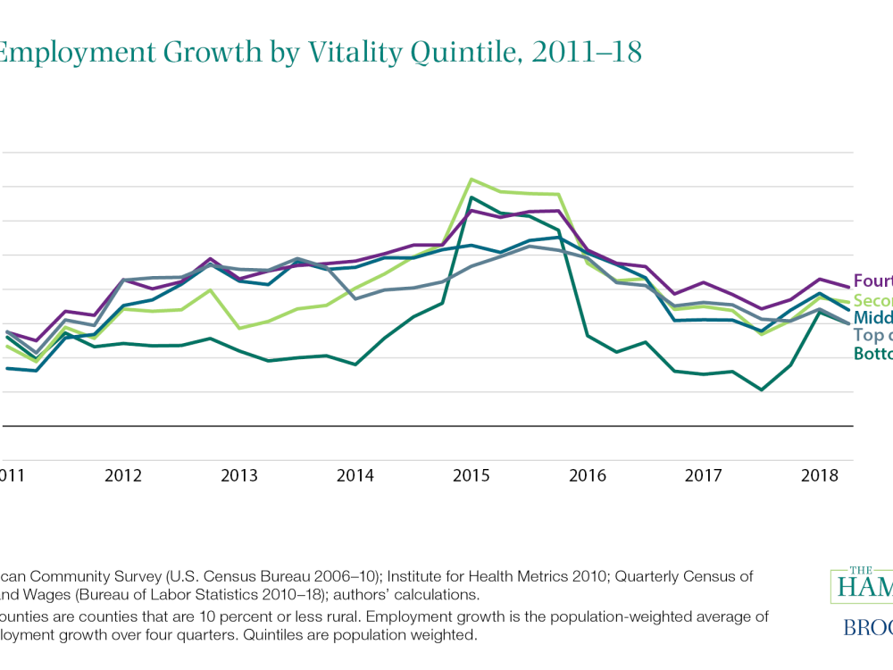
To better explore the experiences of different types of urban areas, we again look at employment growth in counties across vitality quintiles, but this time restricting to counties that are less than 10 percent rural. As in figure 1, job growth begins to increase in the top 3 quintiles before the bottom two, but the gap closes, and growth across quintiles is similar for the 2014–16 period. Lower–performing areas did fall off again in 2016, but have largely rebounded to an employment growth rate similar to that of other urban areas.

Economic outcomes—in particular household income, poverty, and employment—vary dramatically across counties in the United States. The job growth we see in the headline data every month, though, has been spread relatively evenly across the large urban areas regardless of their vitality. This still leaves large gaps in the levels of vitality and employment rates, but it shows that job growth is not restricted to the booming metropolitan areas on the coasts. On the other hand, rural counties—the majority of which were already struggling—seem to be increasingly left behind with employment barely growing over the last 5 years, lagging growth in urban areas by a substantial margin.
The Brookings Institution is committed to quality, independence, and impact.
We are supported by a diverse array of funders. In line with our values and policies, each Brookings publication represents the sole views of its author(s).


Commentary
Has job growth reached America’s struggling places?
March 7, 2019