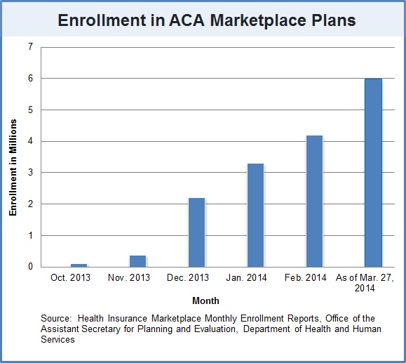
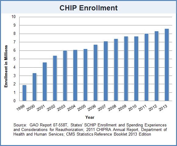
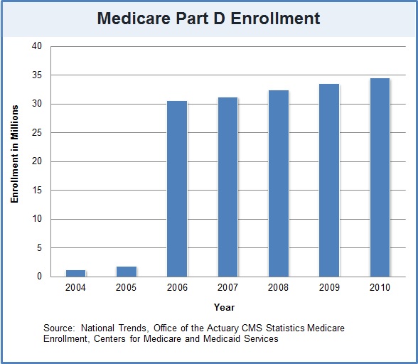
March 31 was the deadline for enrollment in health plans under the Affordable Care Act. The Obama administration reports that over seven million people applied for health insurance. Elaine Kamarck, director of the Center for Effective Public Management, explores key remaining questions about the program and in a series of charts compares the “take-up rate” of the ACA to CHIP (Children’s Health Insurance Program) and Medicare Part D, the prescription drug program:
She writes:
As is clear from these charts, it takes a while for word to get out about new programs. Enrollment in the Affordable Care Act improved consistently in its first six months, along with improvement in the websites themselves. Enrollment in CHIP, passed in 1997, started out slow and improved steadily over the first decade of its existence. And enrollment in Medicare Part D, passed in 2003 but slated to begin in 2006, also increased over time although the curve was not as sharp as others. For all the gloomy claims about Americans’ resistance to enrolling in the program, today’s numbers and the experience of other programs show that enrollment will increase as time goes on.
Read the post to learn more and see what Kamarck says about ACA’s continued unfavorability with the American public.
The Brookings Institution is committed to quality, independence, and impact.
We are supported by a diverse array of funders. In line with our values and policies, each Brookings publication represents the sole views of its author(s).


Commentary
CHARTS: How Enrollment in ACA Compares to CHIP and Medicare Part D
April 1, 2014