Click here for a detailed analysis of specific colleges based on College Scorecard data.
In 2013, President Obama used part of his State of the Union address to announce a new plan to increase transparency in higher education. As he put it, his administration created a “college scorecard that parents and students can use to compare schools based on a simple criteria—where you can get the most bang for your educational buck.” His initial goal was to link performance measures to federal funding, prompting an outcry from college leaders that led to the plan being shelved.
A treasure trove of data
Yet, in keeping with the original vision, the administration recently released a plethora of previously unavailable information about colleges. New metrics include the average family income of students, the characteristics of the average student’s ZIP code, better transfer, debt, loan payment, and completion metrics, and, most importantly perhaps, student earnings data for thousands of colleges.
This represents a huge step toward transparency in higher education. Parents, students, college leaders, journalists, policy makers, and researchers are now empowered to more empirically evaluate thousands of U.S. post-secondary institutions in terms of their contributions to student economic success.
Strengths and weaknesses of the earnings data in College Scorecard
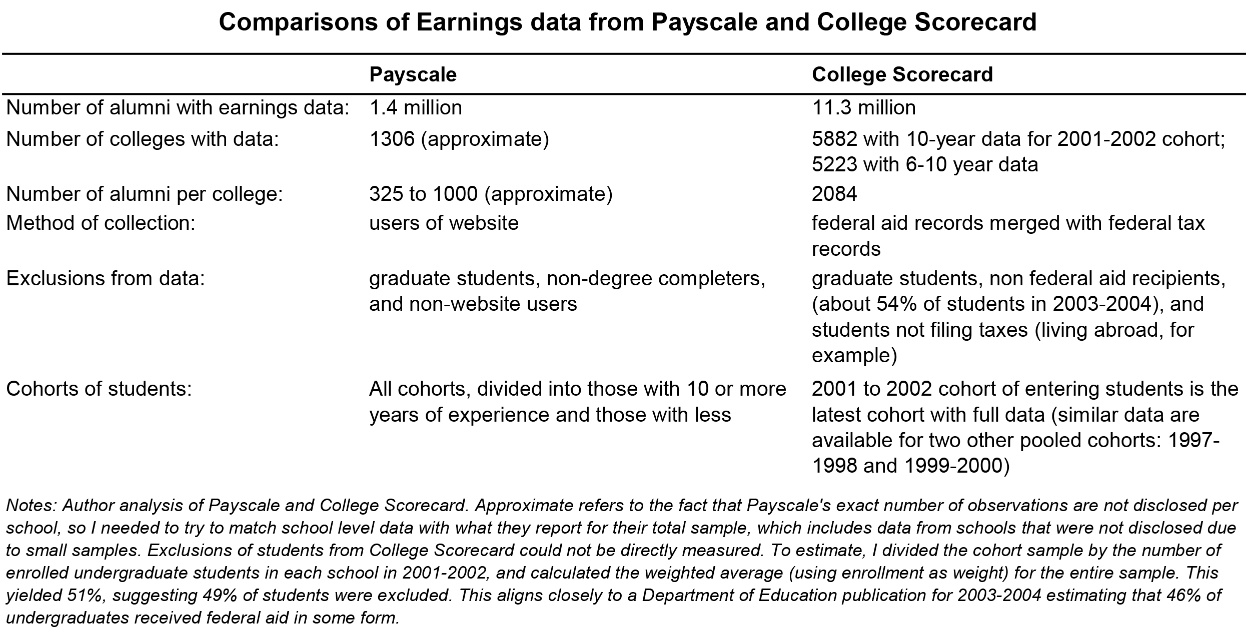
Before these data, there were two sources of earnings data available to the public. A few states, like Texas, linked state tax records to college records and produced tables showing earnings immediately—as in one quarter—after graduation for people working in the state and attending colleges in the state. A broader and more useful database is provided by Payscale, a salary negotiation tool. Their College Salary Report database provides self-reported earnings data by college for alumni who use their website tool.
The College Scorecard data are better than the state data in that they provide earnings after a longer time period: six to 10 years, far more representative of lifetime earnings than one quarter. They also capture earnings from students who leave the state, providing more complete coverage.
The administration data differs from Payscale in several important dimensions.
On the plus side, the College Scorecard data has a sample size that is about 10 times larger and covers an additional 4000 colleges, including many community colleges with no Payscale data. Thus, the scorecard is likely to be more accurate than Payscale, while filling major gaps in coverage.
On the other hand, the College Scorecard earnings data has a significant weakness: It only applies to students who received federal aid. Those students are more economically disadvantaged than their peers. In 2003–2004, per the U.S. Department of Education, 46 percent of all undergraduate students received student aid, a very impressive sample size superior to anything else available. Yet, students from the lowest quartile of family income are more than twice as likely to receive federal aid as students in the highest quartile of earnings. Since family earnings strongly predict student earnings after graduation, this biases the data.
The College Scorecard does not report the percentage of entering students at each school for which they have earnings data. I estimate this for each school by dividing the cohort observation by the number of enrolled undergraduate students in 2001 and 2002, the latest data cohort available. The results suggest that 51 percent of U.S. students were represented, but as expected, that figure is strongly and negatively correlated with average student test scores and incomes. Payscale’s self-reported data are subject to a different bias, but for a given school with low rates of federal aid and high Payscale participation, it may be more accurate.
Another serious problem with the scorecard data is inaccuracy with respect to schools with branch campuses, because earnings data are only reported at the system level, not for each distinct campus. Of all colleges with earnings data, 8 percent of students across 31 percent of campuses attend what appears to be either a branch campus or at least an institution that shares the same six-digit Office of Post-Secondary Education identification number (OPEID), analogous to a company identifier in that a business may have multiple physical establishments in different locations. This problem also affects federal default rate data and has unclear implications for Payscale, which may be subject to various errors related to the assignment of earnings to the wrong campus.
Despite these data challenges, the College Scorecard data largely overlap with alternative measures of earnings from both the Census Bureau and Payscale.
In the College Scorecard database, mean earnings 10 years after entering college are $46,200 (in 2011 adjusted to 2013 dollars) for those entering college between the ages of 18 and 25. This is very close to an analogous figure from the Census Bureau’s 2013 American Community Survey (ACS), which surveys 1 percent of U.S. residents. ACS data shows that college attendees—including non-graduates—between the ages of 28 and 35 earned an average of $49,500. The difference is likely attributable to the fact that federal student aid recipients have lower average salaries than non-aid recipients.
As for the scorecard’s relationship to Payscale, the correlation between Payscale’s mid-career salary measure of earnings—applicable to those who graduated at least 10 years ago—and the scorecard measure of earnings 10 years after entry is very high, at 0.82. Thus, the College Scorecard salary rankings align fairly closely to Payscale, even though there are sometimes wide discrepancies for particular schools.
Perspective on the Scorecard
The College Scorecard is a tremendous asset to the public, as organizations dedicated to improving higher education have noted, and the project should be continued indefinitely with annual updates as new data come in. Better yet, the earnings data should be linked to all attendees, not just federal aid recipients.
Still, by itself, this tool is unlikely to directly change higher education. One issue is that many colleges face limited competition in their area, weakening incentives to compete on quality. As my colleagues Beth Akers and Adela Soliz recently found, roughly one third of Americans do not live within 51 miles of a public college. Secondly, the Scorecard’s raw data are rich, but only of use to economists and other experts. The tool shows but does not readily allow for large comparisons between schools on the three basic criteria of cost, graduation rates, and salary after attendance. Moreover, the tool makes no effort to isolate the school’s contribution to earnings from what one could reasonably expect based on family incomes and test scores of its students or the level of degrees it offers.
Brookings research released earlier this year aimed to do just that by analyzing colleges in an accessible way. To do so, we compiled data on alumni using three economic measures—including earnings after graduation, as reported by Payscale. We compared these outcomes to what we could predict for a typical school, using information on student and school characteristics, such as student test scores, family income, and the type of degrees offered. The difference between expected and actual outcomes is what we call the school’s contribution to alumni economic success, or its value-added.
With the new College Scorecard data, we will again calculate and present value-added estimates, now for an ever larger number of colleges. Despite the limitations mentioned, the Scorecard data will enhance the metrics we released last spring. We hope the new data will benefit the many people interested in knowing how well specific colleges are preparing students for remunerative careers.


Commentary
Op-edUnderstanding the College Scorecard
September 28, 2015