

America today is as divided as it has ever been, in terms of incomes and opportunities, politics, and, perhaps most importantly, hopes and dreams. Hope matters. As our earlier work shows, individuals who do not believe in their futures are much less likely to invest in them—as in education, health, and job training. This increases the odds of America becoming even more unequal in the future. These divisions are corrosive to our society, our polity, our civic discourse, and to our health.
There are high costs to falling behind—and losing hope—in a very wealthy society that prides itself on being a meritocracy (even though the reality is far from the reputation). The starkest marker of these costs is the increase in premature mortality among significant sectors of our society—due to preventable deaths such as suicide, opioid, and other drug overdoses, and heart, liver, and lung diseases. These deaths are most prevalent among uneducated middle-aged whites in rural areas, but the latest (2015) data show increased prevalence across a wider range of ages, races, and places. In this piece, and in the interactive maps below, we focus on the particular role of place.
For starters, there are major differences across populations. Poor minorities (defined here as blacks and Hispanics) face similar—and often worse—poverty-related challenges than do non-Hispanic poor whites. Yet they are more resilient in the face of negative shocks, less likely to report depression or commit suicide, and significantly more optimistic about the future. Part of the explanation is their higher levels of community and family support. Aspirations also matter. Poor blacks and Hispanics tend to report they are better off than their parents were, while many blue-collar whites are facing a reality of downward mobility. Many of their primary occupations are close to extinction, and family structures have weakened significantly (a trend that is associated with the drop in labor force participation).
In recent work based on our well-being metrics in the Gallup polls and on the mortality data from the Centers for Disease Control and Prevention, we find a robust association between lack of hope (and high levels of worry) among poor whites and the premature mortality rates, both at the individual and metropolitan statistical area (MSA) levels. Yet we also find important differences across places. Places come with different economic structures and identities, community traits, physical environments and much more. In the maps below, we provide a visual picture of the differences in in hope for the future, worry, and pain across race-income cohorts across U.S. states. We attempted to isolate the specific role of place, controlling for economic, socio-demographic, and other variables.
Developing a mapping interactive
We are attempting to answer questions, such as: In what states are poor whites the least optimistic? What states are the worst for worry among poor non-whites (in this instance again, blacks and Hispanics)? Which states are associated with higher reports of pain? Our population of interest is the low-income group. We define the “poor” group as having less than $24,000 in annual income for a family of four (based on reported income in the Gallup data), which corresponds closely with the official poverty measure.
In order to provide a benchmark for the state-level comparisons, the box charts below provide the country-level distribution of state-level averages for optimism, worry, and pain for each race cohort. In general, these graphs demonstrate the higher levels of optimism and lower levels of pain for poor minorities compared to poor whites. Reports of worry align more closely across poor cohorts.
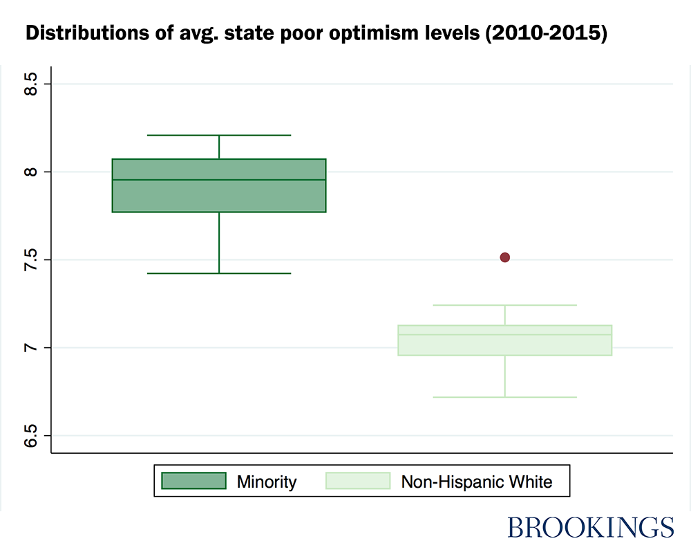
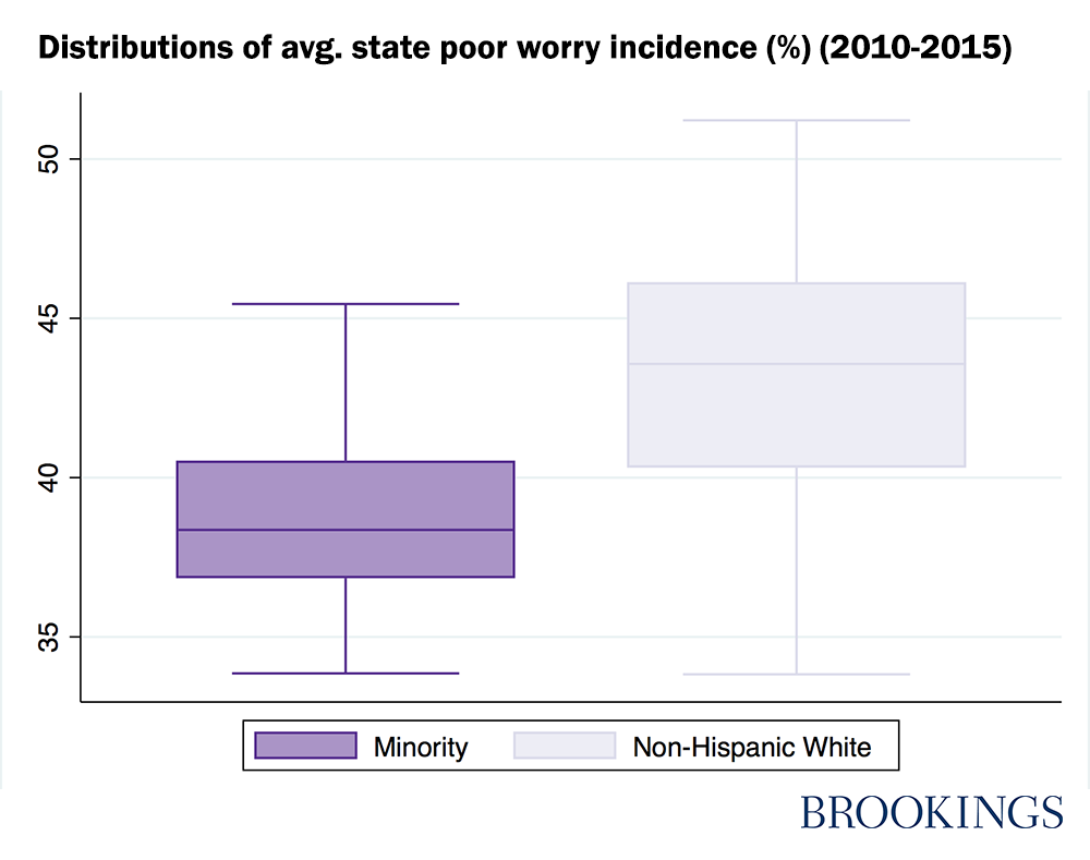

The boxes’ lines represent the first (25 percent), second (50 percent), and third quartiles (75 percent) of the distribution for each race-income cohort, respectively, while the top of the top quartile (i.e., 100 percent) and the bottom of the bottom quartile (i.e., 0 percent) for each is represented by the whiskers (the capped lines extending from the boxes). As with any normal distribution, more respondents in each state fall into the middle ranges and thus the averages within usually represent more people. The dots, meanwhile, represent the few instances where particular states are beyond a reasonable distance from the center, but we isolated them to avoid distorting the distribution.
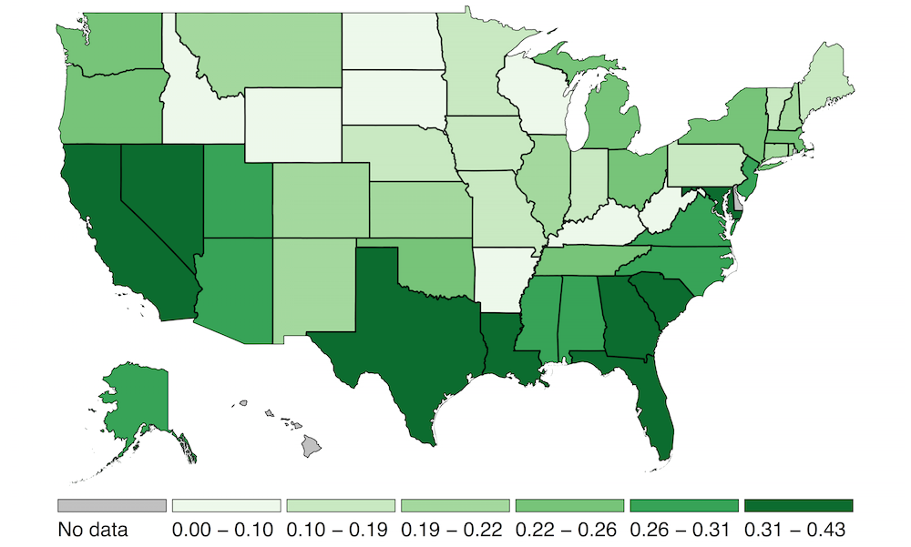
We next ran a standard regression with the well-being variable of interest (e.g. optimism, worry, and pain respectively) as the dependent variable, controlling for socio-demographic and economic trends such as age, gender, marital status, education, employment status, religion, and whether the respondent can afford healthcare or food (indicators of deprivation). We also included state-specific identifiers. We then ranked the states by the values on these identifiers; these values represent the left over differences specific to states that different levels of education, employment status, deprivation, and so forth do not account for. The maps show the state-level differences across these three variables (optimism, worry, and pain) by race, respectively.
In the case of each map, the comparison group is the state with the lowest/worst ranking on optimism, worry, and pain. Thus for optimism, higher values are better while for worry and pain, lower values are better. The colors on the map are green for optimism, purple for worry, and orange for pain, such that lighter colors reflect lower scores and darker colors correspond to higher scores. Thus, dark green states are “better” in terms of well-being for optimism, whereas dark orange or dark purple states are “worse” for pain or optimism, respectively. The legends beneath each map demonstrate the different ranges of scores for non-Hispanic whites compared to minorities. As expected, poor minorities scored much higher on the optimism scale than do poor whites. Their higher range of scores suggests that the difference between the best and worst places for optimism for minorities is greater than it is for whites. Minorities also have a higher range of worry scores, again highlighting a more important role for place. Whites have a higher range of pain scores, suggesting that there are bigger differences in terms of where whites experience more pain.
Differences in Optimism Level Across States (2010-2015)
Poor Non-Hispanic Whites
Poor Minorities (Pooled Black and Hispanic)
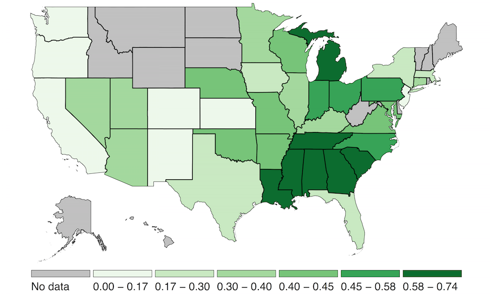
Note: Controls include age, gender, marital status, education, employment, religious preference, and whether respondents can afford food or healthcare. Optimism is measured by best possiple life anticipated (BPLA) scores on a 0-10 scale.
Source: Gallup Healthways.
What patterns are visible?
Our geographic analysis yields many patterns that are consistent with those reported in other kinds of data—and in our earlier work. For example, the best places in terms of optimism for poor minorities are the Southern cluster of states: Louisiana, Mississippi, Arkansas, Georgia, Alabama, and Tennessee. The worst places for this same group are California, Washington-state, Oregon, Kansas, Colorado, and New Mexico. The patterns are almost the inverse for poor non-Hispanic whites, meanwhile. The most optimistic states for this group are Maryland, California, Florida, Nevada, Texas, Louisiana, and Georgia. The most desperate states are the Dakotas, Wyoming, Montana, Idaho, Wisconsin, Missouri, West Virginia, and Kentucky (which correspond, roughly, to the opioid and suicide belts in the heartland).
Related Content

The best places for worry (i.e., the lowest levels of worry) for minorities are, again, the Southern cluster of states, while the worst are Washington state, Kansas, Utah, New Mexico, Florida, and Massachusetts. Again, non-Hispanic whites have an inverse pattern, with worry the lowest in Arizona, New Mexico, Minnesota, Wyoming, Nebraska, Kansas, Colorado, and Georgia. The worst places for poor white worry are Nevada, Utah, Kentucky, West Virginia, Maryland, New Jersey, and Massachusetts. While some of the classic rural areas again show up, so do some coastal regions with more vibrant economies, as in the case of the latter three states.
Average levels of pain also display a mixed pattern. For poor minorities they are highest in Washington state, New Mexico, Arizona, Oklahoma, Michigan, New York, and Massachusetts. The highest levels of pain for poor whites are in Maine, the Appalachian states, Alabama, Arkansas, and Oklahoma—again most of these places have relatively high levels of premature mortality. For minorities, Western states with high levels of immigrant labor display higher reported pain levels, but so do states with very different economies, such as New York and Connecticut. For poor whites, pain levels for the most part link to places with dying industries.
Related Books

This is an initial exploration into subtle differences across places that are difficult to quantify. It confirms some established patterns but also yields surprises. In general, minorities scored worse on all of the variables in states where there are proportionately fewer minorities, such as Washington state and Kansas (although there are other states where there are even fewer minorities that did not score as badly), and/or where there is a larger poverty gap compared to non-white Hispanics. These include Maine, Wisconsin, North Dakota, and Florida. Poor whites, meanwhile, tended to score lower across the board in the Appalachian states, and then poorly in many of the Midwestern and Western heartland states.
One surprise is the low level of optimism and high level of worry in the minority dense and generally “blue” state of California, and high levels of pain and worry in the equally minority dense and “blue” states of New York and Massachusetts. High levels of income inequality in these states may explain these patterns, as may the nature of jobs that poor minorities hold.
We cannot answer many questions at this point. What is it about the state of Washington, for example, that is so bad for minorities across the board? Why is Florida so much better for poor whites than it is for poor minorities? Why is Nevada “good” for poor white optimism but terrible for worry for the same group? One potential issue—which will enter into our future analysis—is racial segregation across places. We hope that the differences that we have found will provoke future exploration. Readers of this piece may have some contributions of their own as they click through the various maps, and we welcome their input. Better understanding the role of place in the “crisis” of despair facing our country is essential to finding viable solutions, as economic explanations, while important, alone are not enough.
Authors
The Brookings Institution is committed to quality, independence, and impact.
We are supported by a diverse array of funders. In line with our values and policies, each Brookings publication represents the sole views of its author(s).