
Public discussions regarding rising college costs typically focus on the listed cost of attendance (COA), or “sticker price.” Sticker prices for four-year colleges and universities are in the tens of thousands of dollars per year and have risen substantially over the past several decades. High and rising college sticker prices are the subject of considerable attention.
But what matters to students and their families is not the sticker price but rather the amount they actually have to pay. Because of the availability of financial aid, most pay less than the sticker price. The average amount students actually pay (the “net price”) has evolved quite differently over time from the sticker price: it has recently stabilized and even fallen in the last few years. But the average net price is only relevant for families with average finances. What about everyone else?
This report shows how the actual price of college for families in different economic circumstances has changed since the mid-1990s. I focus on dependent students attending four-year institutions living away from their parents because those are the students who face the highest sticker prices that typically receive the most attention. They represent around 40% of the roughly 9 million dependent college students and two-thirds of those enrolled full time. These institutions often provide financial aid, using their own resources in addition to aid available from the federal and state governments. I separately examine public (for state residents) and private, nonprofit institutions because of the substantial differences in prices between them.
Several conclusions emerge from this analysis:
- The sticker price is an increasingly poor indicator of college prices for all students, regardless of family income.
- The net price paid by students attending public institutions has risen for families at all income levels, but the increases have been larger for higher-income students.
- At private institutions, the net price is consistently higher than at public institutions, but for more than a decade it has only increased for higher-income students.
- Adjusted for inflation, net prices paid by students today at public institutions across the income distribution are similar to the prices they would have paid at private institutions in the mid-1990s.
How are actual college prices determined?
The full “cost of attendance” is defined by law to include tuition and fees, food and housing, and all other educational and living expenses (books, travel, and other personal expenses). Colleges and universities are required to publicly report that amount. It is often colloquially labeled the sticker price. But financial aid drives a wedge between the COA and what students really pay. The amount students actually pay is labeled the “net price,” and it equals COA less any form of “grant-based” financial aid (i.e., not a loan or subsidized work).
That aid can come in two forms: need-based and merit-based. Eligibility for need-based aid is determined based on the financial information students provide when they complete the Free Application for Federal Student Aid (FAFSA).1 That information is used to calculate the “Expected Family Contribution” (EFC).2 A student’s “financial need” is the difference between the COA and the EFC (need = COA – EFC). Students receiving federal financial aid cannot receive aid in excess of financial need. Institutions are not required to provide the full amount of aid that students are eligible for, and most do not. Those that do are said to “meet full need.”
Many institutions also award financial aid that lowers the net price for other reasons. It is typically labeled as merit aid because students with stronger academic records receive larger awards. For students with no financial need, merit aid directly reduces what students pay.
For students with financial need, though, merit-based aid often substitutes, at least partially, for need-based aid. That is, the need-based award is reduced when a student receives merit aid. This means that merit aid mostly benefits higher-income students who otherwise would pay the full sticker price.
At many institutions, this form of aid is awarded to a large fraction, and in some cases even all, of its students. Such universal merit aid has the same impact as reducing the sticker price. Colleges choose to offer it for marketing purposes, setting a high sticker price to signal institutional quality while awarding “merit aid” to signal support for admitted students.3
The sticker price is the wrong way to track college costs
Most students do not pay the full sticker price. In 2019-2020, 26% of in-state public college students and 16% of students enrolled in private, nonprofit institutions paid the sticker price.4 Those percentages have dropped from 53% and 29%, respectively, since 1995-1996. More students receive financial aid now, highlighting the importance of relying on net price rather than the sticker price when tracking college costs over time.
The sticker price is even becoming an increasingly poor indicator of college costs for higher-income students who are not eligible for need-based financial aid. The growing use of merit-based aid at both public and private institutions accounts for this. At public institutions, the vast majority (79%) of those higher-income students paid the full sticker price in 1995-1996. That share dropped to 47% in 2019-2020. At private institutions, the decline was even greater, falling from 64% to 28% over that period.
The bottom line is that few students now pay the full sticker price, including, perhaps unexpectedly, those from higher-income families. Sticker price is therefore becoming increasingly disconnected from the amount that students actually pay. The practice of tracking it should be exercised with extreme caution.
A better way to track college costs
If students do not pay the sticker price, how much do they pay? And, critically, how does that amount change as family finances change? To answer this question, I examine the relationship between a family’s financial situation, captured by their EFC, and how much they pay to attend college. This relationship between EFC and net price is a fundamental element of the process colleges use to determine financial aid awards. Other factors matter, but the EFC is critical in determining the amount that students pay. All else equal, the net price rises with EFC. At some point, though, the net price hits a ceiling. That maximum net price is often lower than the sticker price because of the extensive use of merit awards, as I described earlier.
To better understand how net prices have changed over time for families with different financial circumstances, I use available data to mimic the underlying system that institutions use to determine students’ net price.5 Separately for each year of data, I estimate the linear relationship between net prices and EFC among students who are eligible for need-based financial aid. I also impose a “maximum net price,” defined as the average amount paid by students who are not eligible for need-based aid. It is not precisely a maximum because some students will pay more, but it represents the typical amount paid by higher-income students whose net price is unrelated to financial need.
Throughout this analysis, I distinguish state residents attending 4-year public institutions from those attending 4-year private, nonprofit institutions (referred to simply as 4-year public and private institutions going forward). Data for this exercise are available every four years from 1995-1996 through 2019-2020 from the National Postsecondary Student Aid Study (NPSAS).6 All dollar values are inflation adjusted and represent the price level in 2023.
To facilitate interpretation, all reported results are distinguished by family income. I converted levels of the EFC to approximate levels of family income, assuming that families’ asset holdings are typical of that income level.
For a variety of reasons, a literal interpretation of the results of this exercise is inappropriate. The exact amount that any particular student pays will depend on their specific characteristics and those of the institutions they attend. Among students with similar family incomes, other details of their financial situation will affect their net price. Even among students with similar financial circumstances, the net price they pay can vary considerably across institutions and within institutions. But the results presented still provide a useful characterization of the system of college pricing facing students over time.
Figures 1A and 1B show the key findings. Figure 1A provides the results for students at public institutions. In the 1995-1996 academic year (all years on the graph are labeled by the end of the academic year), students with family incomes under $50,000 typically faced a net price of about $12,500. The typical net price increases with income. Every additional dollar of income translates to around a 16-cent increase in net price. Families with family incomes of roughly $75,000 typically faced a net price of around $16,000. Once income reaches the vicinity of $100,000, the net price hits the maximum of around $19,000.
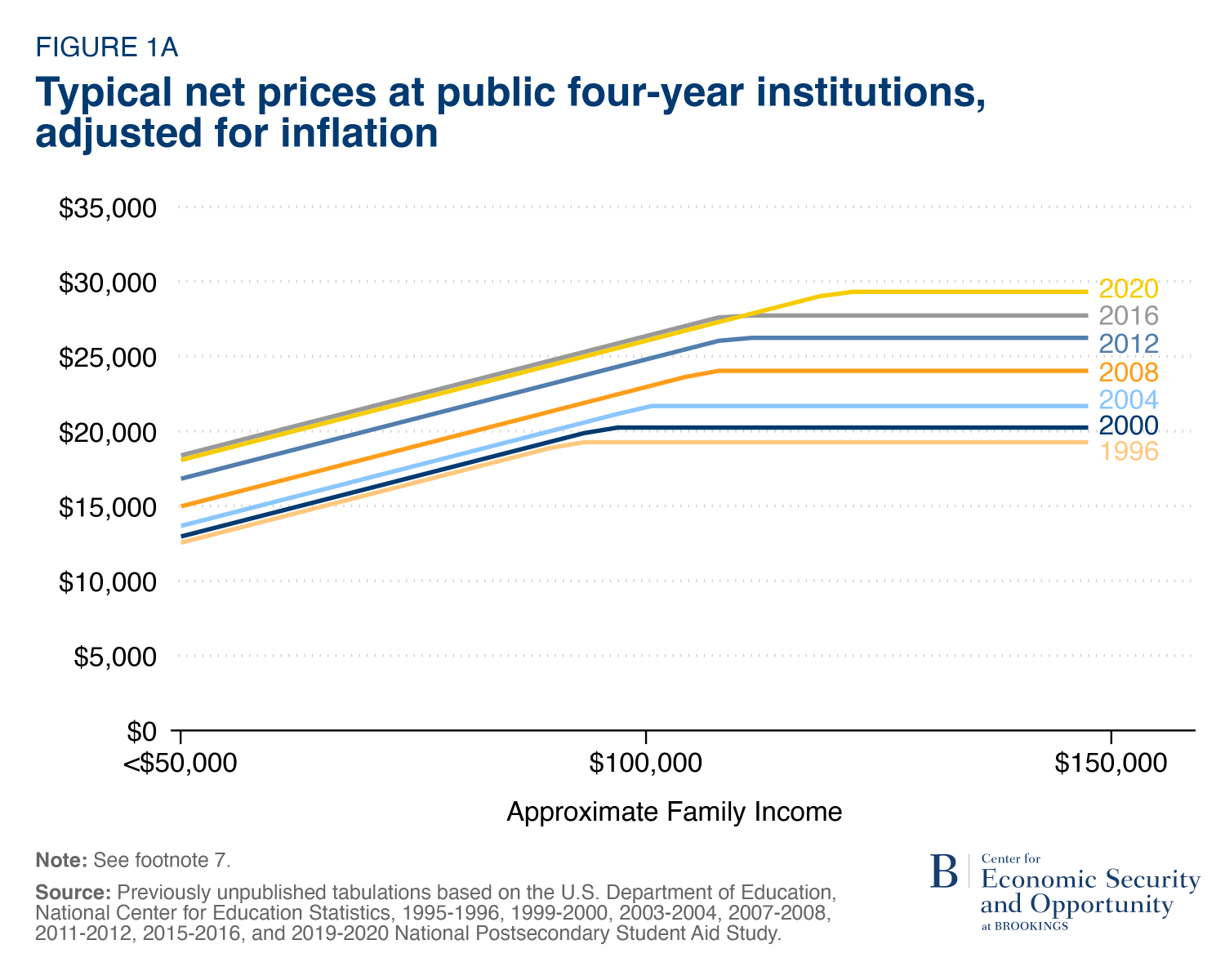
In each subsequent year, that relationship has shifted up.7 By 2019-2020, students from families with incomes below $50,000 faced a typical net price of $18,000. A family with an income of around $125,000 paid the maximum net price of $29,000. The maximum net price increased between 1995-1996 and 2019-2020, so higher-income families became eligible for need-based financial aid.
This upward drift in net prices at public 4-year institutions indicates that they are becoming increasingly more expensive over time for students at all levels of the income distribution. The increase for higher-income families was larger in dollar terms but roughly similar in percentage terms.
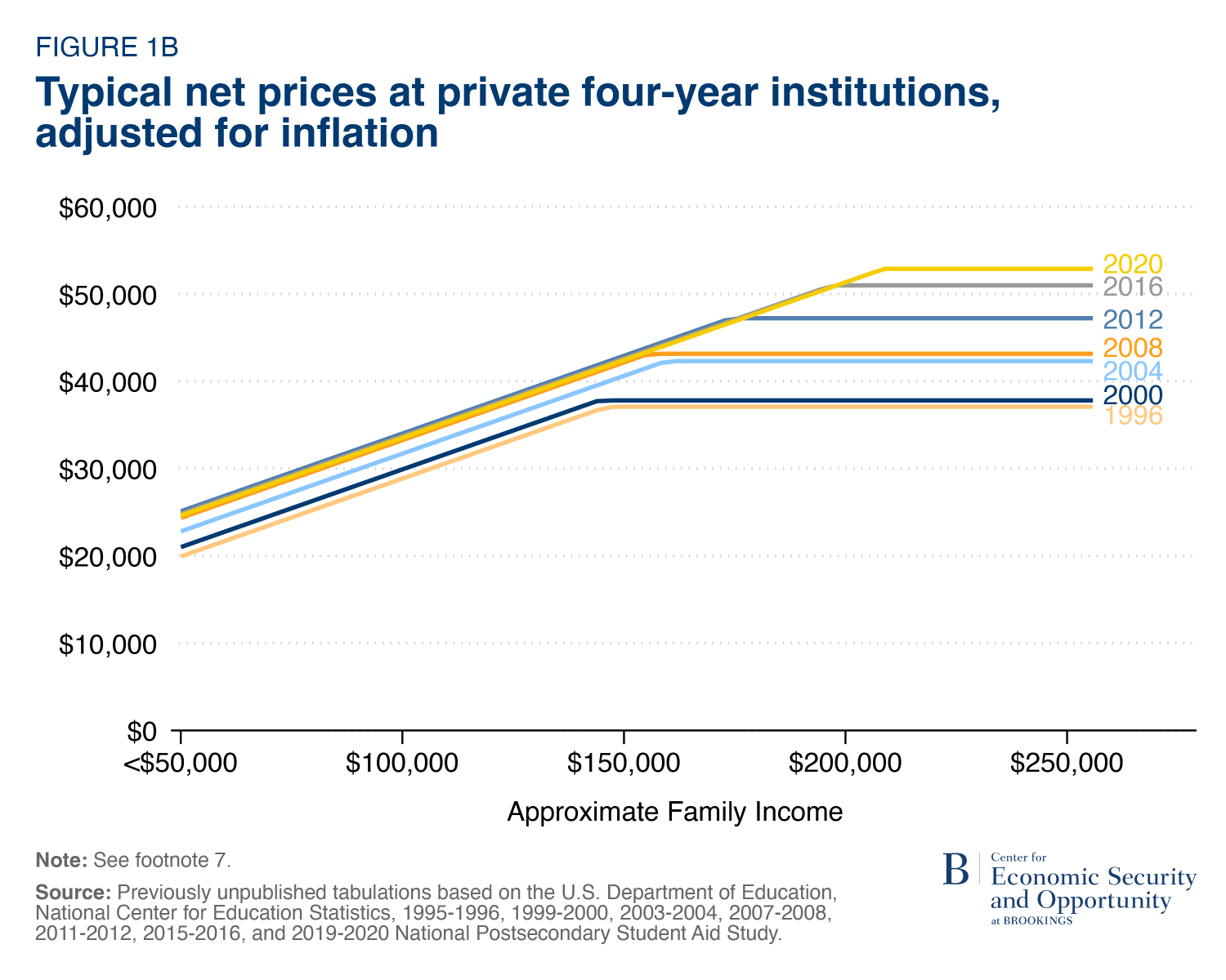
Figure 1B shows the same relationships for 4-year private institutions. Prices at private institutions were higher than at public institutions for students at all income levels each year. Net prices also increased with incomes at a slightly higher rate (18 cents per dollar of income).
Pricing patterns over time, though, observed at these institutions are not quite the same as those at public institutions. The fundamental difference is that net prices for lower- and middle-income students stopped rising in 2007-2008. The prices those students pay have remained roughly constant in real terms since then.
One should not interpret this finding as indicating private colleges are becoming more affordable for low- and middle-income students. Students with incomes under $50,000 are still being asked to pay around $25,000 to attend a typical private institution. But that amount is no longer rising faster than the rate of inflation.
Net prices charged to higher-income students at these institutions have risen consistently over time. In 1995-1996, the maximum net price at private institutions was $37,000. Students hit that threshold at a family income of around $150,000. By 2019-2020, the maximum net price jumped to $53,000 and it corresponded to income of around $200,000.
Net prices paid by students enrolled in the small set of private, highly-endowed private colleges and universities that meet full need are unlikely to follow these patterns. Students pay their EFC at these institutions, perhaps along with loan and work expectations. As I have shown elsewhere, their net prices are lower than at other private institutions for all but higher-income students. They are even lower than at public institutions for lower-income students. For students with the same EFC at different points in time, there is no reason their net price would have changed much. But only a small number of institutions fall in this category, making it difficult to analyze them separately.8
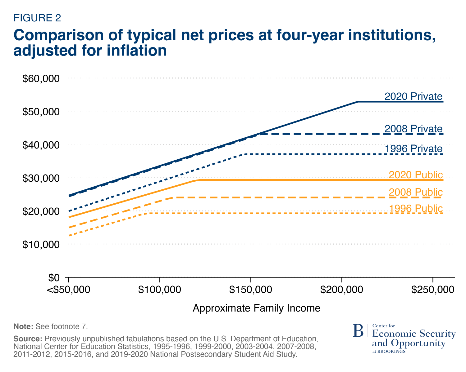
Note that the scales on the graphs for public and private institutions are different to best illustrate the pricing patterns at each type of institution. Figure 2 is designed to overcome that problem, including data for both sets of institutions for a subset of years on the same scale. It shows that private institutions are clearly more expensive than public institutions, as one might expect. We also see that public institutions in 2019-2020 charge prices that are not unlike those charged at private institutions almost 25 years earlier, particularly for lower- and middle-income families and after factoring in financial aid.
An important contribution of this analysis is tracking the net price that lower-income students pay over time. I am not aware of any other source that provides this information. Figure 3 focuses specifically on that group, presenting typical net prices paid by students from families with incomes below $50,000 over time in the two different types of institutions.
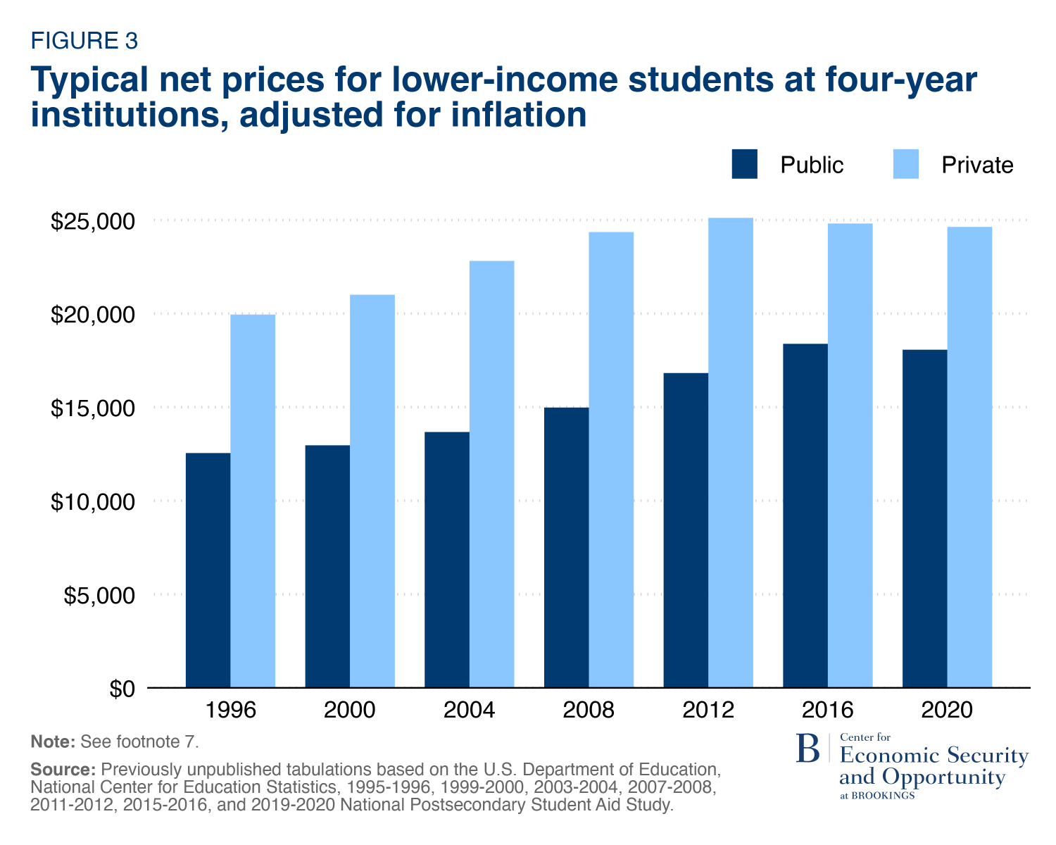
These statistics identify an obvious affordability problem for this group. At public institutions the net price that these students pay has risen from $12,500 to $18,000 between 1995-1996 and 2019-2020. The lower amount would have been difficult for these families to pay then, but these institutions have become even less affordable over time. The cost of a private institution for these students may have stopped rising, but it started and ended the period at a higher level (roughly $20,000 to $25,000, respectively).
Although net prices have risen for students across the income distribution at both public and private institutions, these increases are considerably smaller than increases in sticker prices.9 Sticker prices have risen roughly 70% at both types of institutions between 1995-1996 and 2019-2020 ($20,500 to $35,000 at public institutions and $42,000 to $72,000 at private institutions). For lower-income students (defined here as those with incomes below $50,000), net prices have increased by 44% and 24% at public and private institutions, respectively. Those increases are still substantial, but they are considerably smaller than the increase in the sticker price.
Where do we go from here?
This analysis yields several implications for policy discussions regarding college pricing. First, the nearly universal focus on the sticker price in public discourse is detrimental to our understanding of college costs. It is the easiest measure to track, but it is a misleading statistic that a small and declining number of students pay. Even many higher-income families do not pay the full sticker price.
Second, we need much better information about how much students in different financial circumstances would have to pay for college and how those prices have changed over time. Understanding how much lower- and middle-income students pay is particularly important if we are seeking to improve college access. That information is limited now. One recent survey found that only 19% of Americans know that lower-income students pay less for college than higher-income students.
Third, college costs are still too high, and increasingly so over time. College is indeed expensive for higher-income students, but the affordability problem is much greater—and more consequential—for lower- and middle-income students. If they can’t afford it, they can’t go.
Our current system of setting and communicating college prices simply does not work. We cannot expect students to make sound decisions regarding educational investments if they do not understand how much college will actually cost them. Public officials make strategic decisions affecting the higher education system facing similar blind spots. The media routinely reports on college pricing based on inadequate information. And, ultimately, college costs are too high, particularly for lower- and middle-income students. We cannot expect improvements in the market for higher education if we do not know the facts. This report is a step in that direction.
Technical Appendix: Data and Methodology
All the analyses reported in this report are based on data from the 1995-1996 through 2019-2020 waves (available every fourth year) of the National Postsecondary Student Aid Study (NPSAS). In each wave, I have restricted the data to dependent students enrolled full-time at a single institution living away from their parents (on or off campus).10 These seven waves of the NPSAS were conducted during a period when the formula for determining a student’s EFC was largely unchanged. All NPSAS data used in this report is restricted and accessed under a licensing agreement with the Institute for Education Science/National Center for Education Statistics (IES/NCES).
There are 86,000 students included in these seven waves of NPSAS data that satisfy the sample restrictions. In 2019-2020, over 3 million students satisfy these conditions. I have replicated all the analyses included in this report further restricting the sample to those living on campus (around 2 million students in 2019-2020) and obtained similar results.
Students are divided into two categories, based on whether they have “financial need” depending on whether their expected family contribution (EFC) is greater than the cost of attendance (COA) at the institution they attend (COA – EFC > 0). For those who have no financial need, I calculate the average net price separately for students attending 4-year public institutions and those attending 4-year private institutions. These statistics are generated separately using data from each NPSAS wave. The results set the upper bound of net prices in each wave in each type of institution in this analysis.
For students with financial need (EFC < COA), I estimate linear quantile regression models at the 50th percentile (i.e., the median) relating the net price paid to their EFC. I extended this approach in a preliminary analysis, allowing the year/institution type slope to be non-linear (quadratic). The results indicated some non-nonlinearity exists (increasing at a decreasing rate), but it is minor and I chose to maintain the simplicity of restricting the slope to be linear.
In the analysis reported in Figures 1A and 1B, a single regression is estimated for each type of institution across all NPSAS waves, restricting the slope coefficient relating net price to EFC to be constant, but the intercept is allowed to change by wave. I tested the sensitivity of this restriction relative to models that estimate this relationship separately by type of institution and academic year. This approach allows for the linear slope to differ in different years. Although there is some variability in slopes of the net price/EFC profile by academic year, they are not dramatic. I therefore impose the constant slope restriction for ease of interpretation, without much loss of detail.
The results from the regression analysis that imposes a constant slope over time generate the sloped portions of the relationship between approximate family income (EFC) and the net price, as displayed in Figures 1A and 1B. The sloped portion is allowed to increase until it intersects with the average net price paid by students with no financial need in each sector and NPSAS wave.11
Separately, I also estimate a linear regression relating family income, measured as the adjusted gross income (AGI) that parents report on their child’s FAFSA form, and the resulting FAFSA EFC. This analysis is also restricted to those students who have financial need. I use the results from this analysis to predict family income for alternative values of EFC. It is those predictions of family income based on EFC that are provided in Figures 1A, 1B, and 2.
Author

Related Content


-
Acknowledgements and disclosures
The Brookings Institution is financed through the support of a diverse array of foundations, corporations, governments, individuals, as well as an endowment. A list of donors can be found in our annual reports published online here. The findings, interpretations, and conclusions in this report are solely those of its author(s) and are not influenced by any donation.
-
Footnotes
- A relatively small share of students attends colleges and universities that also require students to complete the CSS Profile. That form asks more detailed questions, and it is used largely at private institutions with high sticker prices. For this analysis, I do not have access to financial aid data based on the CSS Profile.
- The EFC has been relabeled as the Student Aid Index (SAI) beginning with the 2024-2025 FAFSA. I continue to use the historical EFC label because that is what it was called in all of the data used in this analysis.
- Students would benefit and institutions would not be harmed if all institutions using this pricing policy simply cut their sticker price. They do not do so because they face a “prisoners’ dilemma.” If any one school changed their policy on its own, it would lose students. If all agreed to so simultaneously, that would overcome the problem, but it also likely would be seen as a violation of anti-trust laws.
- I use data from the 1995-1996 through 2019-2020 waves (available every fourth year) of the National Postsecondary Student Aid Study (NPSAS) to calculate these statistics and in all other analysis in this report. The technical appendix provides greater details regarding the data and methods used.
- A more traditional approach for providing this information would be to establish categories of EFC or income and compute mean or median net prices within those categories. I conducted such an analysis, but opted for the regression-based approach instead. That approach has the advantage of providing results that are less dependent on having sufficient data within relatively narrow EFC bands. It also provides a better method of determining a typical EFC level at which point net prices stop rising. All the analysis is conducted with the same NPSAS data referenced earlier.
- Note that the 2019-2020 NPSAS was just released in the fall of 2023. A new wave will not be available for a few more years.
- The slopes in these lines are forced to be the same over time, but a more flexible specification allowing them to change indicates that those changes are minimal. More detail is provided in the appendix.
- At these institutions, a student’s financial need is likely to be determined by information provided on the CSS Profile, not FAFSA, which includes more financial detail and places a heavier emphasis on assets. This information is not available in the NPSAS, further hindering an analysis of their pricing systems.
- This finding is consistent with the analysis conducted by Cooke and Turner (2022).
- The results of this analysis are similar, albeit noisier, when I repeat the exercise separately for those who live on or off campus. A similar pattern is observed for students who live with their parents, albeit at lower levels. Lower-income students who live with their parents are generally able to cover the stated tuition (ignoring other cost factors incorporated into the full cost of attendance) throughout this time period at public institutions.
- Replacing this average with a median generates similar results.
The Brookings Institution is committed to quality, independence, and impact.
We are supported by a diverse array of funders. In line with our values and policies, each Brookings publication represents the sole views of its author(s).