

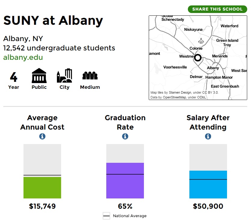
Last week, the White House announced an important innovation in higher education data availability. For the first time, the U.S. Department of Education has made institution level earnings information available to the public.i Students shopping for a college can now log on to the College Scorecard and see earnings information alongside other important factors, such as cost and graduation rate (as seen in Figure 1). The availability of this data makes it possible for consumers of higher education to use a cost-benefit framework to make savvier decisions about college.ii Simply put, they can compare the upfront cost of tuition to the benefits that they are likely to receive in the form of heightened future wages. This has the potential to create both individual and systemic benefits.
Figure 1. Example of College Scorecard Entry
The availability of this information empowers the consumers of higher education to utilize choice, which can elicit competition and innovation. As the theory goes, with this information in hand, students have the opportunity to demand a price for enrollment that is in line with the value that an institution provides, and the invisible hand will phase out institutions that do not respond to this incentive.
This makes sense in theory, but will information on price and outcomes actually change the market in higher education? That depends on a few different factors. First, it will depend on the extent to which institutions are reliant on students’ tuition dollars to balance their budgets and therefor need to take consumer preferences into account. This remains to be seen, but we have some evidence to the contrary. For example, according to the National Center on Education Statistics, tuition and fees only comprised between 17 (at two-year institutions) and 22 (at four-year institutions) percent of revenues at public institutions in 2012. If an institution’s funding does not change appreciably when it loses enrollment to a competitor school, then that institution will not have an incentive to innovate in order to maintain enrollment. Second, the power of this information to affect change will depend on whether consumers access and use it to make decisions about college. That will likely depend, in part, on the degree to which prospective students actually have choice in a practical sense. So, what does choice look like in the market for higher education?
In one sense, we have a national market for higher education. Students are free to spend their federal aid dollars at brick and mortar institutions across the country. Though some students relocate their home (temporarily or permanently) in order to enroll at a particular institution, the reality is that most students face some geographic constraints when they shop for college. According to research published by ACT, students travel a median distance of 51 miles to go to college, though some groups of students are more mobile than others. Higher achieving students typically travel farther, as do students from households with more educated parents. First generation students travel a median distance of only 24 miles to their college. This means that the opportunity for students to exercise choice is constrained by the options available in their geographic region.
The map below provides an illustration of the geography of educational opportunity across the United States. Clearly, there is significant variation in the density of higher education markets across throughout the U.S. Some regions contain a number of colleges for students to choose from, while others (often with lower population density) have few, if any, options.
Figure 2. Institutions of Higher Education and Population Density in the U.S.
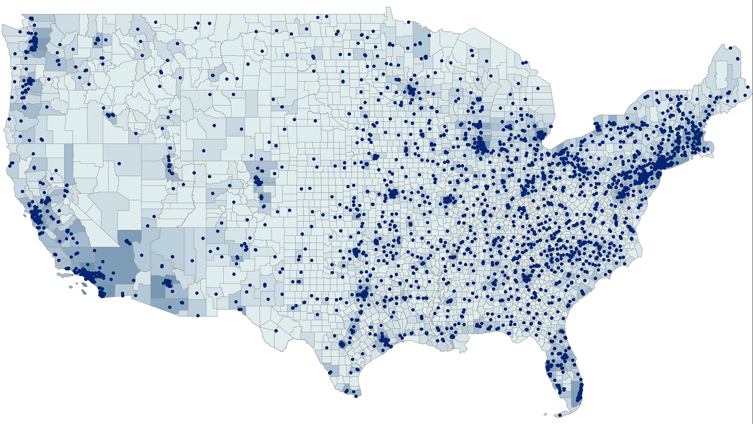
Notes: Points represent all non-for profit colleges and universities. Shading represents population density. The progression from light to dark represents the progression from low density to high density.
To explore this further, we carried out a preliminary empirical analysis using county-level population data from the 2010 Census and geocodes for all institutions appearing in IPEDS in 2010, excluding for-profit institutions.iii Our analysis shows that most of the population (99.5 percent) has at least one institution of higher education within 51 miles of their home. However, that number falls dramatically when you look only at public institutions, which are the most affordable option for most households. We find that only 65 percent of individuals live within 51 miles of a public college and less than 1 in 5 people (19 percent) live within 51 miles of a public 4-year institution.
Figure 3. Percent of the U.S. Population with one, three and five Institutions of Higher Education within 5-50 Miles from their Home
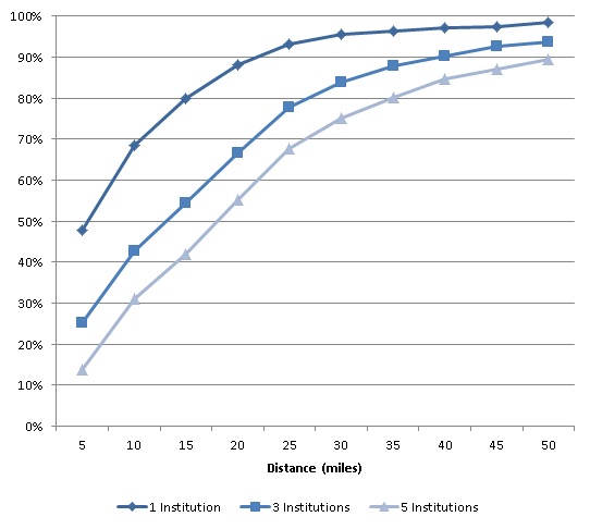
We also want to know the extent to which local education markets provide multiple options for students. We find that about 95 percent of individuals have at least three institutions within a moderate distance of their home (51 miles), but that number drops to less than 50 percent if the individual wishes to attend a public institution.iv Of course, student preference regarding things like program of study and selectivity limit the practical choice set even further. Online education offers an alternative that could supplement the set of options for potential students, but the take-up of online education in higher education is still rather small.
To the extent that students are immobile, choice is constrained. Therefore, the potential for institutions to improve in response to changes in consumer demand resulting from an increase in the information available is limited. It is not practical to propose filling these “education deserts” with new brick and mortar institutions, but we should think carefully about how this variation in market density combined with practical limitations on moving impact opportunity and the ability for choice to drive innovation.
i. Published figures are based on the population of former students who receiving federal student aid.
ii. There is precedent for consumers carrying out this type of research when making other big ticket purchases. For instance, car buyers often utilize data on depreciation and lifetime cost of maintenance when choosing a vehicle.
iii. The distance (as the crow flies) between the center of the county and all institutions, up to 60 miles away, was calculated using ArcMap software. We then used these distances to estimate the percent of the population within some specified number of miles of one or more institutions.
iv.New research by Nicholas Hillman examines how the geographic market for higher education varies for different minority groups.
The Brookings Institution is committed to quality, independence, and impact.
We are supported by a diverse array of funders. In line with our values and policies, each Brookings publication represents the sole views of its author(s).