The issue of high and rising income inequality continues to influence policy and political debates at all levels of government. Local officials, such as mayors and county executives, are increasingly finding themselves at the center
of those debates given a federal government hamstrung by partisan gridlock and budget constraints.
The localization of the debate also reflects new research by Stanford economist Raj Chetty and colleagues that finds local conditions and dynamics matter importantly to economic mobility for the poor. And although Kentucky senator and GOP presidential candidate Rand Paul misleadingly blamed them for the high inequality present in their cities, many Democratic mayors have embraced tackling inequality as a framework for advancing a range of progressive policies on issues such as wages, education, and affordable housing.
Inequality at the local level may be undesirable for a variety of reasons. It may diminish the ability of schools to maintain mixed-income populations that produce better outcomes for low-income students. It may narrow the tax base from which municipalities raise the revenues needed to provide essential public services and weaken the collective political will to make those investments. And local inequality may raise the price of private-sector goods and services for poor households, making it even more difficult for them to get by on their limited incomes.
To understand the state of local inequality today, this analysis updates and extends previous Brookings analyses of income inequality in cities. Like those earlier analyses, it focuses on the difference between incomes near the top of the distribution—for households earning more than 95 percent of all other households—and those closer to the bottom of the distribution—for households earning more than only 20 percent of all other households. It measures the gap between the two using what we call the “95/20 ratio.” This analysis examines that ratio for each of the 100 largest U.S. metro areas, and the largest city in each of those metro areas, using new data from the 2014 American Community Survey (ACS).1 It also examines trends since 2007, before the onset of the Great Recession. (All dollar amounts are adjusted for inflation to 2014 levels.)
City and metro income inequality in 2014
On household income, both large metro areas and their big cities tend to be more unequal places than the nation as a whole. In 2014, the 95/20 ratio for the United States was 9.3. For the 100 largest metro areas in the aggregate, that ratio was 9.7, and for big cities in those metro areas, it was 11.8. Only 18 metro areas had inequality ratios exceeding the national average (they tend to be larger areas that pull up the overall average), while the same was true for 59 of the 97 largest cities in those metro areas.
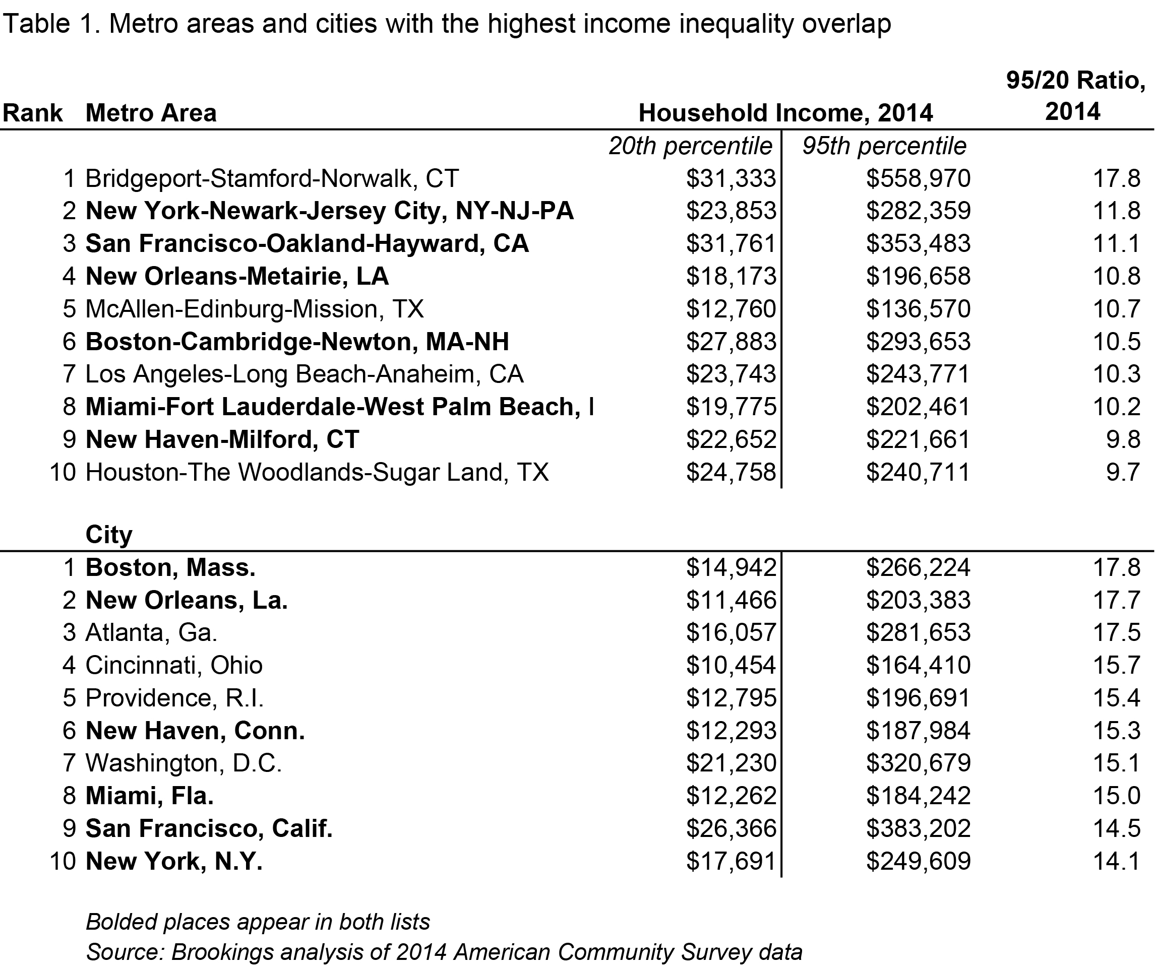
The large metropolitan areas with the highest levels of income inequality in 2014 included some usual suspects, but also a couple surprises (Table 1). The Bridgeport area—equivalent to the New York suburb of Fairfield County, Conn.—led the list, largely due to the very high incomes registered by its top earners (at least $560,000 for the top 5 percent of households).2 Two nearby metro areas—Greater New York and New Haven—also landed in the top 10, as did Northeast neighbor Boston. On the West Coast, both the San Francisco and Los Angeles metro areas also exhibited high levels of income inequality. So did the Southern metro areas of New Orleans, Miami, and Houston, the former two largely due to the low incomes earned by their poorer households (below $20,000 in both cases).
Low levels of metro inequality also characterize a diverse set of places (see Appendix for full list). Metro areas along the Wasatch Front in Utah—Ogden, Provo, and Salt Lake City—all rank among those with the 10 lowest inequality ratios. Honolulu and Las Vegas also represent the West among this group. Yet income differences in a few older Northeast and Midwest regions, including Albany, Grand Rapids, and Harrisburg, are also quite low. Like their Utah counterparts, these places tend to have somewhat more homogeneous populations and industrial structures that result in smaller income disparities overall.
Many cities with the highest levels of income inequality in 2014 reflect broader patterns across their metro areas. Boston leads the city list; its large student population partly explains its relatively low 20th percentile incomes. The cities of Miami, New Haven, New Orleans, New York, and San Francisco, like Boston, anchor metro areas that also registered very high inequality. Joining them are Atlanta and Washington, D.C., cities that house many poor and rich residents, as well as Cincinnati and Providence, which exhibit relatively high poverty and very low incomes among their bottom-earning households.
Likewise, a few of the lowest-inequality cities lie within the lowest-inequality metro areas, namely Las Vegas, Omaha, and Provo. In general, the 10 cities with the smallest income disparities are geographically large Sun Belt places (including three in Florida and two in Southern California) that incorporate significant areas of suburban-style communities within their borders, and thus boast larger middle class populations relative to most cities.
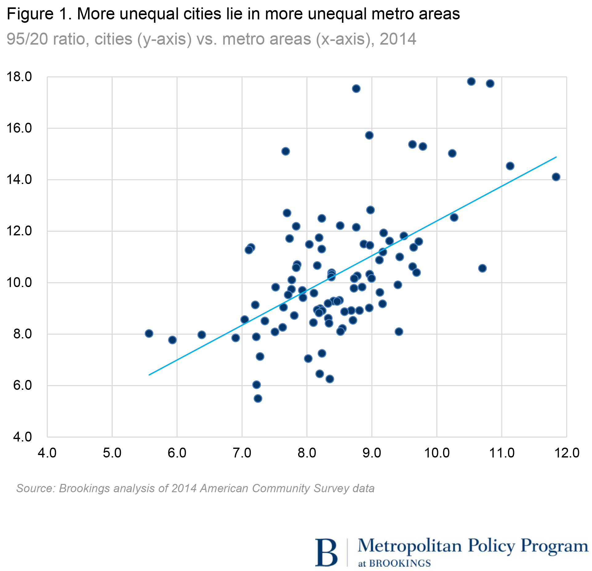
In general, cities with higher income inequality are located in metro areas that also exhibit higher income inequality (Figure 1).3 Of the 97 cities analyzed, 84 had higher inequality than their wider metro areas. Atlanta exhibited the largest difference between its city and region; high-income households in the city earned 17.5 times their low-income counterparts in 2014, twice the disparity seen across the metro area as a whole. Like many other cities, Atlanta contains some of the most sought-after housing and neighborhoods in its region, as well as several of the metro area’s poorest communities and much of its subsidized housing.
 Changes in city and metro income inequality from 2007 to 2014
Household income inequality in the United States is higher today than before the Great Recession. Between 2007 and 2014, the 95/20 ratio nationwide rose from 8.5 to 9.3.
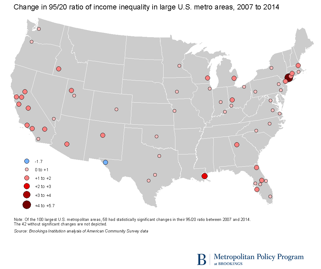
Most places mirror that overall trend, though by varying degrees. Among the 100 largest metro areas, 57 have a significantly higher 95/20 ratio in 2014 than in 2007 (Map 1). Most metro areas experienced increases because top incomes were stable or declined modestly over this period, while incomes near the bottom dropped substantially. Indeed, double-digit slides in 20th percentile incomes were quite common across large metro areas. High-income households earned significantly less in 2014 than in 2007 in 33 of the 100 largest metro areas, but the same was true for low-income households in fully 81 of those metro areas. Many of the metro areas experiencing the largest inequality increases also ranked among those with the highest inequality levels in 2014, such as Bridgeport, New Orleans, San Francisco, Boston, and New Haven (Table 2).
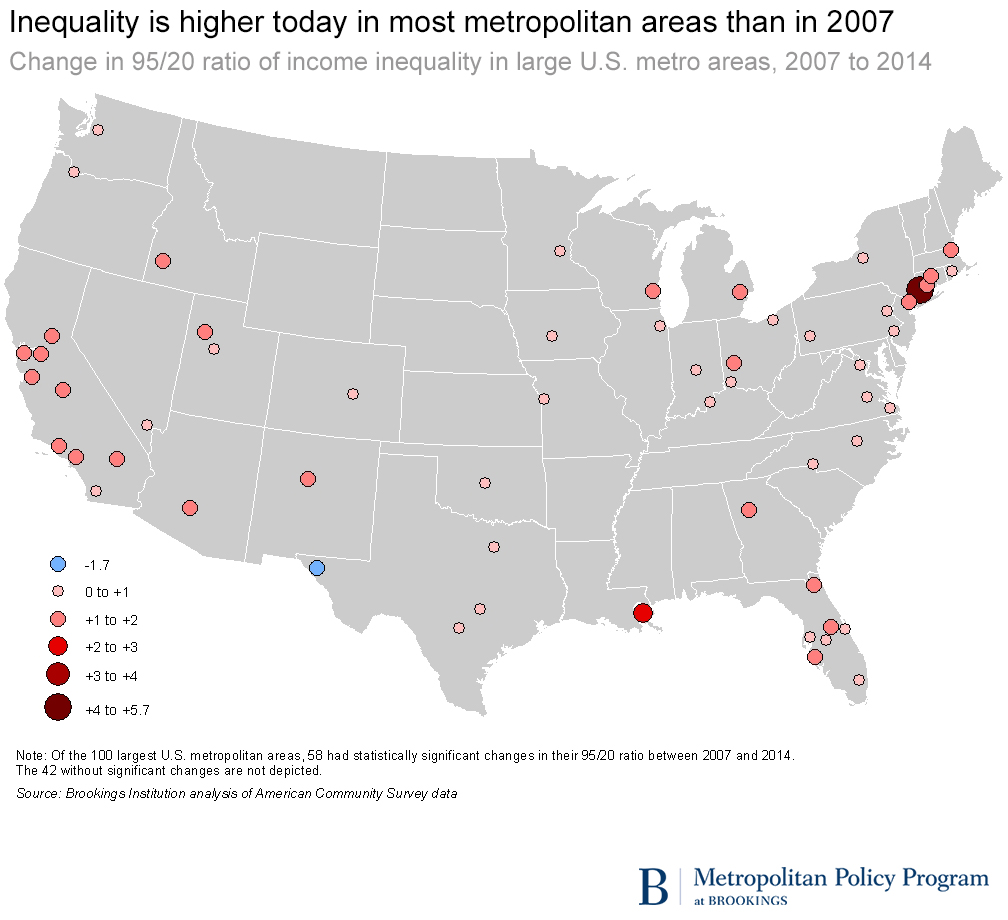
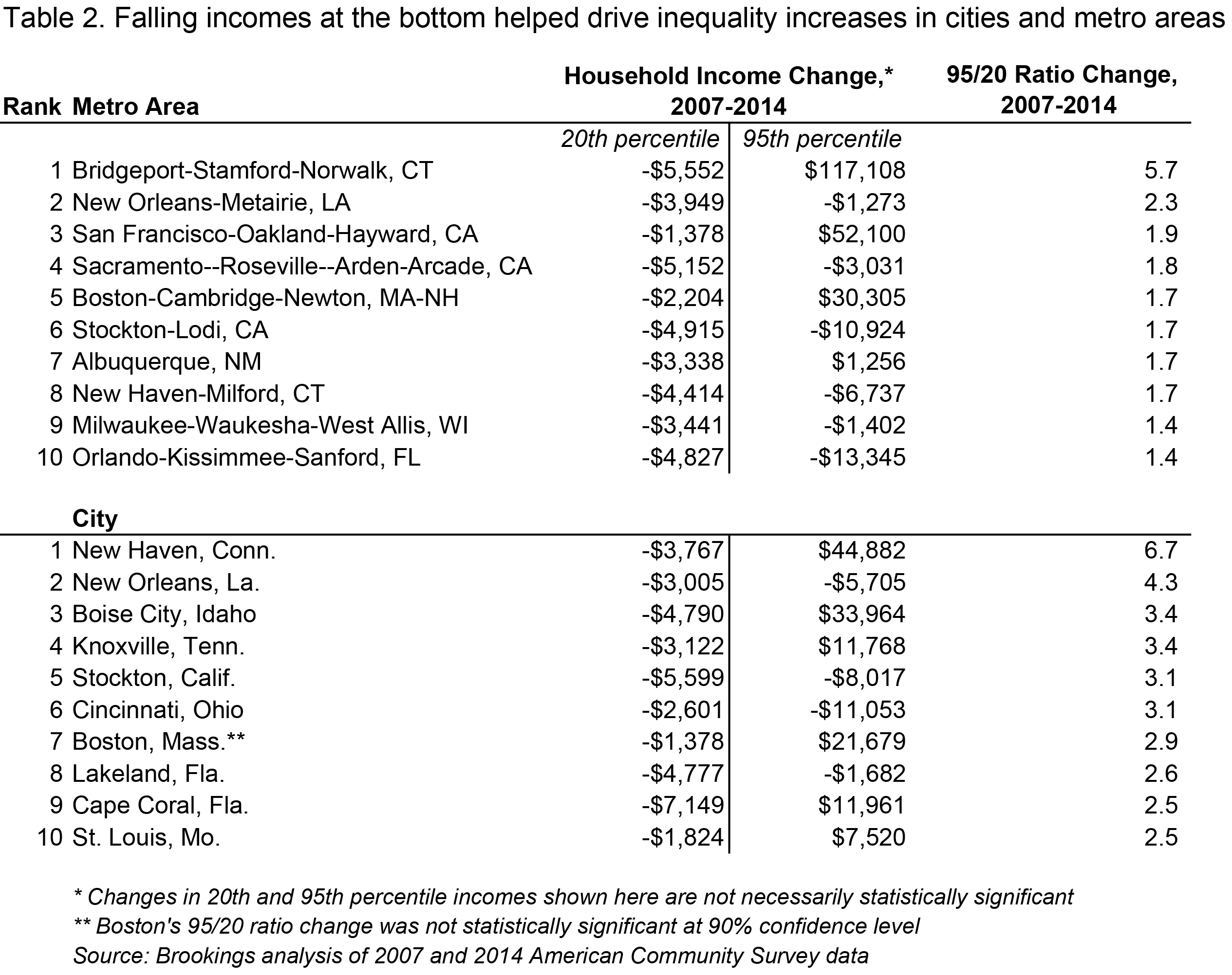
Increases in income inequality among cities were also common, though fewer registered statistically significant increases (due largely to smaller sample sizes in the Census data). The largest significant increases occurred across a range of mid-sized cities, such as New Haven, New Orleans, Boise, Knoxville, Stockton, and Cincinnati, in all cases driven by steep income declines at the low end (generally greater than 25 percent). A similar pattern affected the central Florida cities of Lakeland and Cape Coral. None saw incomes rise significantly at the top end, but the substantial ground low earners lost opened up even wider chasms between the rich and poor in those cities. In fact, only two cities—Denver and El Paso—had 20th percentile incomes significantly higher in 2014 than in 2007.
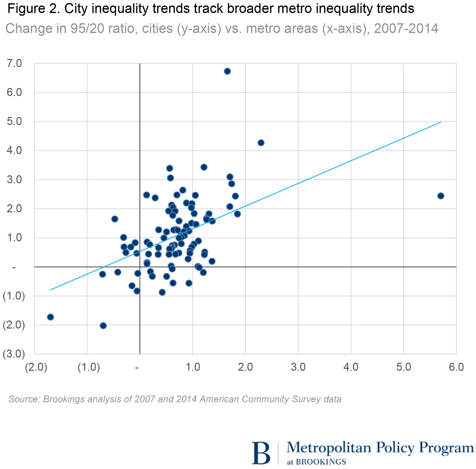
Similar to levels of income inequality, changes in inequality in cities and their metro areas also track one another (Figure 2). Of the 36 cities where the 95/20 ratio rose significantly from 2007 to 2014, 29 are located in metro areas where that ratio also rose significantly. The relationship between income changes for low earners at the city and metropolitan levels was even stronger than that for high earners or overall inequality ratios. Thus income trends in cities, particularly for the least well off, tend to reflect wider changes affecting the metropolitan economies in which those cities are situated.
 The relationship between inequality and affordability in cities
As noted in the Introduction, local inequality may serve to raise prices for poor households. The latest Census data provide some new evidence on that consideration, specifically with respect to housing costs.4 We calculate the annual costs a household would pay for a rental unit at the 20th percentile of the cost distribution in each city. For instance, in Washington, D.C., a unit that rents for $857/month, or $10,286 annually, is more expensive than only 20 percent of all other units in the city. We then compare that amount to the 20th percentile household income in Washington, which is $21,230. The 20th percentile rent in Washington thus represents 48 percent of 20th percentile income in the city ($10,286 divided by $21,230). In Denver, that proportion is 38 percent, because that city’s 20th percentile rental costs are lower ($8,471 annually) and its 20th percentile incomes are slightly higher ($22,154).
Overall, in cities and metro areas where inequality is higher, housing for lower-income households is less affordable (Figure 3). This pattern reflects in part the very low incomes poor households earn in places like Cincinnati, St. Louis, Cleveland, and Hartford. Those low incomes not only produce high inequality measures in those cities, but also tend to make their housing unaffordable to poor households, even though their local housing is inexpensive relative to other cities. Yet lower-income households in cities such as Washington, Los Angeles, New York, and Chicago also face clear affordability challenges even though they earn higher incomes than their counterparts in most other cities. And housing for low-income households appears least affordable in high-inequality cities such as New Orleans and Miami, where 20th percentile rental costs represent nearly 70 percent of 20th percentile incomes.5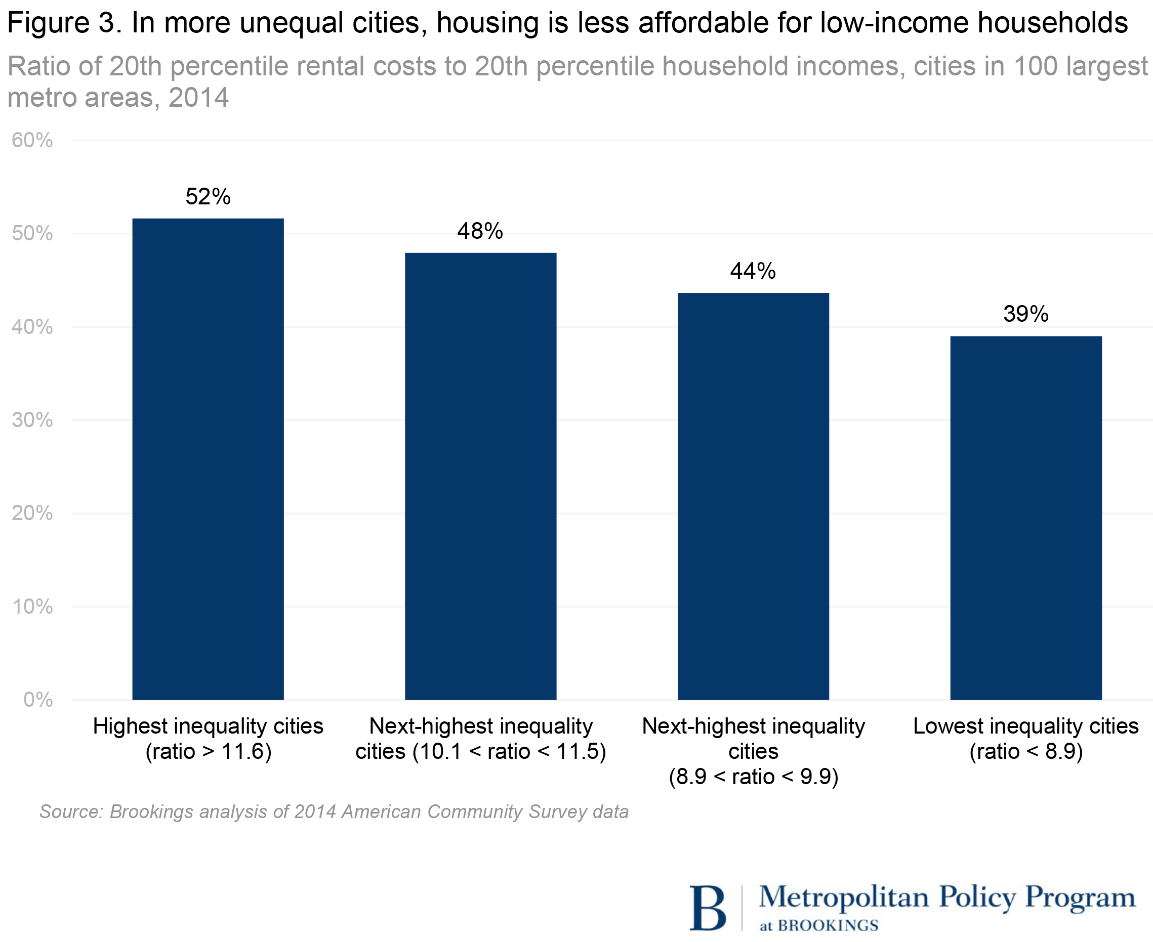
To be sure, many low-income households receive housing subsidies that reduce their rental cost burdens. Yet local inequality may serve to raise the price governments pay for those subsidies (e.g., for vouchers that cover the difference between “fair market rents” and 30 percent of household income). And for the majority of eligible low-income households who do not receive such subsidies, higher private market rents can pose serious financial challenges.
At the same time, some cities where lack of affordable housing is widely acknowledged as a problem—such as San Francisco, Seattle, San Diego—don’t rise to the top of this housing-cost burden list. San Francisco has a very high 95/20 ratio (14.5), yet its low-income households earn high incomes ($26,400) relative to those in other cities. Seattle and San Diego actually exhibit lower-than-average inequality, also owing to their relatively better-off low-income households. That housing appears more affordable to the poor in these cities does not, however, confirm that they necessarily have sufficient affordable housing. There may be many lower-income households who would like to live in those cities, perhaps to be closer to jobs, transit, or other key services and amenities, but simply do not earn enough to afford rents there.
Conclusion
Discussions around how society should respond to income inequality, particularly at the local level, reflect important realities revealed in this analysis. Inequality is indeed high and rising in most places, with the Great Recession and subsequent lackluster recovery exacerbating already-significant gaps between rich and poor households. Yet the magnitude of inequality, its sources, and its trajectory vary markedly across the national landscape.
As local actors grapple with these realities, three additional findings from this analysis bear particular attention.
First, while the effective economic distance between rich and poor might be similar in two cities—Washington, D.C. and Providence, R.I., for instance—the responses to it may need to be quite different. A much higher proportion of Providence’s population lives below poverty, while Washington has a much larger contingent of high-income households. The city of Providence, relatedly, faces much greater fiscal and economic constraints to narrowing income inequality than Washington. Thus, cities situated similarly on our simple inequality measure may have very different tools available to them for confronting inequality’s underlying drivers and implications. Indeed, reducing poverty and improving economic mobility may be more relevant goals for many cities than reducing inequality per se; Providence may actually need more high-income households in order to boost its tax base and improve the quality of its public services.
Second, inequality is most often a function of economic forces acting not at the city scale alone, but at the wider metropolitan scale. This is evident in the strong relationship that exists between levels and changes in income inequality over time in cities and the metro areas they anchor. Thus, comprehensive strategies to address the effects of gaps between rich and poor households should engage regional, as well as local, actors and institutions around issues such as education and workforce development, transportation, and even minimum and living wages.
And third, inequality seems to impact poor households specifically through the housing market, by making rental housing less affordable relative to their incomes. Housing is an area where local officials—mayors, city councilors, county executives and commissioners—have somewhat greater scope to address needs, at least by influencing the supply side of the market. Because rental cost burdens for low-income households are very high in most big cities, local leaders should consider monitoring the relationship between income and rental costs at different points in the distribution—not just at the low end, but in the middle as well—to ensure their efforts respond adequately to those affordability challenges and preserve housing opportunities for a wide range of workers and families.
Endnotes
1. These metro areas have populations of at least 542,000 in 2014. City data are reported for 97 of the 100 metro areas; in three metro areas, the largest city is too small to be reflected in the 2014 one-year ACS data.2. The estimate for the 95th percentile income in the Bridgeport metro area has a considerable margin of error of +/- $138,000.3. This relationship does not simply reflect the contribution of cities to overall metro population; controlling for the share of metropolitan population in the largest city, the 95/20 ratio for metro areas is still positively and significantly associated with the ratio for their cities.4. We focus on cities here because municipalities play a large role in determining the supply and location of housing through zoning and land-use policies. The same patterns described here hold, though somewhat less strongly, for metropolitan areas. The correlation between city inequality and 20th percentile rent cost burden has a coefficient of 0.52; the equivalent correlation for metro areas has a coefficient of 0.36. 5. In a simple linear regression that controls for the 20th percentile income in cities, the 95th percentile income in cities is positively and significantly associated with their 20th percentile rental costs. This suggests that inequality matters to low-income housing costs independent of income levels at the low end.
Authors


The Brookings Institution is committed to quality, independence, and impact.
We are supported by a diverse array of funders. In line with our values and policies, each Brookings publication represents the sole views of its author(s).