Is the upper middle class really pulling away from ordinary Americans, as we claimed in the first post in this series, or is it really just the top 1 percent? A lot of people have asked us that question, and it’s a good one.
Short answer: No. It is certainly true that plotting the income growth of the top 1 percent adds drama to any graph. Using the left-hand scale necessary—here, up to $2 million—for the high numbers at the top has the effect of flattening the lines below:
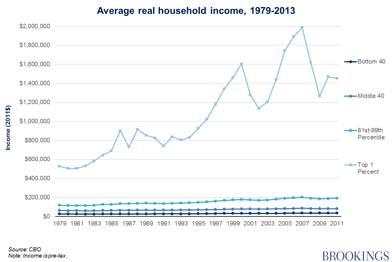
Looking at this picture, you might wonder why we are bothering to write about the upper middle class at all. After all, they look to be bumping along the bottom with most of the population. Maybe they are perfectly justified in fighting to fight to keep their 529s and mortgage deductions.
But now take a look at the trend in income growth for the 19 percent just below the top 1 percent by comparison to the rest:
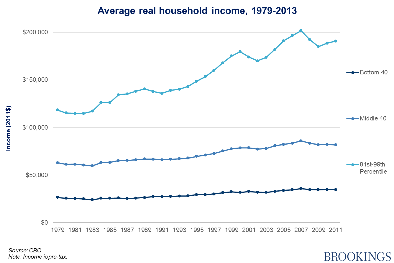
Of course, the left-hand income scale has been adjusted accordingly, now reaching up to only $205,000. But it is clear that even when the upper class (top 1 percent) is taken out of the picture, the upper middle class are pulling away from those below them in the income distribution. For further reading, see this post on the CBO trends from our colleague Gary Burtless.
(Important data notes: this is a different series to the one presented previously, because the Census Bureau’s Current Population Survey (CPS) used in the last post cannot strip out the top 1 percent due to data constraints. Instead, we have used the Congressional Budget Office’s (CBO) analysis, which does separate the top 1 percent from the remaining 19 percent of the upper quintile. Unlike the CPS metric, the CBO income measure also includes noncash government transfers, employer-sponsored health insurance, and an estimate of the share of corporate taxes borne by workers, not included in the definition of pre-tax income in the series used for the last post. The CBO measure also uses a different index to adjust for inflation: the PCE deflator. The PCE deflator controls for price changes in consumer goods and services and is the Fed’s preferred inflation measure. The previous CPS data used the CPI-U-RS deflator, which fails to adequately account for consumers’ ability to substitute between goods and includes quality adjustments for goods like automobiles and personal computers. The concern is that this metric may understate real purchasing power improvements. The choice of deflator is a crucial (though often ignored), issue when it comes to estimating real income gains—see Scott Winship’s excellent piece here for more on this point—but has little effect on distributional patterns.)
While the rise in income and wealth at the very top is eye-catching, it also distracts attention from the action a little lower down the income distribution. The idea that the real divide is between ordinary members of the bottom 99 percent and the rich 1 percent is a dangerous one, since it makes it easier for those in the upper middle class to convince themselves they are in the same economic boat as the rest of America; they’re not.
The Brookings Institution is committed to quality, independence, and impact.
We are supported by a diverse array of funders. In line with our values and policies, each Brookings publication represents the sole views of its author(s).


Commentary
Not just the 1%: Upper middle class income separation
September 10, 2015