As 2015 closes, we look back on another year’s worth of data and information from Brookings research, packaged beautifully into infographics and interactives. Below are some of our favorites, presented in no particular order. (Because you can’t get enough great charts, see our 2014 post, too).
From the AEI-Brookings Working Group on Poverty and Opportunity, a chart demonstrating how an increase in households headed by single moms has resulted in more children being born into poverty.

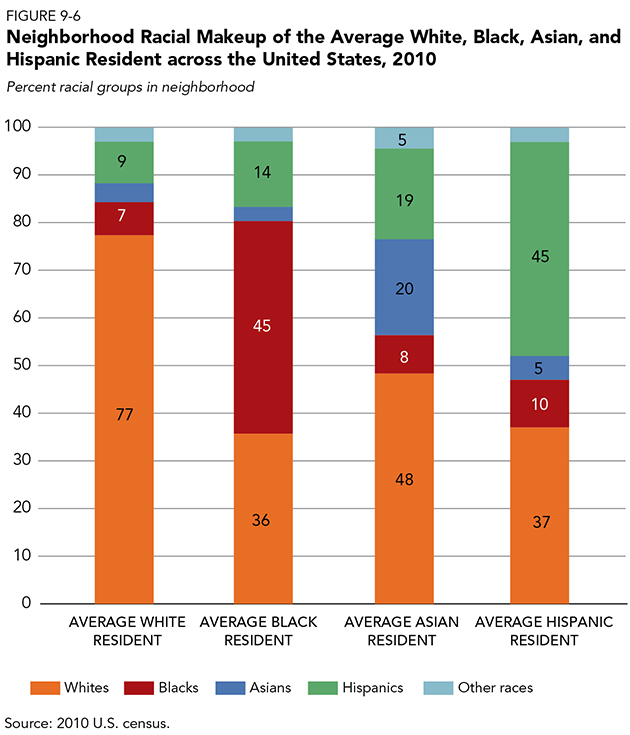
William Frey, author of “Diversity Explosion,” presents data on neighborhoods’ racial composition to show where the “average” resident of that race lives. For a county-by-county interactive of racial composition, visit the Diversity Explosion interactive.
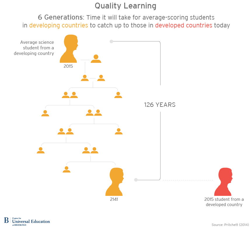
The “gulf in average levels of education between rich and poor countries remains huge” despite massive growth in the number of children attending primary school, write Rebecca Winthrop and Eileen McGivney. In their report and series of charts, “Why Wait 100 Years? Bridging the gap in global education,” they argue for a “fundamental rethinking of current approaches to education.”
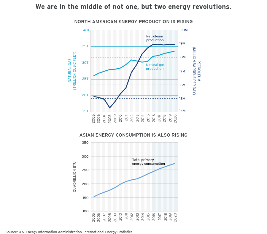
In “The Risk Pivot,” Bruce Jones and David Steven examine two energy revolutions: Asia’s growth in demand, and America’s revolution in technology and markets. They demonstrate the issues in a slide show, starting with the image below.
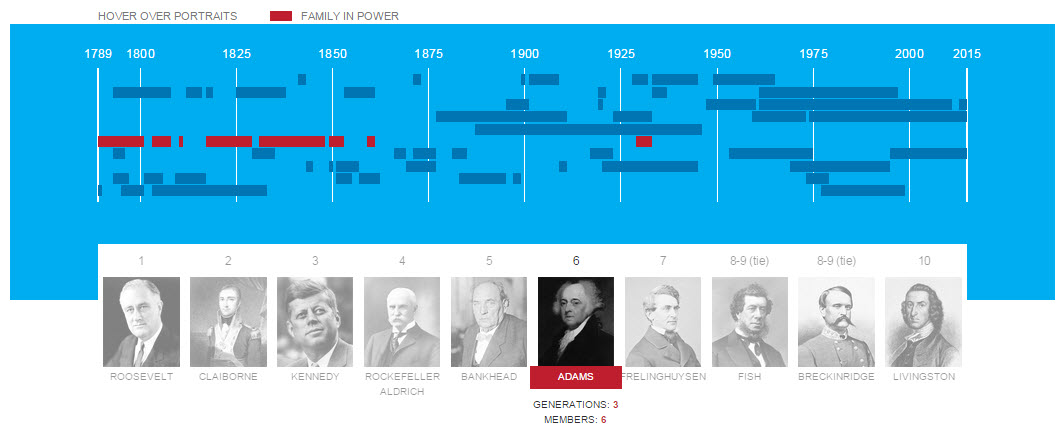
In his new book, “America’s Political Dynasties,” Steve Hess explores the families that have dominated American politics, from the Adamses to the Bushes and Clintons. The image below comes from a fascinating interactive, The Greatness Scale, that measures the depth and breadth of American political families. Find out which dynasty is “the greatest.”
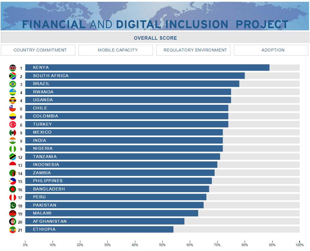
As part of the Financial and Digital Inclusion Project, John Villasenor, Darrell West, and Robin Lewis present data on “access to and usage of affordable financial services by underserved people across 21 countries.” The image below, from an interactive that presents scores across four dimensions, is each country’s overall score.
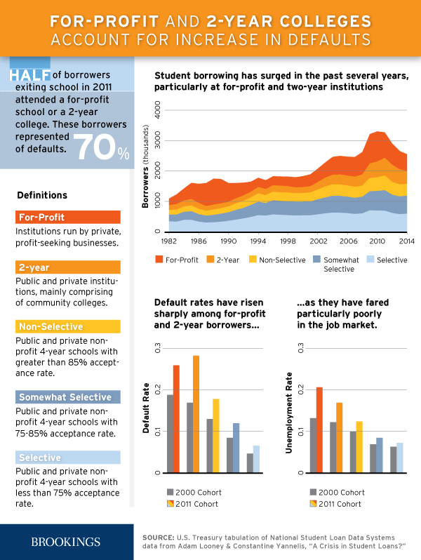
Is there really a crisis in student loan debt? In new research for the Brookings Papers on Economic Policy, Adam Looney and Constantine Yannelis show that “most of the increase in default is associated with the rise in the number of borrowers at for-profit schools and, to a lesser extent, 2-year institutions and certain other non-selective institutions.” Also, watch this video in which David Wessel breaks down the facts behind the issue.
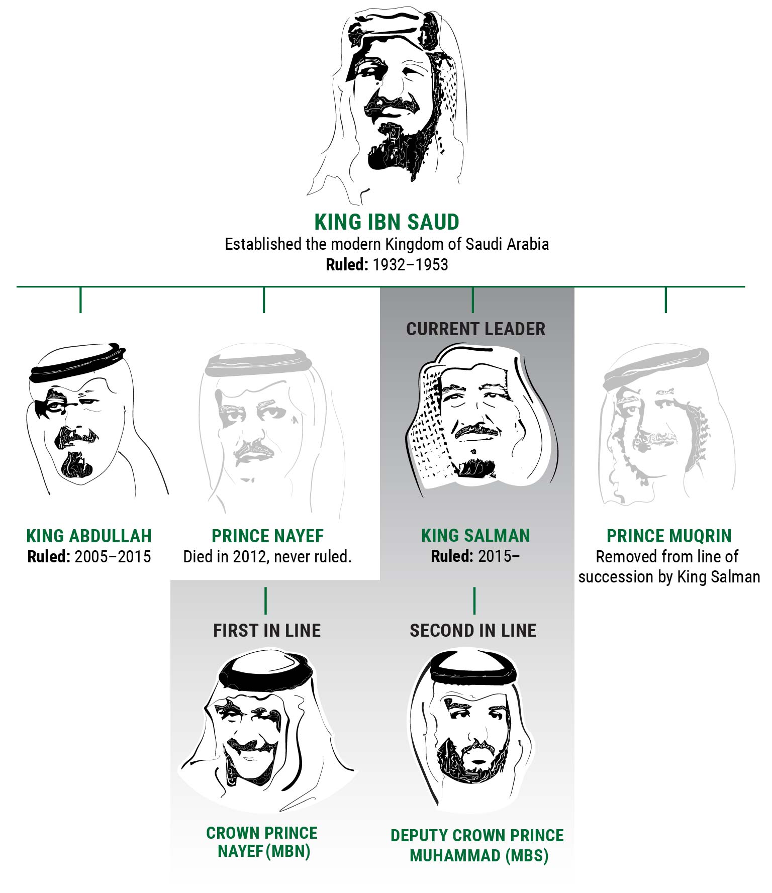
In his Brookings Essay, Bruce Riedel profiles Saudi Crown Prince Muhammad bin Nayef, the “prince of counterterrorism,” and nephew of King Salman. The line of succession graphic shows the crown prince’s relationship to the current and previous kings.
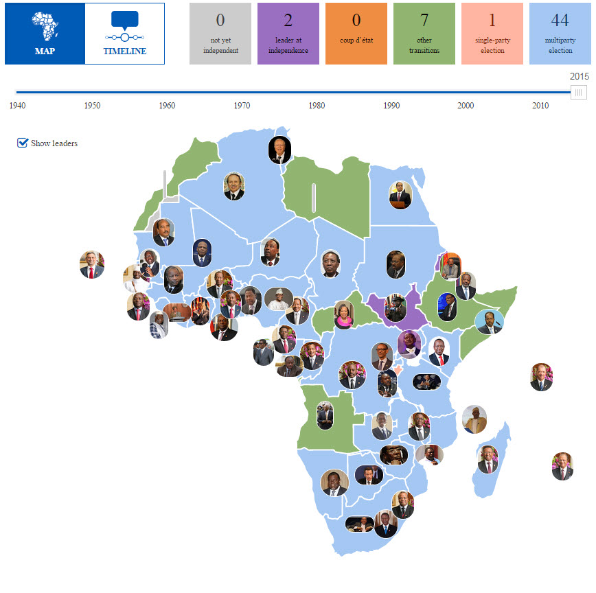
The African Leadership Transitions Tracker (ALTT) is an interactive feature that factually recounts and visually presents changes at the head of state level in every African country from independence or end of the colonial period to the present. The image below is a still from the interactive map.
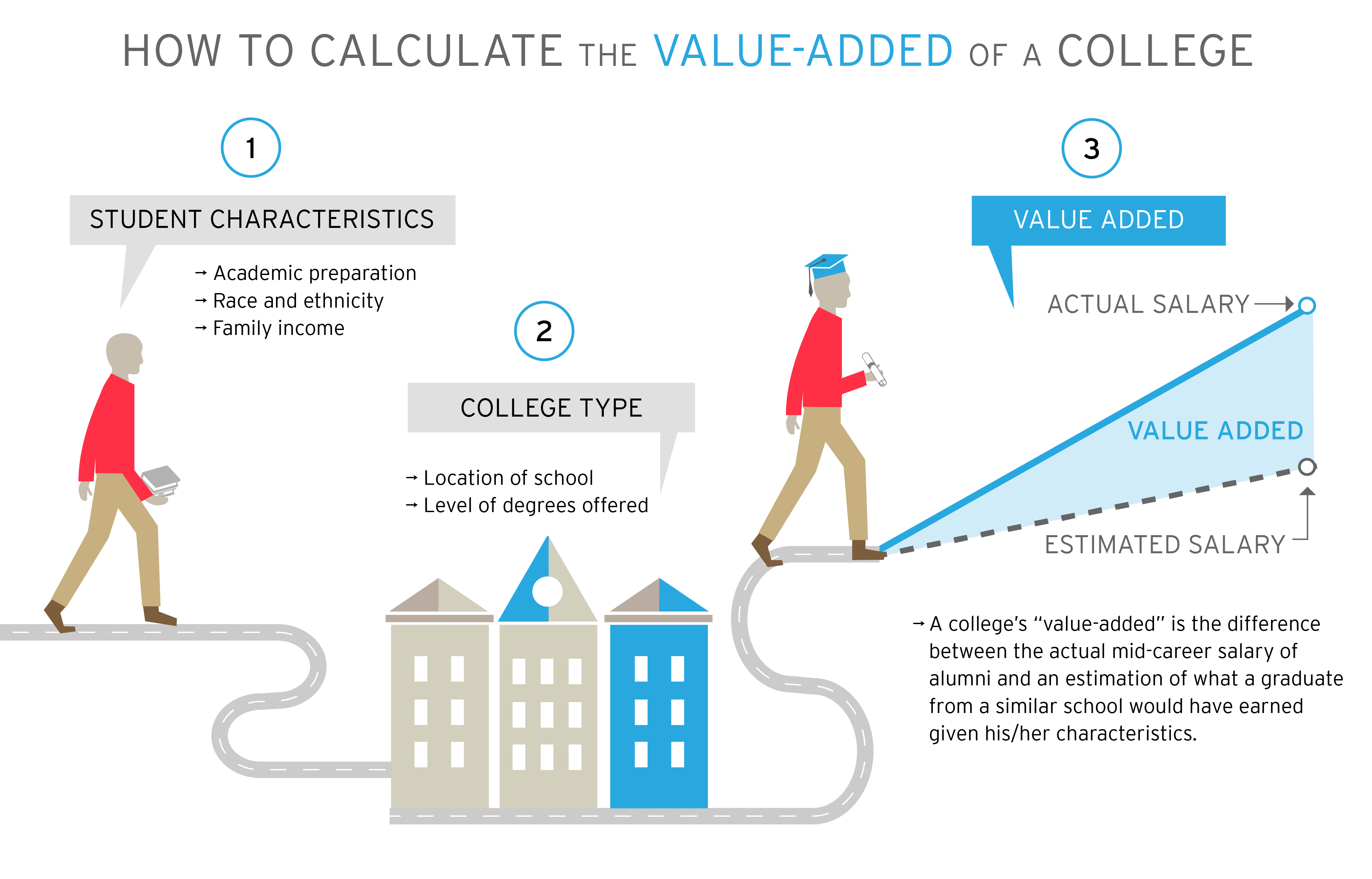
In “Beyond College Rankings: A value-added approach to assessing two- and four-year schools,” Jonathan Rothwell and Siddharth Kulkarni present data to improve on conventional college rankings. See also their updated report based on new Obama administration College Scorecard data.
Related Books


The Brookings Institution is committed to quality, independence, and impact.
We are supported by a diverse array of funders. In line with our values and policies, each Brookings publication represents the sole views of its author(s).
Commentary
Best Brookings infographics of 2015
December 30, 2015