

Last week, the latest scores from the National Assessment of Educational Progress (NAEP) were released. The state of Tennessee performed exceptionally well, registering statistically significant gains from 2011 to 2013 on all four NAEP tests: fourth grade reading, fourth grade math, eighth grade reading, and eighth grade math. Tennesseans should be pleased with the progress the state is making in education.
All politicians hype favorable test statistics. The hype that Tennessee officials produced for the release of 2013 NAEP scores was remarkable. In front of a large audience assembled for the event, Governor Bill Haslam played a beautifully produced video. Several classrooms of adorable Tennessee kids count down the states from tenth to first place in NAEP gains (the segment starts at 3:27 on the video). As the numbers flash, the name of each state appears. Kids chant the appropriate state’s name for each ranking. The drama reaches a crescendo when “#1” flashes. After a pause, the screen splits into several classrooms of kids shouting “Tennessee!” The applause from the audience went on for an extended period.
The governor then displayed a large chart with the rankings. Tennessee was ranked #1 with a gain of +21.80 points, Indiana #2 with a 14.67 point gain, Washington #3 with a gain of 13.93 points, followed by the rest of the states. “It really wasn’t even close,” the governor proclaimed. “We literally blew away the other states.”
I hate to be a skunk at the picnic and really, truly—cross my heart and hope to die—do not want to disappoint a bunch of first graders. But the governor can only say that Tennessee is number one because the chart leaves out the District of Columbia (DC), presumably because it’s not a “state.” That’s pretty weak. DC also participates in NAEP, has plenty of adorable kids, and takes NAEP tests on the same testing schedule as the fifty states. Its NAEP scores are routinely reported along with the states when scores are released. How did it do? DC’s total NAEP gain on Governor Haslam’s statistic was 22.22 points, nipping TN for number one.
But there’s a more serious matter. Governor Haslam’s chart is based on a very crude statistic. Tennessee’s gains on all four NAEP tests add up to 21.80 points—and DC’s to 22.22—but the tests have different scales. A one-point gain on NAEP’s 4th grade math test is not the same as a one-point gain on the 8th grade reading test. The NAEP website warns users, “Since these scales are calculated independently from each other, we cannot compare scale scores across subjects and grades.” The same goes for adding scale score gains from the different tests. If you search the NAEP website for a statistic like the one on Governor Haslam’s chart—combining gains on all four tests—you won’t find one.
The governor’s chart also reinforces common statistical errors. Test score rankings are tricky. They are often misinterpreted, especially if they are taken from data based on sampling. To help explain this, I created four Excel spreadsheets—one for each of the 2013 NAEP tests: 4th grade math; 8th grade math; 4th grade reading; and 8th grade reading—that show how states can be compared on NAEP. The data for the charts were downloaded from the NAEP Data Explorer, which I urge readers to investigate on their own. I have reformatted the data to make state-to-state comparisons easy. The data illustrate several pitfalls to avoid, on NAEP or any other test, when interpreting rankings.
NAEP Scores
First, a brief explanation of how rankings are constructed. Not every student in a state takes NAEP, only a random sample of students. The scores that are reported, therefore, are estimates of states’ average scores. Estimates based on sampling contain error. Sampling error is not like an error in baseball. It does not mean a mistake has occurred. It is more like a description of the wiggle room that must be taken into account when making estimates from samples.
The wiggle room has a name, standard error. NAEP’s gain scores have standard errors. Standard errors are used to create confidence intervals. Most people know confidence intervals from political polls. Pollsters say that their estimates of a candidate’s support are valid plus or minus a certain percent. That plus or minus places wiggle room on both sides of a poll estimate to show you the range of percentages that a singly reported percentage truly represents.
The same holds true for NAEP scores and their confidence intervals. Confidence intervals are a good reminder that a reported score isn’t the end of the story. The convention in NAEP testing is to create 95% confidence intervals (expressed as p<.05), and it is common to hear analysts say that we can be 95% confident that a particular state’s score is different from another state’s. That means that the confidence intervals of the two scores do not overlap. If the confidence intervals overlap, then they share possible values, and it cannot be determined with 95% confidence that the two scores are different. The p-value (e.g., p<.05), tells us the maximum error rate that is acceptable. In the case of public opinion polls, for example, a p-value of p<.05 means that if the poll were repeated an infinite number of times, the true value of a candidate’s support would fall outside the confidence interval no more than 5% of the time.
Let’s now turn to tables of data that compare the states’ NAEP score changes from 2011 to 2013.
How to Read the Tables
Figure 1. shows a screen shot of the upper left-hand corner of Table 1, NAEP gains for fourth grade math. This corner is magnified to explain what each cell represents. The entire table is 51 X 51 (the 50 states and DC on both axes) so details are lost if taken in one gulp. We will do that below.
Figure 1. Close-up of Table 1, NAEP gains for fourth grade math
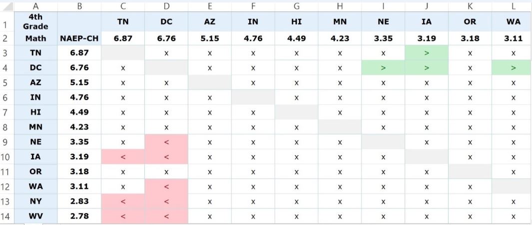
I have rank ordered the states by gain—both vertically and horizontally. In this screen shot, the top ten states are shown on the horizontal axis (column headers) and the top twelve states on the vertical axis (row headers). TN did quite well, with a gain of 6.87 scale score points, more than any other state. DC notched a similar gain, 6.76 points, AZ a gain of 5.15 points, and so on. The sign within the cell is referenced by the state in the row and color-coded for emphasis. The cells with a “>” (shaded green) indicate a statistically significant difference that is positive (i.e., the state on the row had gains that were greater than the intersecting state in the column). An “x” (shaded white) designates that two states’ score gains are not statistically significantly different. Cells shaded red indicate a statistically significant difference that is negative for the state in the row. In those cases, the column state did better.
One can see, for example, by scanning left to right on the first row, that TN’s gain is statistically significantly greater than IA (gain of 3.19) but not statistically significantly different from the gains of eight states: DC, AZ, IN, HI, MN, NE, OR, and WA. As stated above, the cells shaded in red indicate a negative difference. Locate NE on the vertical axis. Look at the data on NE’s row. NE’s gain of 3.35 points is statistically significantly less than DC’s gain of 6.76, but oddly enough, it is not statistically significantly different from TN’s larger gain of 6.87.
I hope by now that readers have been intrigued by a few findings.
- The intervals between rankings are not equal. For example, the difference between #1 and #2 is .11 points, but the distance between #2 and #3 is 1.61 points.
- Rankings make a lot of gains look distinct that are in fact indistinguishable. TN’s gain of 6.87 is not statistically significantly different from WA’s 3.11 gain. This is despite the fact that TN ranks #1 and WA ranks #10.
- Two states’ rankings, even if close, don’t always tell us how they individually compare to a third state. Let’s stick with TN and WA. Their gains of 6.87 (TN ranked #1) and 3.11 (WA ranked #10) are statistically indistinguishable, but IA’s gain (ranked #8) of 3.19—larger than WA’s—is distinguishable from TN’s. How can the #10 gain be more like the #1 gain than the #8 gain? The answer lies in the standard error for WA’s gain, which is larger than IA’s. As result, the p-value for the TN-WA difference is p = .0517. It just barely exceeds the .05 level. The p-value for the TN-IA difference is p = .0367, well under the .05 threshold.
Let’s now zoom out and examine the screenshot of the entire table. It’s not important to read the values in the table.
Figure 2. Full screenshot of Table 1, NAEP gains for fourth grade math
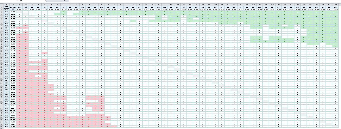
Notice that the table is dominated by white. Most state changes in NAEP scores are too similar to differentiate using a p<.05 test of statistical significance. The cluster of green cells in the upper right hand corner represents differences favoring the states on the rows. We discovered above that TN’s gain is not statistically significantly different from eight states. That long stretch of green on the top row illustrates the 42 states that TN did indeed outgain. DC’s gain (the second row) is statistically significantly larger than that of 44 states.
The cluster of red cells in the bottom left hand corner represents the states with the lowest gain scores. In fact, some of them registered losses on NAEP’s fourth grade test in math. MD occupies the very bottom row, with a decline of 1.94 scale score points. But also notice that MD’s test score decline is not statistically significantly different than the gain scores of 34 states. FL’s gain of 1.85 points, for example, is not statistically significantly different from MD’s loss.
Conclusion
I hope you find the four tables comparing state NAEP score changes informative. To conclude the discussion of TN’s gains, here is a summary of its statistically significant gains relative to the other 49 states and the District of Columbia.
- 4th Grade Math: Greater than 42 states. Not significantly greater than 8 states.
- 8th Grade Math: Greater than 15 states. Not significantly greater than 35 states.
- 4th Grade Reading: Greater than 22 states. Not significantly greater than 28 states.
- 8th Grade Reading: Greater than 34 states. Not significantly greater than 16 states.
Test scores are susceptible to spin by politicians, whether the politicians are Republicans or Democrats, liberals or conservatives, governors or mayors, incumbents or challengers, pro- or anti- practically any policy you can think of. Rankings are particularly vulnerable to spin—or other forms of misinterpretation—because they conceal information that statisticians consider important for proper interpretation. It’s important to look at the data on which rankings are based to see what’s really going on with test scores.
The Brookings Institution is committed to quality, independence, and impact.
We are supported by a diverse array of funders. In line with our values and policies, each Brookings publication represents the sole views of its author(s).