Editor’s note: The following remarks were prepared and delivered by Gary Burtless at a roundtable sponsored by the American Tax Policy Institute on January 7, 2016. Video of Burtless’ remarks are also available on the Institute’s website. Download the related slides at the right.
We are here to discuss income inequality, alternative ways to evaluate its size and trend over time, and how it might be affected by tax policy. My job is to introduce you to the problem of defining income and to show how the definition affects our understanding of inequality.
To eliminate suspense from the start: Nothing I am about to say undermines the popular narrative about recent inequality trends. For the past 35 years, U.S. inequality has increased. Inequality has increased noticeably, no matter what income definition you care to use. A couple of things you read in the newspaper are untrue under some income definitions. For example, under a comprehensive income definition it is false to claim that all the income gains of the past 2 or 3 decades have gone to the top 1 percent, or the top 5 percent, or the top 10 percent of income recipients. Middle- and low-income Americans have managed to achieve income gains, too, as we shall see.
Tax policy certainly affects overall inequality, but I shall leave it for Scott, David, and Tracy to take that up. Let me turn to my main job, which is to distinguish between different reasonable income measures.
The crucial thing to know is that contradictory statements can be made about some income trends because of differences in the definition of income. In general, the most pessimistic statements about trends rely on an income definition that is restrictive in some way. The definition may exclude important income items, items, for example, that tend to equalize or boost family incomes. The definition may leave out adjustments to income … adjustments that tend to boost the rate of income gain for low- or middle-income recipients, but not for top-income recipients.
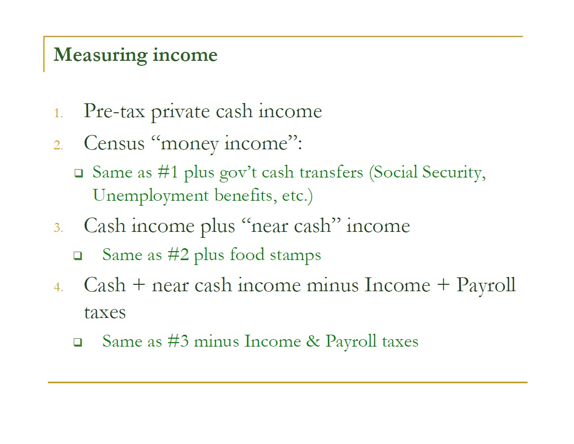
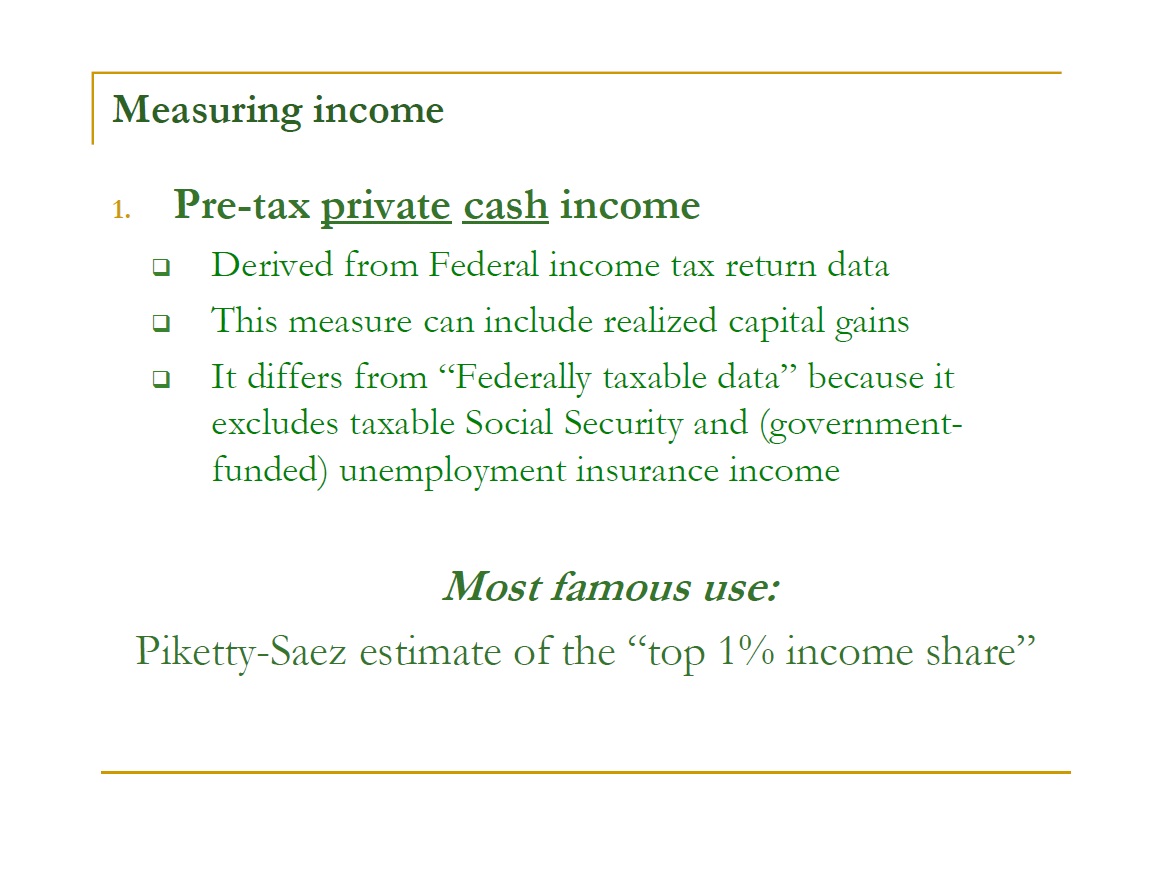
The narrowest income definition commonly used to evaluate income trends is Definition #1 in my slide, “pretax private, cash income.” Columnists and news reporters are unknowingly using this income definition when they make pronouncements about the income share of the “top 1 percent.” The data about income under this definition are almost always based on IRS income tax returns, supplemented with a bit of information from the Commerce Department’s National Income and Product Account (NIPA) data file.
The single most common income definition used to assess income trends and inequality is the Census Bureau’s “money income” definition, Definition #2 on the slide. It is just the same as the first definition I mentioned, except this income concept also includes government cash transfer payments – Social Security, unemployment insurance, cash public assistance, Veterans’ benefits, etc.
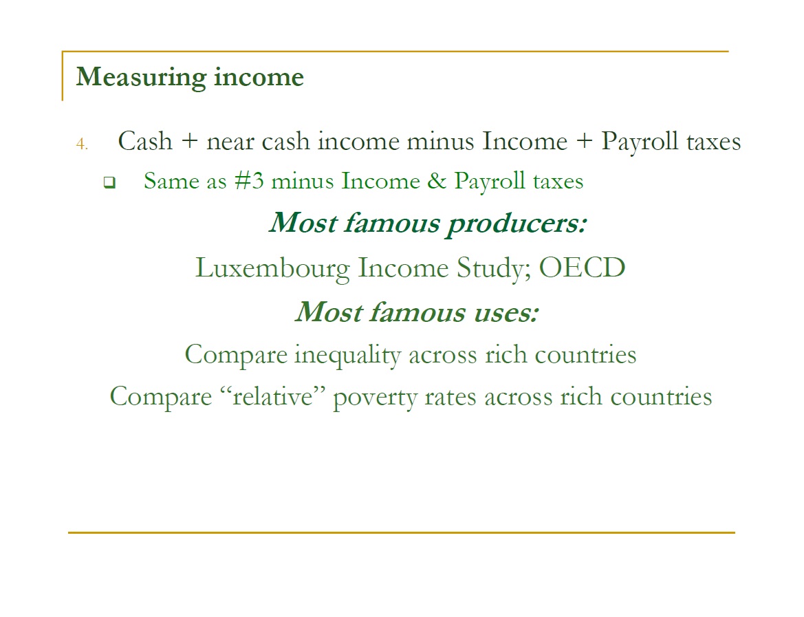
A slightly more expansive definition (#3) also adds food stamp (or SNAP) benefits plus other government benefits that are straightforward to evaluate. Items of this kind include the implicit rent subsidy low-income families receive in publicly-subsidized housing, school lunch subsides, and means-tested home heating subsidies.
Now we come to subtractions from income. These typically reflect families’ tax obligations. The Census Bureau makes estimates of state and federal income tax liabilities as well as payroll taxes owed by workers (though not by their employers). Since income and payroll taxes subtract from the income available to pay for other stuff families want to buy, it seems logical to also subtract them from countable income. This is done under income Definition #4. Some tax obligations – notably the Earned Income Credit (EIC) – are in fact subtractions from taxes owed, which would not be a problem in the case of families that still owe positive taxes to the government. However, the EIC is refundable to taxpayers, meaning that some families have negative tax liabilities: The government owes them money. In this case, if you do not take taxes into account you understate low-income families’ incomes, even as you’re overstating the net incomes available to middle- and high-income families.
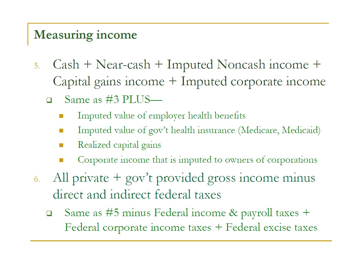
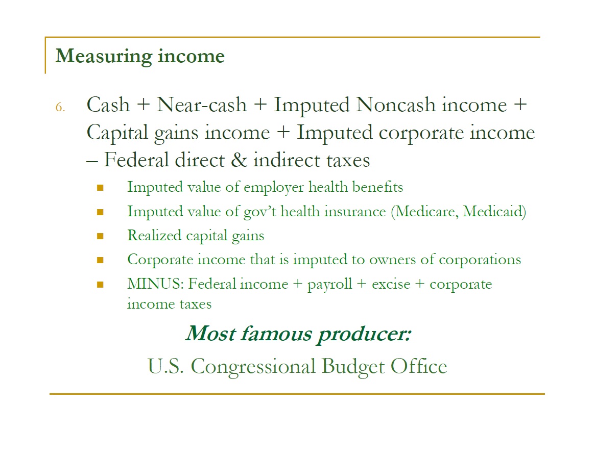
Now let’s get a bit more complicated. Forget what I said about taxes, because our next income definition (#5) also ignores them. It is an even-more-comprehensive definition of gross or pretax income. In addition to all those cash and near-cash items I mentioned in Definition #3, Definition #5 includes imputed income items, such as:
• The value of your employer’s premium contribution to your employee health plan;
• The value of the government’s subsidy to your public health plan – Medicare, Medicaid, state CHIP plans, etc.
• Realized taxable gains from the sale of assets; and
• Corporate income that is earned by companies in which you own a share even though it is not income that is paid directly to you.
This is the most comprehensive income definition of which I am aware that refers to gross or pre-tax income.
Finally we have Definition #6, which subtracts your direct and indirect tax payments. The only agency that uses this income definition is principally interested in the Federal budget, so the subtractions are limited to Federal income and payroll taxes, Federal corporate income taxes, and excise taxes.
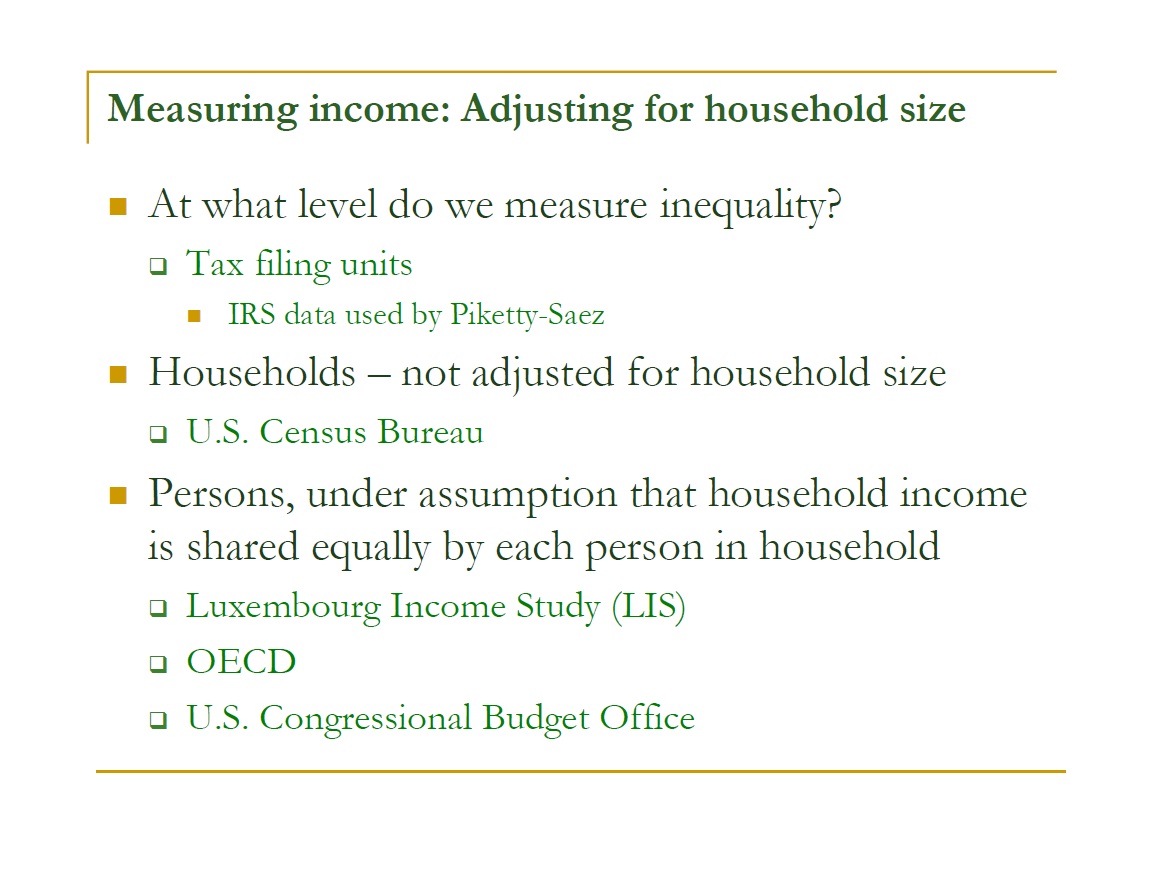
Before we go into why you should care about any of these definitions, let me mention a somewhat less important issue, namely, how we define the income-sharing group over which we estimate inequality. The most common assessment unit for income included under Definition #1 (“Pre-tax private cash income”) is the Federal income tax filing unit. Sometimes this unit has one person; sometimes 2 (a married couple); and sometimes more than 2, including dependents.
The Census Bureau (and, consequently, most users of Census-published statistics) mainly uses “households” as reference units, without any adjustment for variations in the size of different households. The Bureau’s median income estimate, for example, is estimated using the annual “money income” of households, some of which contain 1 person, some contain 2, some contain 3, and so on.
Many economists and sociologists find this unsatisfactory because they think a $20,000 annual income goes a lot farther if it is supporting just one person rather than 12. Therefore, a number of organizations—notably, the Luxembourg Income Study (LIS), the Organisation of Economic Cooperation and Development (OECD), and the Congressional Budget Office (CBO)—assume household income is equally shared within each household, but that household “needs” increase with the square root of the number of people in the household. That is, a household containing 9 members is assumed to require 1½ times as much income to enjoy the same standard of living as a family containing 4 members. After an adjustment is made to account for the impact of household size, these organizations then calculate inequality among persons rather than among households.
How are these alternative income definitions estimated? Who uses them? What do the estimates show? I’ll only consider a two or three basic cases.
First, pretax, private, cash income. By far the most famous users of this definition are Professors Thomas Piketty and Emmanuel Saez. Their most celebrated product is an annual estimate of the share of total U.S. income (under this restricted definition) that is received by the top 1 percent of tax filing units.
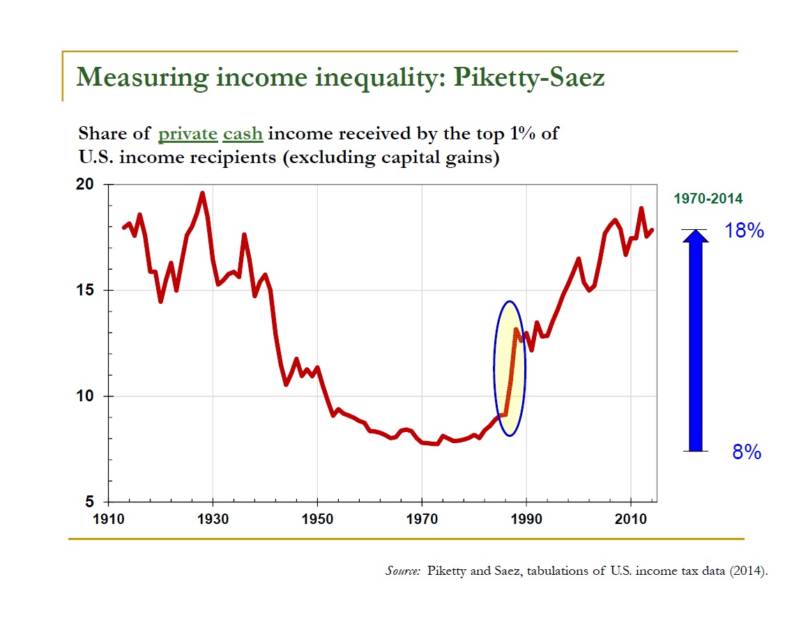
Here is their most famous chart, showing the income share of the top 1 percent going back to 1913. (I use the Piketty-Saez estimates that exclude realized capital gains in the calculation of taxpayers’ incomes.) The notable feature of the chart is the huge rise in the top income share between 1970—when it was 8 percent of all pretax private cash income—and last year—when the comparable share was 18 percent.
I have circled one part of the line—between 1986 and 1988—to show you how sensitive their income definition is to changes in the income tax code. In 1986 Congress passed the Tax Reform Act of 1986 (TRA86). By 1988 the reform was fully implemented. Wealthy taxpayers noticed that TRA86 sharply reduced the payoff to holding corporate earnings inside a separately taxed corporate entity. Rich business owners or shareholders could increase their after-tax income by arranging things so their business income was taxed only once, at the individual level. The result was that a lot of income, once earned by and held within corporations, was now passed through to the tax returns of rich individual taxpayers. These taxpayers appeared to enjoy a sudden surge in their taxable incomes between 1986 and 1988. No one seriously believes rich people failed to get the benefits of this income before 1987. Before 1987 the same income simply showed up on corporate rather than on individual income tax returns.
A final point: The chart displayed in SLIDE #6 is the source of the widely believed claim that U.S. inequality is nowadays about the same as it was at the end of the Roaring 1920s, before the Great Depression. That is close to being true – under this income definition.
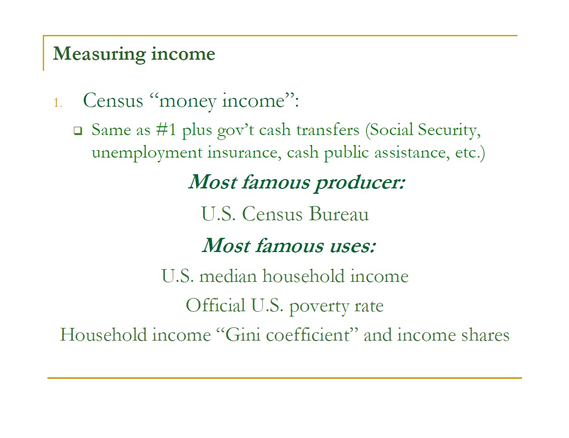
Census “money income”: This income definition is very similar to the one just discussed, except that it includes cash government transfer payments. The producer of the series is the Census Bureau, and its most famous uses are to measure trends in real median household income and the official U.S. poverty rate. Furthermore, the Census Bureau uses the income definition to compile estimates of the Gini coefficient of household income inequality and the income shares received by each one-fifth of households, ranked from lowest to highest income, and received by the top 5 percent of households.
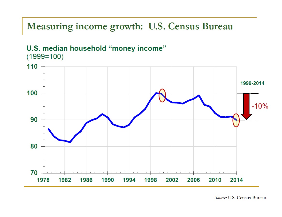
Here is a famous graph based on the Bureau’s “median household income” series. I have normalized the historical series using the 1999 real median income level (1999 and 2000 were the peak income years according to Census data). Since 1999 and 2000, median income has fallen about 10 percent. If we accept this estimate without qualification, it certainly represents bad news for living standards of the nation’s middle class. The conclusion is contradicted by other government income statistics that use a broader, more inclusive income definition, however.
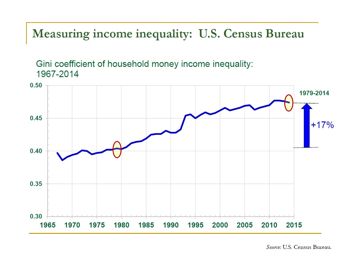
And here is the Bureau’s most widely cited distributional statistic (after its “official poverty rate” estimate). Since 1979, the Gini coefficient has increased 17 percent under this income definition. (It is worth noting, however, that the portion of the increase that occurred between 1992 and 1993 is mainly the result of methodological changes in the way the Census Bureau ascertained incomes in its 1994 income survey.)
When you hear U.S. inequality compared with that in other rich countries, the numbers are most likely based on calculations of the LIS or OECD. Their income definition is basically “Cash and Near-cash Public and Private income minus Income and Payroll taxes owed by households.” Under this income definition, the U.S. looks relatively very unequal and America appears to have an exceptionally high poverty rate. U.S. inequality has been rising under this income definition, as indeed has also been the case in most other rich countries. The increase in the United States has been above average, however, helping us to retain our leadership position, both in income inequality and in relative poverty.
We turn last to the most expansive income definition: CBO’s measure of net after-tax income. I will use CBO’s tabulations using this income definition to shed light on some of the inequality and living standard trends implied by the narrower income definitions discussed above.
Let’s consider some potential limitations of a couple of those definitions. The limitations do not necessarily make them flawed or uninteresting. They do mean the narrower income measures cannot tell us some of the things that users claim they tell us.
An obvious shortcoming of the “cash pretax private income” definition is that it excludes virtually everything the government does to equalize Americans’ incomes. Believe it or not, the Federal tax system is mildly progressive. It claims a bigger percentage of the (declared) incomes of the rich than it does of middle-income families’ and especially the poor. Any pretax income measure will miss that redistribution.
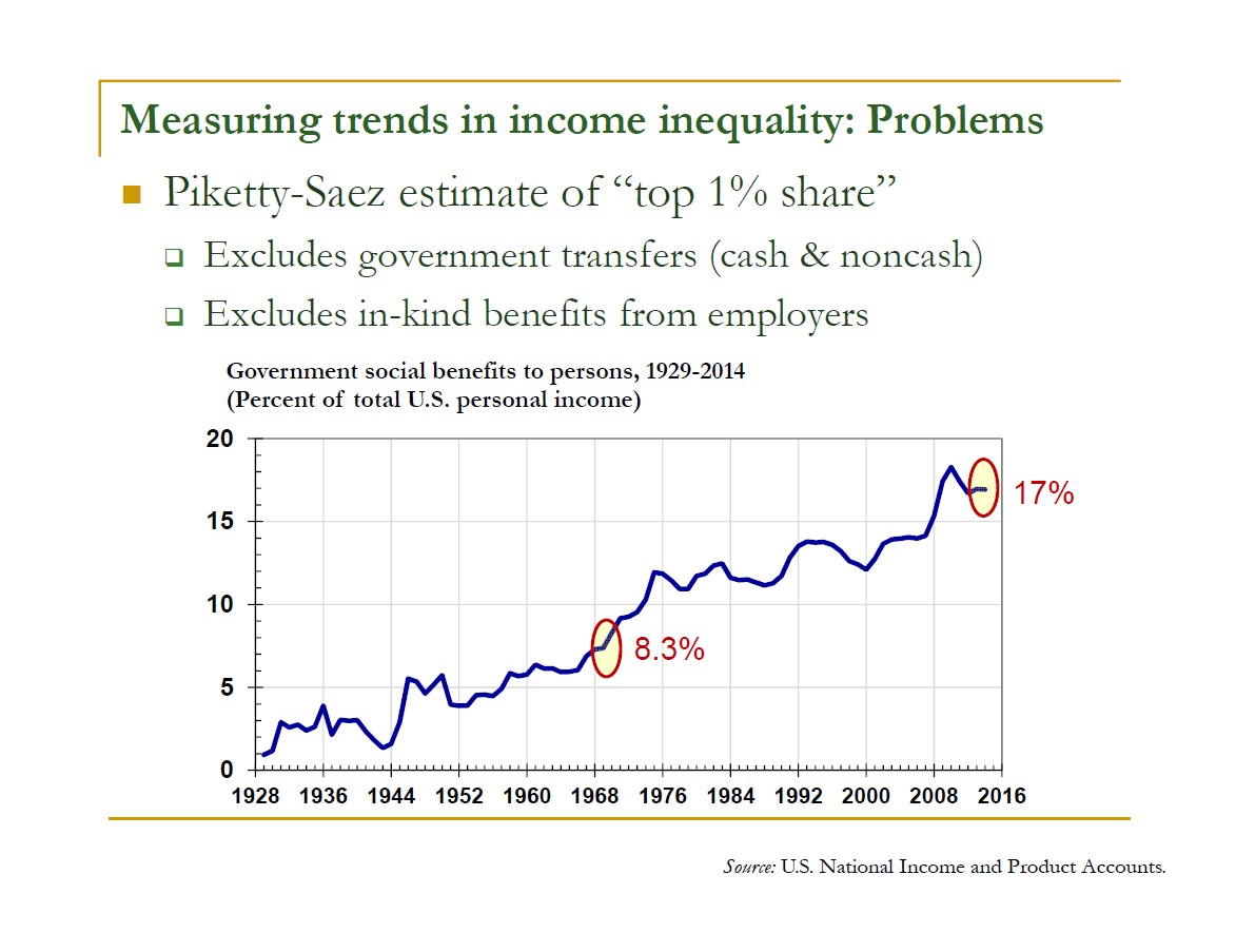
More seriously, it excludes all government transfer payments. You may think the rich get a bigger percentage of their income from government handouts compared with middle class and poorer households. That is simply wrong. The rich get a lot less. And the percentage of total personal income that Americans derive from government transfer payments has gone way up over the years. In the Roaring 1920s, Americans received almost nothing in the form of government transfers. Less than 1 percent of Americans’ incomes were received as transfer payments. By 1970—near the low point of inequality according to the Piketty-Saez measure—8.3 percent of Americans’ personal income was derived from government transfers. Last year, the share was 17 percent. None of the increase in government transfers is reflected in Piketty and Saez’s estimates of the trend in inequality. Inequality is nowadays lower than it was in the late 1920s, mainly because the government does more redistribution through taxes and transfers.
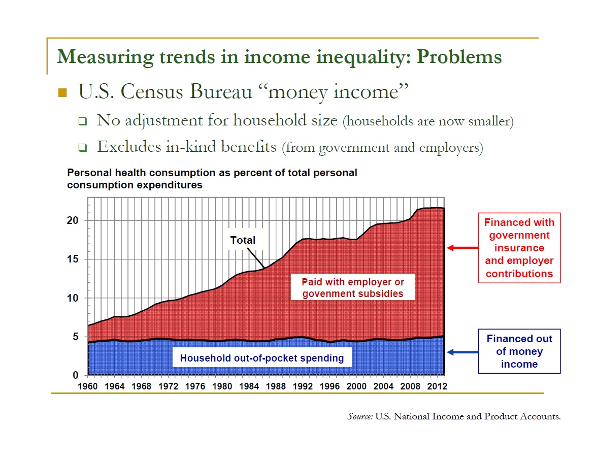
Both the Piketty-Saez and the Census “money income” statistics are affected by the exclusion of government- and employer-provided health benefits from the income definition. This slide contains numbers, starting in 1960, that show the share of total U.S. personal consumption consisting of personal health care consumption. I have divided the total into two parts. The first is the share that is paid for out of our own cash incomes (the blue part at the bottom). This includes our out-of-pocket spending for doctors’ charges, hospital fees, pharmaceutical purchases, and other provider charges as well as our out-of-pocket spending on health insurance premiums. The second is the share of our personal health consumption that is paid out of government subsidies to Medicare, Medicaid, CHIP, etc., or out of employer subsidies to employee health plans (the red part).
As everyone knows, the share of total consumption that consists of health consumption has gone way up. What few people recognize is that the share that is directly paid by consumers—through payments to doctors, hospitals, and household health insurance premium payments—has remained unchanged. All of the increase in the health consumption share since 1960 has been financed through government and employer subsidies to health insurance plans. None of those government or employer contributions is counted as “income” under the Piketty-Saez and Census “money income” definitions. You would have to be quite a cynic to claim the subsidies have brought households no living standard improvements since 1960, yet that is how they are counted under the Piketty-Saez and Census “money income” definitions.
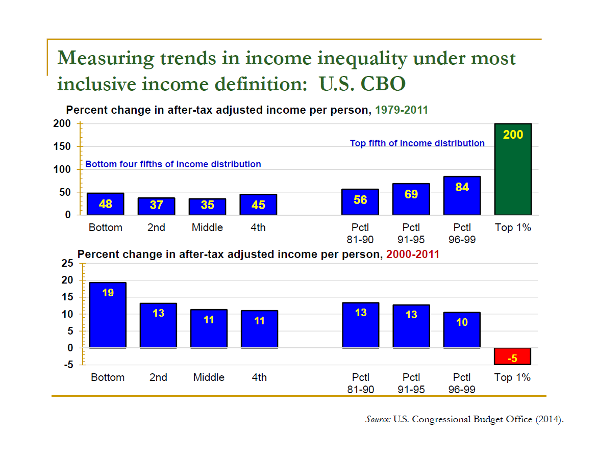
Final slide: How much has inequality gone up under income definitions that count all income sources and subtract the Federal income, payroll, corporation, and excise taxes we pay? CBO gives us the numbers, though unfortunately its numbers end in 2011.
Here are CBO’s estimates of real income gains between 1979 and 2011. These numbers show that real net incomes increased in every income category, from the very bottom to the very top. They also show that real incomes per person have increased much faster at the top—over on the right—than in the middle or at the bottom—over on the left. Still, contrary to a common complaint that all the income gains in recent years have been received by folks at the top, the CBO numbers suggest net income gains have been nontrivial among the poor and middle class as well as among top income recipients.
Suppose we look at trends in the more recent past, say, between 2000 and 2011. That lower panel in this slide presents a very different picture from the one implied by the Census Bureau’s “money income” statistics. Unlike the “money income numbers” [SLIDE #9], these show that inequality has declined since 2000. Unlike the “money income numbers” [SLIDE #8], these show that incomes of middle-income families have improved since 2000. There are a variety of explanations for the marked contrast between the Census Bureau and CBO numbers. But a big one is the differing income definitions the two conclusions are based on. The more inclusive measure of income shows faster real income gains among middle-income and poorer households, and it suggests a somewhat different trend in inequality.
The Brookings Institution is committed to quality, independence, and impact.
We are supported by a diverse array of funders. In line with our values and policies, each Brookings publication represents the sole views of its author(s).


Commentary
Alternative methods for measuring income and inequality
January 11, 2016