In his recent piece, “How to Read President Obama’s New Budget,” Senior Fellow David Wessel includes this chart showing the share of federal revenue from various sources:
Wessel, director of the Hutchins Center on Fiscal and Monetary Policy, explains:
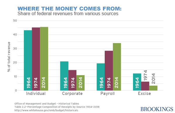
Of course, all this money has to come from somewhere. This year, Washington will borrow about 14 cents for every dollar it spends. (That’s a sharp contrast to the worst year of the recession when it borrowed 44 cents for every dollar spent.) The rest comes from taxes. Measured as a share of the economy, taxes in the current fiscal year will be about 17.5% of GDP, roughly in line with the 17.4% average for the past 40 years. But the source of those revenues has changed significantly over the years: The payroll tax levied on wages to financial Social Security and Medicare accounts for a growing share of federal receipts; the tax on corporate profits represents a shrinking share.
This year, about 46% of all revenues come from the individual income tax, 34% from the Social Security/Medicare payroll tax and 12% from taxes on corporate profits. Forty years earlier, it was 45% from the individual income tax, not much change there. But 15% came from the Social Security/Medicare payroll tax and 29% from taxes on corporate profits.
Read the full post which includes additional charts about understanding the federal budget.
The Brookings Institution is committed to quality, independence, and impact.
We are supported by a diverse array of funders. In line with our values and policies, each Brookings publication represents the sole views of its author(s).


Commentary
CHART: Where Federal Revenues Come From
March 26, 2014