
Funding levels for the National Institutes of Health (NIH) have come under scrutiny since President Trump took office in January of 2025. Initially, an executive order was issued limiting coverage of overhead expenses associated with funded awards (“indirect costs”) to 15% of the award. Many specific research grants were also terminated, totaling at least $7.5 billion through the end of May. But perhaps the biggest threat to funding of NIH-supported medical research is looming as part of the 2026 budget process. The White House has proposed a reduction in NIH funding from $48 billion this year to $27.5 billion next year, a 43% drop. The outcome of this process remains uncertain, with the Senate’s Committee on Appropriations supporting sustained funding.
The main impact of NIH funding is on human health. The purpose of public funding is to support research that is foundational for future medical innovation. No single firm has the incentive to fund such research because any firm can benefit from it. A cut in funding would reduce such advances, potentially harming our future health.
But the extent of these potential NIH funding cuts may have even broader implications. The innovations that result from this research generate investments that spur economic activity across the country. The economic impact may also be felt at the local level. When individual institutions receive those funds, they hire researchers who may relocate to take these jobs. Spending in the area increases and other local businesses may prosper. Public funding of scientific research may also encourage private investment in the same community, as firms translate scientific discoveries into products for the market. Overall, the broader labor markets in which recipient institutions reside could benefit from NIH funding. Cutting that funding may be detrimental to the community.
In this report, we investigate the extent to which NIH funding affects local labor markets. We categorize major NIH awards by the location of their recipients and track funding per capita in those locations over the past two decades. We examine changes in such funding levels to investigate whether those locations with a larger influx of NIH funding experienced greater employment growth. We also evaluate whether such funding increases lead to an increase in the population share with a college degree. In both cases, our analysis supports such a relationship.
“College towns” are most likely to receive large NIH awards
To examine geographic patterns in NIH funding, we start with the historical catalog of NIH awards.1 We focus on those awards made since 2004 to researchers outside of NIH. Many institutions receive relatively small awards that are unlikely to have a substantial impact on local labor markets. To focus on the larger awards that have a greater potential to result in a local economic impact, we restrict our attention to institutions that received awards larger than $50 million per year in 2024.2 These institutions accounted for over 80% of NIH funding in 2024.
We assigned each institution to a “labor market” based on the concept of a “commuting zone,” which is a group of counties linked by commuting patterns; we use the terms “commuting zone” and “labor market” interchangeably in our discussion.3 We aggregate all large awards (if any) to institutions in each commuting zone. We average over five years to reduce idiosyncratic annual fluctuations, yielding four observations for each commuting zone: 2004-2008, 2009-2013, 2014-2018, and 2019-2023 windows. To adjust for inflation, we convert all awards to real (2023) dollars using the Consumer Price Index.
We augment these data with year 2000 commuting zone population counts to create measures of NIH funding per capita.4 We fix the population in these areas in that year because the size of the population may also vary in response to the local level of funding.
Figure 1 provides a descriptive analysis of these data. They include a total of 741 commuting zones. Of those, 664 included no institution that received large NIH awards during our analysis period. For those 77 zones that did, this figure displays the distribution of the level of NIH funding per capita in the 2019-2023 period. It shows considerable dispersion across areas. Eight of these areas received average funding greater than $500 per capita: Rochester, MN ($1,237); Raleigh, NC ($1,183); Iowa City, IA ($996); Gainesville, FL ($768); Charlottesville, VA ($728); Madison, WI ($681); Boston, MA ($616); and Wilmington, NC ($502). These are mainly locations where universities with large medical facilities account for a substantial share of the local economy. The Mayo Clinic and its Alix School of Medicine are located in Rochester, MN. The Raleigh commuting zone includes the entire Raleigh Durham Research Triangle area, including medical schools at Duke University and the University of North Carolina. Other locations house the University of Iowa, the University of Florida, the University of Virginia, the University of Wisconsin, and Harvard University.5
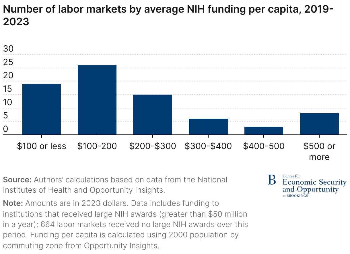
Figure 2 shows changes in funding between 2004-2008 and 2019-2023. NIH funding initially fell slightly and then rebounded in the later years. Among those areas that received sizeable awards, the majority experienced an increase in real funding per capita, though this varied across areas.
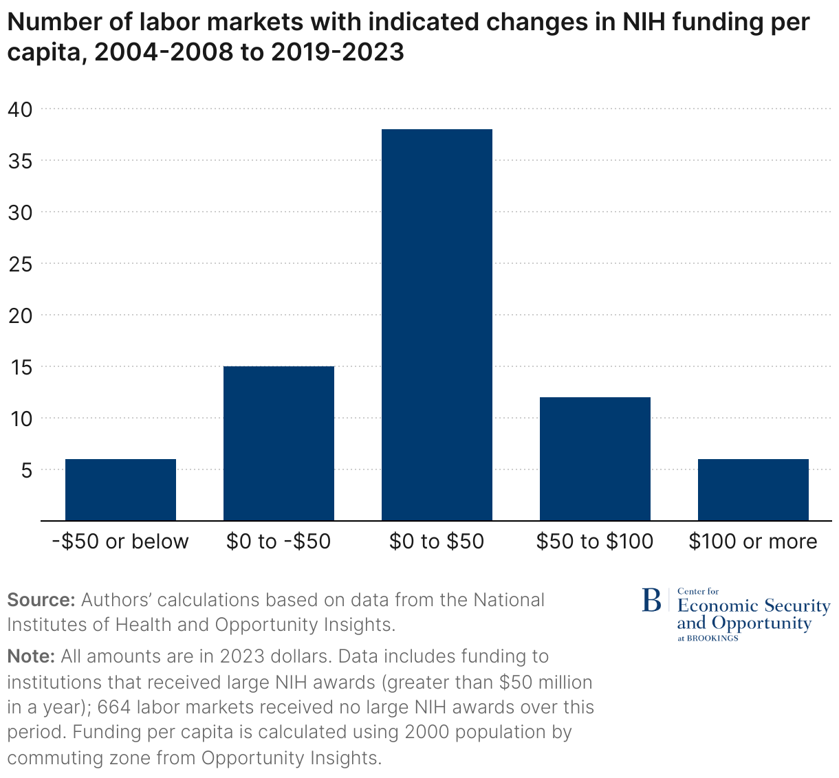
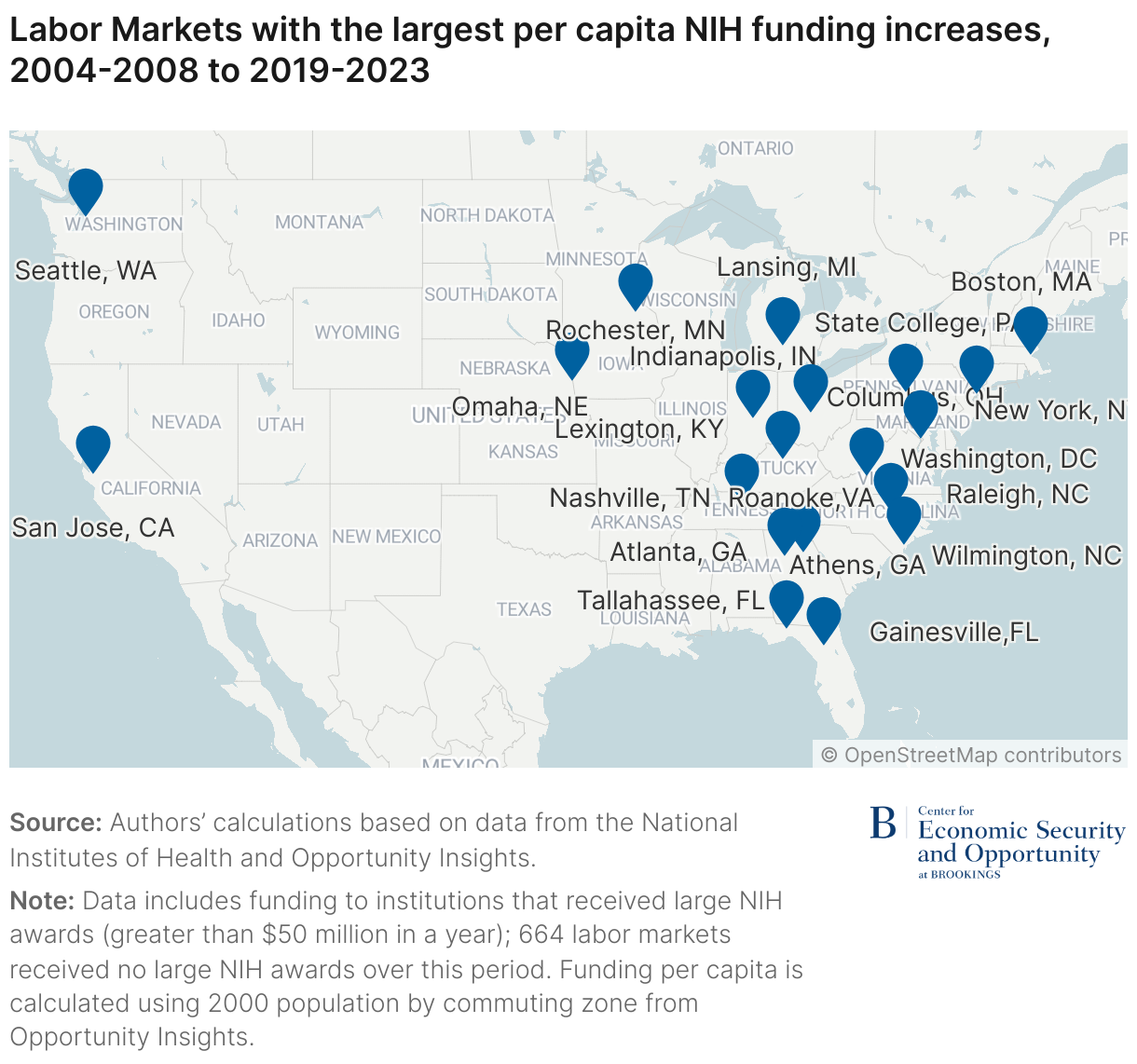
Figure 3 identifies the 20 labor markets that received the largest increases in award levels over the period. Many, but not all, of those locations that received the largest awards in the most recent period also received the largest increases over the past two decades. Again, the primary characteristics of a location receiving the largest increases are universities with large medical facilities. Along with those highlighted earlier, the pinned locations mainly include a major university medical center, like those located at public flagship universities in Georgia, Kentucky, Nebraska, and Pennsylvania. With a few exceptions, they are in the eastern half of the country, but they are widely distributed between the North and the South.
Changes in NIH funding are linked to changes in local labor markets
How do these funding levels affect the strength of local labor markets? The simple correlation of NIH funding levels with labor market characteristics is not necessarily a good indicator of whether NIH funding causes a stronger labor market. For example, places with more educated workers may attract more research funds, rather than the reverse.
A better approach is to examine the impact of changes in funding over time. If the NIH increases research funding in a particular location, does its labor market grow stronger? Such variation in funding over time is plausibly generated by the idiosyncratic differences across locations in the strength of the research being proposed and its alignment with NIH priorities. In this case, comparing changes in funding to changes in labor market conditions would be an appropriate method of identifying a causal relationship.
This isn’t a perfect approach. Perhaps the increase in research money is attributable to a strengthening labor market. But such concerns are weaker when examining changes over time in funding and labor market conditions than they are when comparing levels of these variables. Still, this is an important limitation of this research design, and any positive relationship should be viewed as suggestive of a causal impact and not definitive.
There are other important considerations regarding our data and statistical methods that could affect the interpretation of our results. For instance, a grant provided to any particular institution may have subcontracts that provide funding to institutions in other commuting zones. Other awards are provided to fund research at NIH sites; we are unable to identify their location in the data. Funding of basic research may also increase employment over longer periods of time than our five-year windows. Finally, a worker who moved to take a job at an NIH-funded location may have worked elsewhere otherwise. These factors are discussed in greater detail in the appendix. Despite these limitations, in the absence of a more robust method this analysis can shed some light on how NIH funding affects local labor markets.
We use data from the 2005 through 2023 American Community Survey (ACS) to measure labor market activity. These data include geographic identifiers for all respondents labeled “public use microdata areas (PUMAs),” which can be translated into 1990 commuting zones using available crosswalks.6 Using these data, we construct measures of the employment-to-population ratio as well as the percentage of those between ages 25 and 64 with a college degree in each labor market. We aggregate these data into the same five-year averages for each commuting zone as defined earlier.7
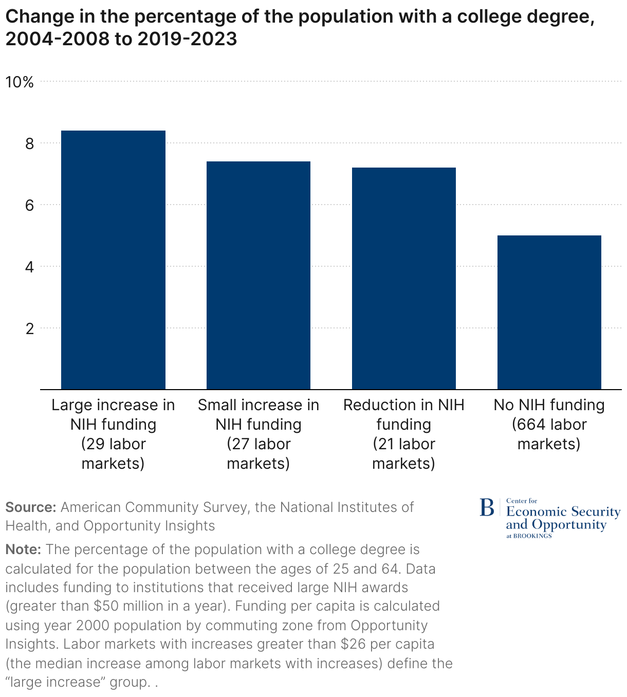
Figures 4 and 5 show the relationship between changes in NIH funding levels and changes in labor market conditions. Commuting zones are categorized into those that received no funding throughout the period (most of them), those whose real funding per capita fell, and those whose real funding per capita increased. The latter category is further distinguished by those in which the increases were “large” (above the median among those with increases) and “small” (below the median). Within each of those categories we display changes in labor market activity between the last period (2019-2023) and the first (2004-2008).
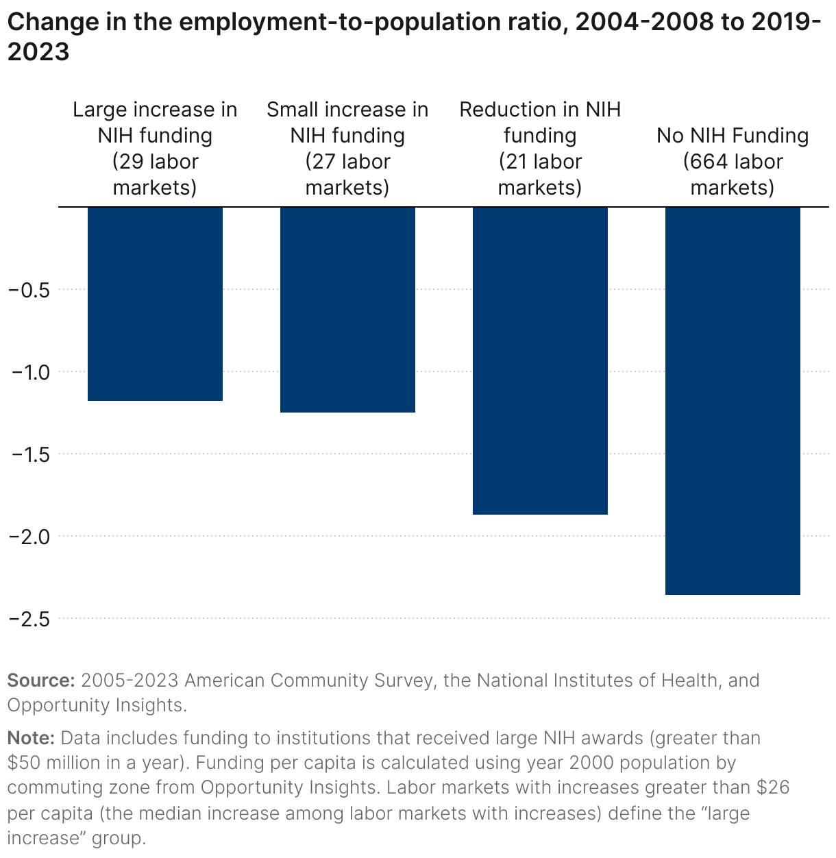
Here, and in all subsequent analyses, each labor market counts as one observation; we do not weight by population counts. The goal is to treat each labor market as an individual experiment regarding the impact of funding changes rather than to replicate national statistics.8
Figure 4 displays the results of this analysis for the employment-to-population ratio. For reference, between 2004-08 and 2019-2023 this statistic declined from 63% to 59% nationally.9 The drop in employment was lower in locations that received the largest increases in NIH funding. Locations where real funding levels fell also saw smaller drops in employment than labor markets that never received large awards. It is possible that those labor markets were somewhat protected by the lingering impacts of previous funding. This could include subsequent investments by private firms that intentionally chose locations near NIH-funded institutions.
In Figure 5, we also see a strong relationship between changes in NIH funding and changes in the educational composition of the population. The percentage of college graduates in the national population increased from 28% to 37% over this period.10 Across labor markets, we see the largest increase in the percentage of college graduates in locations that received the greatest increase in NIH funding. Again, even those locations whose real funding per capita was cut had larger increases than those with no funding at all, suggesting that the impact of prior awards had perhaps lingered. It makes sense that NIH funding attracts a population with the training necessary to work in research-intensive environments.
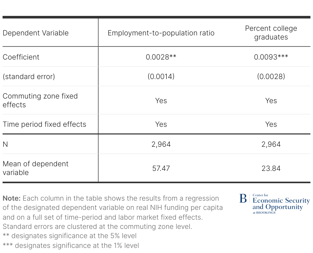
Beyond these descriptive analyses, we also estimated regression models relating these local labor market outcomes to the level of funding in each of the five-year periods we examine (with four periods and 741 commuting zones, there are 2,964 observations in this regression analysis). These models use panel data methods that include time-period and labor market fixed effects. The estimates can be viewed as the impact of changes in funding on changes in these local labor market outcomes after controlling for national trends over time and features of individual local labor markets that are constant over time.
For both outcomes, we find a positive relationship with NIH funding changes. The results are detailed in the appendix. They indicate that a $100 increase in NIH funding per capita leads to an increase in the employment-to-population ratio of 0.3 (i.e., an increase from, say, 60 to 60.3; this estimate is statistically significant with a p-value of 0.042). We similarly find a positive relationship between NIH funding changes and the percentage of the population with a college degree. The same $100 increase is estimated to increase the share of college graduates by 0.9 percentage points (i.e., an increase from 30 to 30.9; this estimate is statistically significant with a p-value of 0.001).
Cutting NIH funding will likely reduce employment in academic communities
What do these estimates imply about how many jobs would be lost if NIH funding were cut from $47 billion to $28 billion? For the purposes of this exercise, we assume that the reduction in funding would be distributed uniformly across labor markets that receive NIH funding. We apply that 43% cut to the level of funding per capita observed in the 2019-2023 data in each labor market that receives NIH funding. Then we incorporate our estimates of the impact of funding changes on the employment-to-population ratio to simulate the estimated impact on employment.11
These simulations suggest that employment losses in affected areas would be meaningful. Consider many of the college towns that would be strongly affected by these funding cuts. For instance, Madison, WI, Gainesville, FL, and Charlottesville, VA all receive considerable funding from NIH relative to their population. They each receive approximately $700 per resident in a typical year. With an adult population of around 500,000, the Madison, WI labor market is estimated to lose almost 4,000 jobs. The loss in the Gainesville, FL, and Charlottesville, VA labor markets would be smaller, but they still would lose roughly 2,000 jobs. Other college towns like Columbia, MO and State College, PA would lose almost 1,000 jobs in labor markets with adult populations of around 250,000.
Among bigger cities, Boston leads the way. NIH funding per capita was more than $600 in 2019-2023. Our simulation suggests NIH cuts would lead to 29,000 lost jobs, a roughly 1% reduction relative to current employment levels in that labor market. The combined estimated effects on local labor markets total 300,000 jobs. However, this simple aggregation misrepresents the national employment effect because displaced workers in one labor market may obtain jobs in another one.
Avoiding these cuts is a worthwhile investment
Avoiding these cuts will substantially improve employment levels in the affected labor markets. But this impact ignores the other important benefits to society that are associated with NIH funding. These include the value of the health improvements that result from such funding and the national economic impact associated with medical innovations. Indeed, the director’s letter accompanying NIH’s FY2026 budget request cites the “lifesaving breakthroughs in biology and medicine” that have resulted from NIH-funded research. A recent analysis by the Congressional Budget Office estimated that a 10% reduction in funding would lead to a 4.5% reduction in new drug development. Presumably a 43% reduction in funding would have a much greater impact. These other benefits alone are arguably much greater than the local labor market effects.
The NIH’s FY2026 budget request also states that “American taxpayers invest precious resources into NIH and expect a positive return on that investment.” Our estimates of the local labor market effects—along with the impact on pharmaceutical innovation and private-sector patents, documented elsewhere—suggest that the investment return on NIH funding is positive and very high. In an era in which government efficiency is considered an important objective, substantial cuts to NIH funding seem counterproductive.
Related Content


Authors


Statistical appendix
This appendix provides additional details about the statistical methodology used to estimate the effect of NIH funding on local labor markets.
Our empirical specification is as follows:
Yct = β0 + β1NIHFundingct + θc + δt + εct
Where Yct represents a labor market outcome for commuting zone c in time period t. In the equation, θc represents a full set of commuting zone fixed effects, which control for any features of local labor markets that are fixed over time, and δt represents a full set of time-period fixed effects, which control for any time trends that are common across commuting zones. The coefficient of interest is β1, which, under the usual assumptions, captures the effect of NIH funding on labor market outcomes. Standard errors are clustered at the commuting zone level. Results are reported in the table below.
The first column shows the impact of NIH funding, measured in dollars per capita, on the employment-to-population ratio. The coefficient indicates that an additional dollar per capita in NIH funding is associated with a 0.003 percentage point increase in the employment-to-population ratio. The second column shows the impact on the percentage of the population with a college degree. The coefficient indicates that an additional dollar per capita in NIH funding is associated with a 0.009 percentage point increase in college graduates. Both coefficients are statistically significant at the 5% level.12
There are several limitations of this approach. On one hand, to the extent that employment shifts across places in response to changes in NIH funding, the estimated effects on local labor markets will overstate the effects on employment nationally.
But other limitations suggest that our estimates are likely to understate the local labor market consequences of NIH funding. First, our measure of NIH funding in a commuting zone is measured with some error, because large grants often provide funding to multiple institutions. For example, large clinical trials often include many sub-contracts to clinical sites. Because we are not able to disaggregate funding to each specific location, we may overestimate location-specific funding in some instances and therefore underestimate the effect of NIH funding.
Second, our measure of NIH funding excludes intramural grants that fund research on NIH sites. Again, we expect that this measurement error will lead us to underestimate the impact of NIH funding on labor market outcomes. We can address this potential bias by estimating our regression models excluding commuting zones that include NIH research campuses, where our measure of NIH funding is subject to the greatest measurement error. Specifically, we exclude commuting zones that encompass Baltimore, MD; Bethesda, MD; Frederick, MD; Research Triangle Park, NC; and Phoenix, AZ. When we exclude these commuting zones, the magnitude of the impact on the employment-to-population ratio increases by approximately one-third (from 0.0028 to 0.0038). This finding supports the idea that our main estimates may understate the impact of NIH funding on local labor markets.
Third, our regressions capture only the short-term effects of NIH funding. It seems plausible that NIH funding increases employment over a longer period; our descriptive results in Figures 4 and 5 are consistent with this possibility. For example, if private firms such as pharmaceutical companies find it beneficial to permanently locate near institutions where NIH-funded research occurs, then the beneficial effect of NIH funding on a community’s labor market could persist for many years. If such longer-term benefits exist, then our regression coefficients would understate the local labor market effects of NIH funding.
Since our regressions do not control for private industry funding of scientific research, our estimates should be interpreted as the net effect of public funding, including the direct effects of hiring by the NIH-funded institutions and the indirect effects on the private sector.
-
Acknowledgements and disclosures
Robin McKnight is editor of the National Bureau of Economic Research’s (NBER’s) “Bulletin on Health,” which is funded by the National Institute on Aging, one of the Centers of the National Institutes of Health.
-
Footnotes
- We augment these data with information on NIH awards provided through supplemental funding associated with the American Recovery and Reinvestment Act of 2009. Our results are not sensitive to the exclusion of these supplemental funds.
- We also include several institutions that frequently received awards larger than $50 million in prior years but did not in 2024.
- We use the 1990 definitions of commuting zones. Crosswalks to convert counties into 1990 commuting zones were created for use in Autor, Dorn, and Hanson (2013) and Autor, Dorn, and Hanson (2019). They are available here.
- These data are available from Opportunity Insights, Equality of Opportunity Project. Specifically, they come from the online data appendix to Chetty and Hendren (2017).
- Large awards in Wilmington, NC are the exception. These awards are to PPD, a pharmaceutical research organization that, for example, conducted NIH-funded clinical trials for a COVID-19 treatment beginning in 2020.
- Existing crosswalks can translate 2000 Census and 2010 Census PUMA classifications back to 1990 commuting zones. Beginning in 2022, the ACS switched from 2010 Census PUMA classifications to those based on the 2020 Census. No existing commuting zone crosswalks are available for the 2020 Census. For simplicity, we converted PUMAs in 2022 and 2023 to the 2010 classification system based on the greatest likelihood of overlap across areas. This translation was based on a crosswalk between 2020 and 2010 PUMA codes available here. Then we applied the same 2010 Census to 1990 commuting zone crosswalk used elsewhere for those years.
- The one minor exception to this statement is that the period labeled 2004-2008 is based only on 2005-2008 data because the 2004 ACS had not yet grown to sufficient size to include PUMAs for all respondents.
- If instead we weight by population, the results presented below regarding the employment-to-population ratio are smaller and statistically insignificant. This is because the impact is concentrated in labor markets with smaller populations. Our analysis of the share of the population with a college degree is unaffected by the use of population weights.
- These statistics are calculated based on data available from the Federal Reserve Bank of St. Louis (FRED).
- These statistics were calculated based on data from the 2004 through 2022 Current Population Survey (available here).
- Technically, we use the following formula to calculate the impact on employment in each labor market: Change in Employment = (NIH Funding2019-2023*0.43*0.003/100)*Population Age 16+. Where the 0.003 represents the coefficient estimate of the impact of a $1 funding change on the employment to population ratio, we divide that by 100 since the ratio is typically multiplied by 100 for ease of exposition (i.e., 60, not 0.6), and then we multiply by the population age 16 and over (the “adult population”) to convert the impact on the employment to population ratio to the impact on employment. To estimate the population age 16 and over, we start with the 2000 commuting zone population estimate used earlier to measure funding per capita. We then multiply that by 0.8 as a rough estimate based on national data relating the population age 16 and over to the total population.
- When the regressions are weighted, the coefficient for “Percent college graduates” is minimally changed (coefficient = 0.0090, significant at the 1% level). The coefficient for “Employment-to-population ratio” falls and becomes statistically insignificant (coefficient=0.0008). This set of findings suggests that the strongest impact of NIH funding on the employment-to-population ratio occurs in less populated labor markets.
The Brookings Institution is committed to quality, independence, and impact.
We are supported by a diverse array of funders. In line with our values and policies, each Brookings publication represents the sole views of its author(s).