Editor’s Note: This blog was originally published on Publish What You Fund on June 13, 2014.
There are two new agencies publishing information to the foreign assistance dashboard: the State Department and the U.S. Department of Agriculture (USDA). This is good news. But the question remains: Is more data always better and for whom? Is the exercise of publishing volumes of data to the dashboard just a routine exercise or a deliberate effort to improve the information available for ultimately more effective aid and better development outcomes?
A decade ago data was the private domain of statisticians, economists, mathematicians, engineers, demographers, and others with a technical bent. The closest it got to policy was on the political side—pollsters advising candidates and politicians configuring legislative districts to their advantage. But today data is discussed not just in academic and limited policy circles, but in high level international fora. The “data revolution,” for example, was highlighted in the U.N. Panel of Eminent Persons as part of the post 2015 agenda. Today, open government and aid transparency are widely discussed, a substantial shift from the days when discussing corruption in development meetings was taboo.
The U.S. government has been part of this change. It co-founded the Open Government Partnership in 2010, launched the U.S. Foreign Assistance Dashboard to make public all U.S. foreign assistance data, and in 2011 committed to the International Aid Transparency Initiative (IATI). Strong as the U.S. policy commitment on aid data transparency has been, implementation has been slow.
To be fair, it must be acknowledged that aid data transparency—putting data and information on assistance into the public realm—is a concept that is easy to understand but complicated to implement. What data? In what form? For what user? How best presented? And the questions go on.
A central issue in aid transparency is whether the effort is worthwhile—whether the data is useful to users. And usability is driven by the amount and quality of the data, how it can be accessed and viewed (visualization), and the needs of the particular user.
The Diversity of Aid Data Platforms
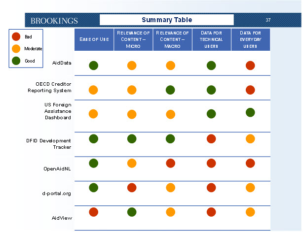
There are various platforms (websites) being built to house and visualize data on assistance. Two colleagues at Brookings and I have been looking at some of the principal aid data websites. What comes through is that no single site meets the needs of all users. And that is as it should be.
Go here for the full presentation, which is intended to start a conversation and encourage further analysis.
Some platforms are global in presenting data for many or all donors, such as the OECD Creditor Reporting System (CRS) and AidData; others are donor specific (U.S. Foreign Assistance Dashboard, DFID Development Tracker, and the Dutch OpenAidNL); and some aid recipients are creating systems to track data into their countries. Some platforms are strong in providing the non-technical, macro-perspective user with a quick overview of assistance statistics, while others allow downloading raw data for the technical person who knows how to work data and needs to perform detailed analysis. The data platforms should clearly indicate their core functions and intended audiences. Many of the sites use a single source for the data intake, the IATI Registry, which is where one can find the raw, structured data. IATI is the only place to find comparable aid information from all donors. IATI simply provides the data for different uses and users.
A second finding is that, despite the global commitment in principle, there is a paucity of good, valuable data. The CRS data is comprehensive but detailed information often is two years old, making it ideal for statistical studies and analysis but of little use for in-country planning or budget allocation. Several donors have put up their own sites, but they provide data only for that donor, such as the U.S. Dashboard. Governments responsible for 86 percent of official development assistance have committed to IATI, but the data is only slowly entering the IATI registry. A few donor agencies, such as the U.K.’s Department for International Development (DFID), have fully embraced IATI. DFID not only has published data to the registry but has adopted the IATI schema for its own Development Tracker and is using the data to manage its programs.
The U.S. record is mixed. The newest publication is from the State Department, which includes information from the bureaus and offices implementing foreign assistance funding. The data published is a step forward and State’s progress is welcomed, but the quality of the data remains a challenge to be addressed. Two weeks ago, five of the nine USDA agencies implementing foreign assistance programs published planning, obligated, spent, and transaction data to the Dashboard. Similarly, this is a positive development and USDA’s data is a useful addition to the foreign assistance full picture. The Millennium Challenge Corporation (MCC) has published all of its data in IATI XML format and has led the way with comprehensive, high quality, disaggregated information. The U.S. Treasury Department’s Office of Technical Assistance published its data in XML in 2013, but this file has not yet been updated. Other U.S. government agencies are far behind: USAID has loaded a lot of data but it is financial information that is not connected to specific projects; the Defense Department is missing its transaction data; and totally missing is data from PEPFAR (the President’s Emergency Plan for AIDS Relief) and other agencies.
Balancing Aid Data vs. Visualization
There is a tension in the data arena on priorities—more data or better visualization? It is not a chicken-and-egg issue, as either the chicken or the egg must come first, we just aren’t sure which. But data and visualization should evolve together—one cannot create visualizations without data, and most of us cannot analyze or understand reams of spreadsheets with numbers unless they are aggregated into nice “pictures.” I learned a long time ago that demand for data does not exist in a vacuum. The demand for more and better data is created by demonstrating the knowledge that can be found in data through graphs and charts that are easy to interpret. Show a policymaker new knowledge through a graph, and she will begin to understand the value of data and want more. The visualization should be easily interpreted by the user, it should answer the users’ questions and concerns and it should be tailored to his needs.
That said, to determine the proper focus—the proper balance—for U.S. government data transparency efforts, it is necessary to ask what is the comparative advantage of government. In this arena, it clearly is providing the data and maintaining the high quality of the supply. U.S. government agencies have the data and only they can provide it to the Dashboard and the IATI registry. In addition, I think we can all agree that it is the private sector (companies, NGOs, academia) that has proved its innovative ability in visualizing data. So, the principal U.S. government effort should be on providing comprehensive, high quality, timely data, along with basic visualization that presents the data in simple, understandable formats. The raw data must be accessible to those who can manipulate the data. The government should encourage others—third parties and infomediaries—to create the exciting and varied visualization, possibly even offering an “X prize” for particularly creative and useable visualizations that respond to the needs of users.
Ensuring Comprehensive & Quality Data
The data and the platforms that present it will be widely used only when the data is complete—comprehensive, timely, comparable, searchable, easy to access and also shared and promoted. Only then will data be useful for sophisticated analysis and in-depth research, or to answer simple questions such as how much is being spent in a specific village for education or health. For that to happen, agencies must fully comply with their commitment to IATI, the only databank that when fully invested with data will be truly global and timely.
U.S. agencies are facing two deadlines. Most immediately is the 2014 Publish What You Fund Aid Transparency Index, with June 30th as the closing date for collecting data for the assessment. MCC scored first overall in the 2013 ATI, an accomplishment that rewarded strong management leadership and technical capacity. That ranking in the new index is at risk as the MCC’s complete, XML IATI-formatted data has inexplicably 10 months later not yet moved from the Dashboard to the IATI registry. The new and current data is due to be published sometime this month. We all would like to see other U.S. agencies do well and are hoping that USAID and the Department of State, which together are responsible for about 75 percent of U.S. assistance dollars, are working to meet that June 30th date by publishing data that is comprehensive and of high quality.
Why US Interests Include the IATI
More importantly, it is only 18 months before the due date on the U.S. commitment to be fully compliant with IATI. In over 3 years the U.S. has made only moderate progress toward that goal. What is needed is a clear path forward—a detailed, costed management plan to meet that commitment. To do that requires concerted political will and leadership, which will come only if there is an understanding that a robust IATI data registry is in the US interest.
There is no better demonstration of that interest than Haiti. Aid coordination is nice in theory and can work at the level of general policy, but it is impossible when there are 20 or 50 donor agencies, 10-20 international organizations, and hundreds of NGOs implementing projects in a country. How do you coordinate thousands of projects? You don’t! But what you can do is have a common registry so that when a donor or an NGO decides to undertake an activity it can see who else is putting what funds for what purpose in a particular region of the country. And so the Ministry of Finance knows what aid money is coming into the country, in what sectors and regions, and therefore can better allocate its own resources and engage donors in an informed conversation on priorities and where to allocate resources. The American government and the American people want our assistance to be effective: to be effective we must allocate aid smartly, which requires knowing the full range of resources and activities that are present in a sector and region.
To end with a notion expressed by MCC Vice President Sheila Herrling at the recent launch of the new Modernizing Foreign Assistance Network policy paper, The Way Forward, “What $50 billion-a-year company would not want good data to inform its operations!”


Commentary
Building Aid Transparency: More Data, Better Data
June 13, 2014