Have American cities lost their middle class? The recent unrest in Baltimore caused some to (inaccurately) portray that city as overwhelmingly poor. Meanwhile, rising inequality and rapid gentrification in places like San Francisco and Seattle raise the concern that some cities are becoming exclusive enclaves for the wealthy.
Yet it turns out that many U.S. cities still retain a sizable middle class, at least judged by national standards. We took annual income data from the American Community Survey, which the Census Bureau publishes for all places with populations of at least 65,000. Comparing these city income data from 2013 to national data for the same year, we classified households in each city by the quintile (fifth) of the national income distribution into which they fell. Jump to the interactive data.
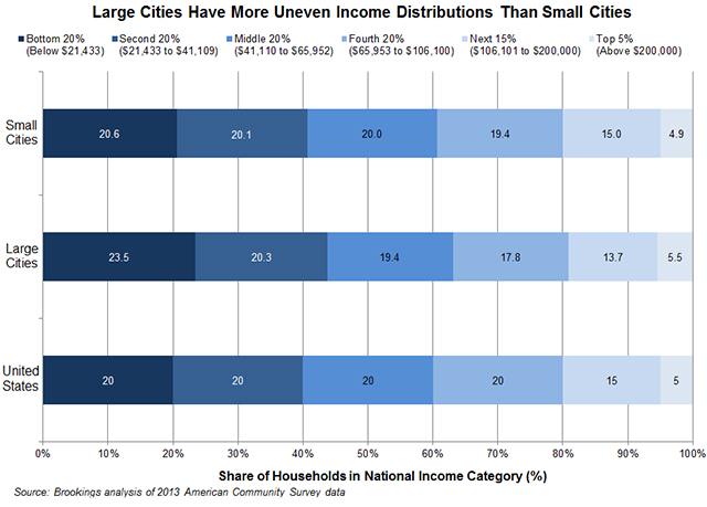
Two overarching patterns emerge. First, smaller cities look more like the nation than larger cities. Most (87 percent) of the cities for which the Census Bureau reports annual data have fewer than 100,000 households, but together they represent about the same number of households as cities with more than 100,000 households. Collectively, the smaller cities mirror the national income distribution almost exactly. In large cities, by contrast, both low-income (bottom 20 percent) and very high-income (top 5 percent) households are overrepresented.
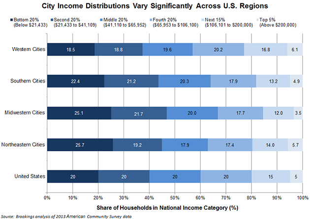
Second, city incomes look very different across U.S. regions. Households in Western cities have higher incomes than those nationwide, those in Midwestern cities have lower incomes, and those in Southern cities look about average. To be sure, these averages mask important differences among cities within regions—contrast Camden, N.J., where nearly half of households have incomes in the bottom fifth nationally, with Newton, Mass., where more than half of households are in the top fifth nationally. Nonetheless, these regional differences reflect the more expansive geography of many Southern and Western cities that enables them to take in more middle-income neighborhoods and households, as well as the deeper levels of inequality and segregation that have long affected cities and metro areas in the Midwest and Northeast.
(Although not shown here, adjusting household incomes for differences in the cost of housing across metro areas tends to make city distributions in all regions look more equal, except in the Northeast, where they look somewhat poorer.)
These wider patterns aside, it is fascinating that the income distribution in several cities around the nation—Bayonne, N.J.; Bakersfield, Calif.; St. Paul, Minn.; and Fort Worth, Texas—resembles almost exactly the national distribution. Even Baltimore, which has more than its share of low-income households (29 percent), still places one-fifth of its households squarely in the middle quintile nationally. The interactive chart provides a quick snapshot of the household income distribution in 575 cities around the country, and can hopefully stimulate further informed discussion around the present condition and future prospects of the middle class in urban America.
Related Content


Related Books


Authors


Commentary
How big (or small) is your city’s middle class?
June 9, 2015