The chart below, taken from the Organisation for Economic Co-operation and Development’s (OECD) just released “Education at a Glance 2017,” has been receiving considerable attention. Take a look at the big red arrow I added to see why. On the horizontal dimension: The U.S. is far to the right, way down on the list of relative teacher pay. Vertical: The U.S. bars are short, indicating that American teachers are poorly paid relative to other American workers with comparable education.
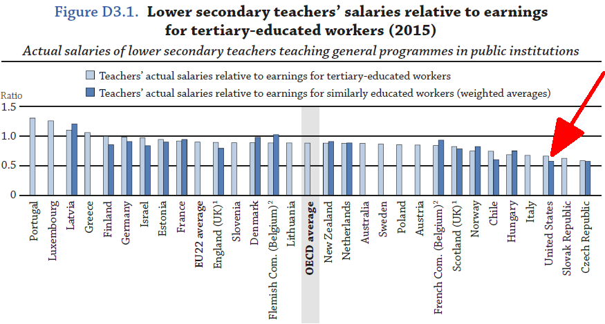
The good thing about how the chart is constructed is that looking at teacher pay relative to the pay of comparable workers is exactly the right comparison. Why? Because a key element in the decision of the best and the brightest as to whether to become a teacher or to remain a teacher is how well teacher pay looks like compared to alternative careers. It’s not the only consideration, but it’s a big one.
Fundamentally, the big red arrow tells the right story. But the story isn’t perfect, and it’s informative to talk about which shortcomings matter and why.
Horizontal first. Why do we even care about international comparisons? We care because the U.S. might learn something from how other countries conduct business. And to make a particular point, notice that the exemplar of educational excellence, Finland, is most of the way to the left on the chart, while America is most of the way to the right.
The advantage of the comparisons made by the OECD is the OECD does the best it can to make the measures comparable across countries. So even if you don’t like the particular measure the OECD has chosen, the relative standings are still valuable. Having said that, there is a reason that the comparisons are a little unfair to the United States. Teachers generally receive more of their compensation in the form of fringe benefits than do other American workers, while this is less true in other countries. A measure of total compensation would move the red arrow to the left at least a bit.
In most other industrialized countries, everyone has roughly equally expensive health insurance. In the U.S., in contrast, teachers generally get more expensive health insurance than other workers. In addition, teacher pension systems appear to be more generous than most private-sector arrangements; although, so many teachers end up without a pension and so many state pension systems are near bankruptcy that it isn’t clear how much accounting for differential pensions would matter.
Vertical now. Is the height of the U.S. bar, teacher salaries as a fraction of the earnings of all college-educated workers, the right measure? I’ll give you a couple of reasons why you might want an alternative. Warning though, down below I’m going to tell you why the exact way we measure doesn’t matter.
The OECD is measuring teacher salaries against the earnings of full-time, full-year workers. That seems to make sense in that most teachers do have a full-time job. On the other hand, one characteristic that makes teaching an attractive career is precisely that you’re unlikely to be unemployed or unable to find part-time work; its job security tends to be far higher than other occupations. The height of the bar would be higher if the comparison were made to all workers, not just full-time workers.
Also, the OECD numbers are done using means, not medians. That measures the typical pay gap, but not the gap of the typical person. The difference is that the mean includes individuals with very high pay, whereas the median really doesn’t. Since teacher salaries are much more compressed than earnings in general, the difference is substantial. Here’s a quick picture of teacher income versus non-teacher income in the United States over several decades, calculated separately by mean and median.
The most recent ratio is 62 percent if measured by means and 80 percent if measured by medians. The former is pretty much in line with the OECD numbers; the latter is a lot higher.
As an aside, you probably noticed that the median measure has been flat for four decades while the mean gap has opened enormously. This is because a bigger and bigger share of income in the U.S. now goes to the upper brackets, and teachers don’t get into the upper brackets.
Which is right, mean or median? I don’t know, and I’m quite sure no one else knows either. Do people thinking about a teaching career care only about typical salaries (look at medians), or do they also care about a potential significant economic upside (look at the mean)? I doubt there is any research on the question, despite the fact that the two measures differ by nearly 20 percentage points.
Of greater importance, do we know what the right target is? The implicit notion behind the OECD figure seems to be that teacher salaries should be somewhat on par with workers with a similar educational background.
To an economist, that won’t fly, no matter how you look at it. Teaching has enormous nonpecuniary rewards—thus, teacher salaries can be lower than other professions. Teaching is an incredibly difficult job—ergo, teacher salaries need to be higher than other professions. Teachers have great job security (after a couple of years on the job)—teacher salaries can be lower. Teaching requires EQ as much as IQ—teacher salaries need to be higher.
To an economist, looking at qualifications and at job characteristics can be a helpful starting point in figuring the right salary. But there’s only one acid test: Are we attracting and retaining enough great teachers? My view is that we’re getting lots of great teachers, but we’re not getting nearly as many as we need. If you agree, then you should want higher teacher salaries no matter how the averages are calculated. If you disagree, you should be okay with the status quo.
Related Content


Authors


Commentary
What should we pay teachers?
September 20, 2017