“COVID-19 has caused a perfect storm for our economy, society, and health,” write Carol Graham and Sergio Pinto in their introduction to the new interactive tool, The Geography of Hope and Desperation in America. “The pandemic is holding up a magnifying glass to our country’s deep inequities and challenges,” they continue, “including our crisis of deaths of despair.”
Graham, the Leo Pasvolsky Senior Fellow at Brookings, and Pinto, a doctoral student at the University of Maryland, collaborate on research that highlights unhappiness among different populations, showing how this despair and frustration is connected to preventable deaths and suicide, particularly among poor and uneducated white Americans. The opioid crisis and now the coronavirus pandemic have exacerbated these long-standing trends. The new tool, which presents data at the national and county-levels through engaging maps, was developed in a collaboration between Graham and my colleagues in the Office of Communications: visual designer Katie Merris and front-end developer Abigail Kaunda. To learn more about the background, development, and purpose of this project, I asked them a few questions.
Q: What is the purpose of this interactive?
Graham: Our newly built vulnerability interactive, which is based on our extensive research on the associations between trends in well-being/ill-being and deaths of despair, provides a baseline—and an interactive tool—for better understanding these trends and how they vary across states and counties in the U.S.
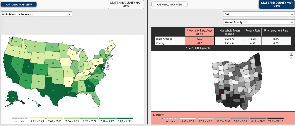
Merris: The interactive allows for the comparison of well-being indicators at the state level and mortality, income, poverty, and unemployment metrics at the county level. Mortality here refers to mortality among people ages 25–64 from deaths of despair. Carol’s research finds that people who are more optimistic tend to be healthier and live longer. She says it best in her intro: “A key objective of the following interactive is to help us better understand the relationship between well-being and these deaths (of despair), and the extent to which interventions designed to enhance well-being can break the vicious cycle of lost hope and premature mortality in some of these places.”
Q: Who is the intended audience?

Graham: The interactive is of interest to federal-level policymakers seeking to understand the broader trends underlying these public health crises, as well as to local ones who seek to understand how their daily challenges in this arena compare to those in places around the country.

Merris: I would say the main audience is policymakers, and anyone who can take a look at troublesome areas within counties and states and then take next steps to make improvements. That said, the interactive is designed to be simple, accessible, and easy to understand for anyone who is interested in taking a look.
Q: How long did it take you to work on it, from the first meeting to when it launched?

Kaunda: Our first kickoff meeting on this project was back in late February. While I worked intermittently on this project during April and May, the bulk of my work was done in June. It took about two weeks to build and submit for review, and then another week or so was spent tweaking it.
Merris: This interactive had an unusually long runway from conception to launch. I was starting to receive information about it in April, and it launched in July. It was great that Carol approached the team early with her request, which allowed time to start thinking and planning in the back of my mind as I completed some other work.
Q: What tools/applications did you use to create this?
Merris: I used the design tool Adobe XD.
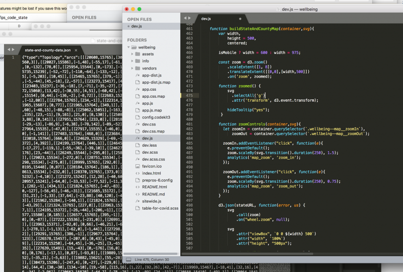
Kaunda: I used the D3 Javascript library, TopoJSON, and a Semantic UI dropdown module. Without getting too into the weeds of technical details, I use Sublime Text for my code and Prepros as a compiler for production.
Q: Was it more, or less, challenging to do this work from home instead of in the office?
Merris: Work environment is very much a personal preference, and for me, it is easier to work from home. I had comfortable workspaces and equipment ready to go from my previous job where I worked one day a week in the office, and the rest remote. Perhaps because of my prior experience, I’m used to receiving information and interacting through remote communications like video meetings. The time and energy saved from a long commute allows me to have a better work-life balance, which I believe has a positive impact on my work.
Kaunda: Luckily, my job is one that’s easy to do from just about anywhere with an internet connection, so it wasn’t any more challenging to do from home.
Q: What excited you most about working on this project as you started to engage on it?
Kaunda: The subject matter was really interesting, especially looking at the county level maps! My husband and I grew up in pretty different environments, so we had some interesting discussions about how we lived and how the data in the interactive still reflected that. It made me excited for the conversations this would spark for other non-scholars as well, as I think Carol’s work is very accessible to a general audience and Katie’s design really speaks to that.
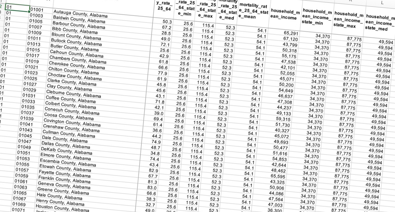
Merris: I always feel excited when a spreadsheet of numbers starts to take shape in a visual way. The data is critical to helping others but is rather indigestible and laborious to interpret in spreadsheet form. I like the challenge of taking something that is not intuitive to look at and making it easy to use and understand. Additionally, it was a pleasure working with Carol and Sergio, who were open to various suggestions and ideas.
Q: What have you learned in creating this interactive that might be useful for your next project?
Merris: This sounds rudimentary, but a lesson that was reinforced is that carefully listening to the customer is the most critical and helpful part of the design process. Separately, I’d say that having sufficient time to go through a process of creating, receiving feedback, and iterating in the wireframe stage ultimately produced a more refined product.
Kaunda: I used a CSS preprocessor for the first time on this project, and I have no idea why I waited so long to do so. I’m absolutely going to use it on every project going forward as it saved me a lot of time and headaches.
Q: What is the next project of this scale that’s on your radar?
Merris: Up next is an interactive which is part of a larger project we’re working on for the Future of the Middle Class Initiative with Richard Reeves and his team in Economic Studies. This project combines three main products that synthesize qualitative and quantitative research on the middle class. I think the product will have wide appeal, because anyone in the middle class will be able to relate in some way to the research.
Kaunda: I’ll be working on building an interactive monitor for the Future of the Middle Class Initiative later this fall, and I’m excited to dive into that work as well. I think it’s another topic that’s very accessible to a general audience and they have pulled out some interesting trends. I’m sure as I build it I’ll learn even more about the middle class than I expected.
Q: Anything else you’d like to add?
Kaunda: Just that I had a lot of fun putting this together and working on such a wide array of research is one of my favorite things about this job. I learned a lot from this project, just like I do from every interactive I get to work on.
Merris: I appreciate working with not only the scholars who do the important research, but also with my colleagues in the Communications department. For this project I worked with Abigail, who did a fantastic job of coding the interactive and bringing it to life.
Graham: Going forward, we are adding in COVID-19 mortality rates as well as post-COVID-19 spikes in overdose deaths, which will allow us to see changes as these two public health crises proceed—and interact—and to serve as a warning indicator of deepening distress in some places. Our research shows that widespread despair preceded the onset of premature mortality, and, as such, it is a useful indicator to follow.
Authors

Commentary
Creating the “Geography of Hope and Desperation in America” interactive
July 30, 2020