
- Homepage
- Introduction
- Chapter 1: Which districts allocate resources progressively?
- Chapter 2: Does teacher sorting contribute to financial inequalities?
- Case studies: Massachusetts, Indiana, Louisiana, Nevada, New York, and North Carolina
- Methodological appendix
Introduction
In the 1930s, Harold D. Lasswell, a political scientist at the University of Chicago, published a book that set out to explain how individuals and groups secure political power and, in turn, the resources that accompany that power. In the decades since, Lasswell’s book titled, “Politics: Who Gets What, When, How,” has become a shorthand definition for politics itself. In a world of scarce resources, understanding who has power—and what they want and do with it—is fundamental to understanding “who gets what.”
In education, “who gets what” has real consequences. For a student, attending a better-funded school can mean access to more experienced teachers, smaller class sizes, richer extracurricular offerings, and more modern facilities and materials. These types of resources make a difference. C. Kirabo Jackson and Claire Mackevicius analyzed 31 studies of the causal effects of K-12 public school spending on student outcomes. Twenty-eight of those studies found positive effects from increased spending. Jackson and Mackevicius estimate that increasing per-pupil spending by $1,000 for four years is associated with increases of 0.04 standard deviations on test scores, 1.9 percentage points on high school graduation rates, and 2.7 percentage points on college-going rates. The positive effects were evident across student subgroups but less pronounced for economically advantaged students.
Identifying the causal effects of school spending is hard, but determining who, in fact, gets what—and how—might be even harder. There are two reasons for that. The first involves the distributed nature of public school governance. The second involves data limitations.
“Consequently, leaders of local school districts have important, though often overlooked, decision-making authority over how resources are allocated to schools.”
Let’s start with governance structure. The U.S. uses a governance model that creates an assortment of school funding streams, with each shaped by its own set of political actors. With no mention of schools in the U.S. Constitution, primary responsibility for education passes to the states via the Tenth Amendment. State governments retain some of this authority, which they vest in a state-specific mix of governors, legislatures, state boards of education, and chief state school officers. For example, states create school funding models and mechanisms that define how state resources are allocated and how state and local funds interact. States pass other responsibilities to localities—typically district or county school boards—via state constitutions and statutes. Consequently, leaders of local school districts have important, though often overlooked, decision-making authority over how resources are allocated to schools. This is particularly true for certain states, such as California with its Local Control Funding Formula (LCFF).
In 2018-2019, about 47% of public school funds came from state sources (e.g., income taxes), 45% from local sources (e.g., property taxes), and 8% from federal sources (which disproportionately go to students with particular needs). Due to pandemic aid, the share of public-school funds from federal sources has spiked sharply in recent years—a reminder of the federal government’s potential for impact in school funding. In some districts, non-government contributions (e.g., via parent-teacher associations) supplement government funding, likely in ways that benefit economically advantaged students.
These resource streams eventually flow to students in one form or another, but data limitations have obscured our view of which students get which resources. We have, for some time, been able to observe funding at the district level and how that funding varies across different types of districts. A 2017 Urban Institute report found that “poor students in most states attend school districts that are about as well funded as the districts non-poor students attend in their states.” However, districts (and schools) have discretion over how they use those resources. Even a progressive allocation of funds to school districts—with more per-pupil funding for districts with larger shares of disadvantaged students—could be regressive in practice if districts use those extra funds to benefit their more advantaged students.
Until recently, districts had not been required to report how they were allocating funds to individual schools. That left the disconcerting possibility that: (a) district-to-school spending could be regressive, or close to it, and (b) we would not have the data to document those patterns nationally. That story is plausible even after a wave of court-ordered school finance reforms to address funding inequities. We have complex governance structures in education through which many people might affect school resource allocation decisions, from members of Congress to voters in local school board elections. Decades of research on opportunity hoarding has shown the inclination and ability of privileged groups to wield their political power to secure valuable resources for themselves and their children. And we know that school funding is valuable.
“Decades of research on opportunity hoarding has shown the inclination and ability of privileged groups to wield their political power to secure valuable resources for themselves and their children.”
Fortunately, our ability to observe district-to-school resource allocations has improved in recent years. That is due to new reporting requirements in the Every Student Succeeds Act (ESSA) and efforts from organizations such as the Edunomics Lab at Georgetown to make the data usable.
This chapter uses these newly available data to examine within-district resource allocations. Specifically, we consider the per-pupil funds that districts allocate to economically disadvantaged students relative to economically advantaged students within the same district. The results are nuanced. We find that most U.S. public school students attend districts that allocate slightly more per-pupil funding to schools that serve more economically disadvantaged students (with federal funds allocated more progressively than state and local funds). Are these differences enough to address large opportunity gaps observed within districts? Probably not. We also observe some patterns in the types of districts and communities with more progressive district-to-school resource allocations. However, these patterns, too, defy easy explanation. For example, at a time when partisan divisions seem sharp and defining in education, we find that district-to-school allocations are not a simple story of political attitudes. Districts in counties that lean Democratic have slightly more progressive within-district allocations than districts in counties that lean Republican, but the differences are small and might be explained by other variables.
Below, we consider these patterns in within-district allocations and describe lingering data limitations that cloud our view of “who gets what” in U.S. public schools.
Data and methods
Our main research objectives for this chapter are to calculate, within districts, the ratio of resources allocated to economically disadvantaged students relative to economically advantaged students and to explore how that ratio varies across different types of districts and communities. With school-level data, we can do this by assessing how districts allocate funds to schools with varying shares of economically disadvantaged students. (One could also explore progressivity by other important dimensions, such as student race/ethnicity, but that is beyond the scope of this chapter.)
This requires us to merge datasets from a variety of sources. Our school finance data comes from the National Education Resource Database on Schools (NERD$) via the Edunomics Lab. Our core spending data are school-level variables showing total per-pupil funding (normed in NERD$), per-pupil funding from federal sources, and per-pupil funding from state and local sources combined. We use data from school year 2018-2019, which was the most recent year available and was unaffected by pandemic spending. As we are interested in comparing the resources of different schools within the same district, we keep only regular and vocational schools (e.g., excluding charter schools) that serve elementary, middle, and high school grades (e.g., excluding early childhood and adult education). We drop districts with a single school, as well as districts with reported student poverty rates of 0% or 100%, since it is not possible to assess how these districts allocate resources to schools with varying poverty rates.
Nationwide analyses of school spending are subject to data challenges related to differences in how expenditures are classified across locales as well as data reporting errors. We take several precautions accordingly. We use the normed total funding variable from the NERD$ data, which accounts for some cross-district and cross-state differences in expenditure classifications, and we drop schools flagged in NERD$ for having potentially erroneous values. When disaggregating by federal and state/local funding sources, we also drop schools that are outliers in their states’ funding distributions (to keep potentially erroneous data from having undue impact on our results). The methodological appendix provides additional details. As a consequence of these precautions, many schools and districts are not included in our analyses (or maps), but we see this as a necessary tradeoff for data quality. Our full sample consists of 8,667 districts that enroll about 38.3 million public school students.
Our main outcome variables are within-district progressivity ratios. We compute these ratios by dividing the weighted average of per-pupil funding for economically disadvantaged students by the weighted average of per-pupil funding for economically advantaged students in the same district. Our main school-level poverty measure is the percentage of students in a school eligible for free or reduced-price lunch (FRPL), which we supplement with direct certification rates where FRPL data are not available. We follow the approach of Gordon and Reber (2022) to calculate these weighted averages. This, too, is described in the methodological appendix. To illustrate, if 60% of a district’s disadvantaged students are in a school that spends $10,000 per pupil and 40% are in a school that spends $15,000 per pupil, the weighted average for disadvantaged students in that district would be $12,000 per pupil (from 0.6*10,000 + 0.4*15,000). If, in that district, the corresponding weighted average for advantaged students were $12,500 per pupil, we would calculate a within-district progressivity ratio of 0.96 (12,000/12,500). Ratios greater than one indicate progressive within-district spending. Ratios less than one indicate regressive spending.
We merge these school finance data with other datasets containing information on district and community characteristics. At the district level, this includes data on student enrollment, student demographics, and district locale types from the U.S. Department of Education’s Common Core of Data; an income-based school segregation measure (information theory index) from the Stanford Education Data Archive; and data on median family income and community poverty rates (based on participation in the Supplemental Nutrition Assistance Program) from the U.S. Census Bureau’s American Community Survey-Education Tabulation five-year estimates. We merge these district records with data from the counties in which the districts are located. County-level variables include 2020 presidential election results from the MIT Election Lab, which we use as a measure of local political attitudes, and a measure of income inequality (reported as a Gini coefficient) using five-year estimates from the American Community Survey. Some school districts enroll students in multiple counties. In these cases, we determine the share of students enrolled in each county and use weighted averages of county data.
A premise of this chapter is that assessing governance structures and political dynamics is important to understanding “who gets what.” Thus, we disaggregate between total, federal, and state/local spending and incorporate measures of local political leanings. For this reason, we also collect data on the structure of local school boards. Collecting uniform data on local school boards is notoriously challenging and time-consuming. To begin to understand how school boards might differ, we collected data for a stratified random sample of school districts across the country (restricted to districts with at least 500 students enrolled). We randomly selected 25 districts from each of 12 locale types from the National Center for Education Statistics (NCES). These classifications fall under four broad categories: city (large, midsize, small), suburb (large, midsize, small), town (fringe, distant, remote), and rural (fringe, distant, remote). We stratified the sample to ensure that we have a sizable number of districts from each locale type. We randomized to ensure that our samples are representative of those locales. For each district, we collected information about school board elections and governance such as whether board members are elected or appointed, how they are elected (e.g., by ward or at-large), whether board elections are on cycle with other state/federal elections, and whether school board candidates have political party affiliations. A stratified sample of 300 districts is likely to be too small for certain analyses but sufficient to explore variation in how school board members are chosen and consider how that might matter for within-district resource allocation.
Equipped with data that link within-district progressivity ratios to these various district, county, and school board characteristics, we begin our analysis. First, we present within-district progressivity statistics for the nation as a whole. Next, we provide a map with district-specific information. We then show patterns across different types of districts, before showing multivariate regression results that examine whether certain district or community characteristics are associated with more progressive or regressive within-district allocations. Our analysis concludes with data on local school boards. We conclude with the implications of our results and other recent research in this area.
Findings
First, we present statistics on the national distribution of within-district funding progressivity ratios. Ratios greater than 1 indicate progressive patterns (more money to schools with more economically disadvantaged students), while ratios less than 1 indicate regressivity (less money to schools with more disadvantaged students). For example, a ratio of 1.1 would indicate that economically disadvantaged students receive 10% more funds, on average, than economically advantaged students based on district-to-school allocations.
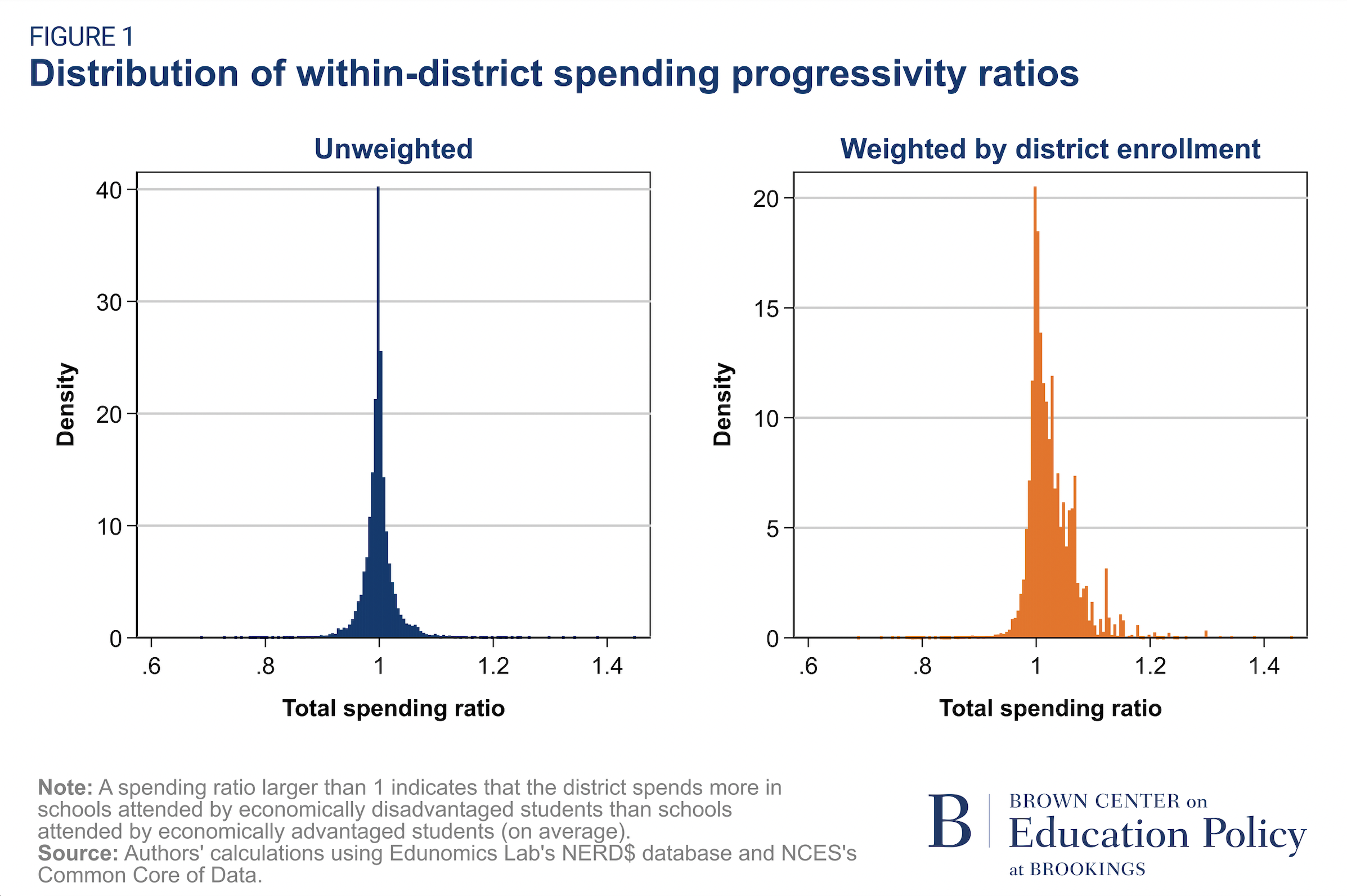
Figure 1 shows the distribution of within-district progressivity ratios for our full analytical sample. The chart on the left shows the unweighted distribution in which each district counts equally. In the unweighted sample, we find that the mean ratio in overall funding is 1.001. However, counting each district equally would mean that small districts that enroll very few students receive just as much weight as the country’s largest districts. Therefore, we also present the distribution weighted by district enrollment such that each student counts equally. This is our preferred approach, and we apply these enrollment weights in all subsequent analyses unless otherwise noted.
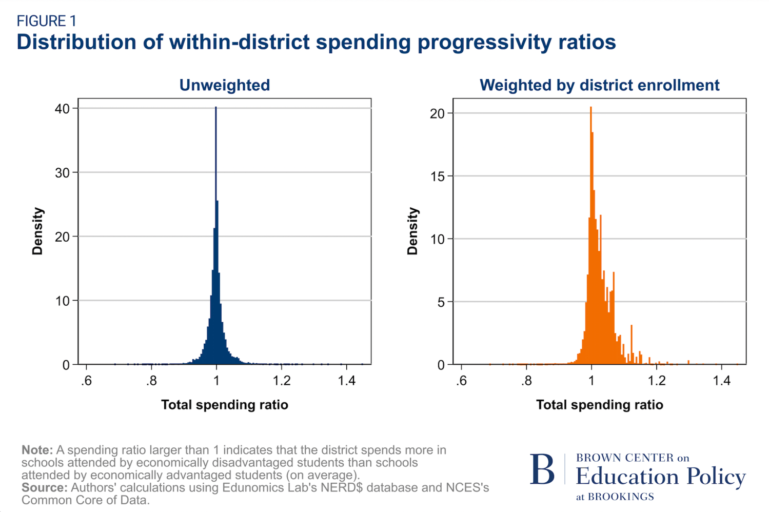
The chart on the right (with data weighted by district enrollment) shows that 74% of students are enrolled in a district that allocates its total resources progressively, with an overall mean progressivity ratio of 1.028. In other words, on average, economically disadvantaged students attend schools that receive about 2.8% more in per-pupil funding than schools attended by economically advantaged students in the same district. The distribution is quite condensed, with the 5th and 95th percentiles of the progressivity ratio being 0.981 and 1.104, respectively.
“…on average, economically disadvantaged students attend schools that receive about 2.8% more in per-pupil funding than schools attended by economically advantaged students in the same district.”
Federal funds are distributed much more progressively within districts (mean ratio = 1.234) than state/local funds (mean ratio = 1.018). The total ratio looks more like the state/local ratio because most funding comes from state and local sources.1
Next, we show progressivity ratios for all districts for which total spending progressivity ratios are available and included after we apply our sample restrictions. Figure 2 is an interactive map that shows progressivity ratios for each district. More information is visible by hovering over (or searching for) a particular district.
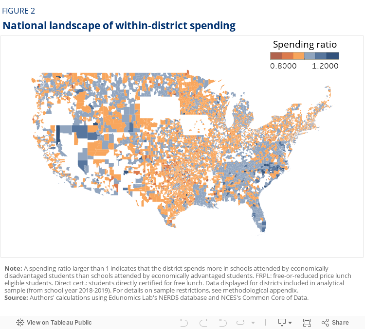
The map is colored such that districts with progressivity ratios above 1 appear in blue and districts with progressivity ratios below 1 appear in orange. Darker shades of those colors indicate ratios farther from 1. We should note that while a ratio of 1 provides an intuitive anchor—equal allocations to schools with different shares of economically disadvantaged students—it implies a normative standard that warrants scrutiny. One could argue that today’s opportunity gaps—which result from historical and contemporary policies and practices—call for much larger allocations to the most disadvantaged or marginalized groups of students than what we observe.
The speckling of blue and orange across the map conveys some complexity. For example, the map does not divide cleanly along “red state” versus “blue state” lines. However, some patterns are evident. For one, states in the Southeast appear generally more progressive than states in neighboring regions with respect to within-district total spending. Second, and related, while this is a district-level map, we see patterns that conform to the outlines of certain states. For example, Maryland’s districts, taken together, have a progressivity ratio of 1.065, which is among the highest in the country. That is, on average, economically disadvantaged students in Maryland attend schools that receive about 7% more in per-pupil funding than the schools attended by economically advantaged students in the same district. In Maryland, where the average per-pupil funding is roughly $15,000 for our sample, this amounts to a difference of about $1,000 per pupil. Maryland’s blue in the map stands apart from the orange of Pennsylvania, which is among the most regressive states on this measure (0.991). These types of visible state boundaries could reflect differences in state policy. Still, it is important to remember that these maps show within-district progressivity and not across-district progressivity (a measure that may be more directly reflective of state policy). We return to the topic of across-district progressivity in Chapter 2.
“One could argue that today’s opportunity gaps—which result from historical and contemporary policies and practices—call for much larger allocations to the most disadvantaged or marginalized groups of students than what we observe.”
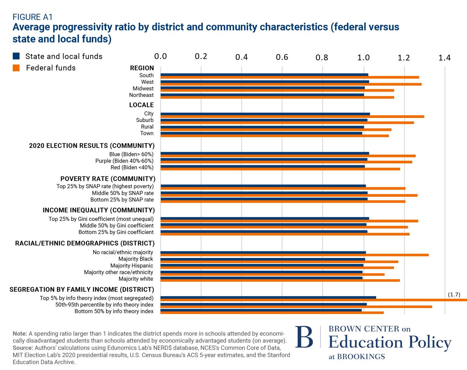
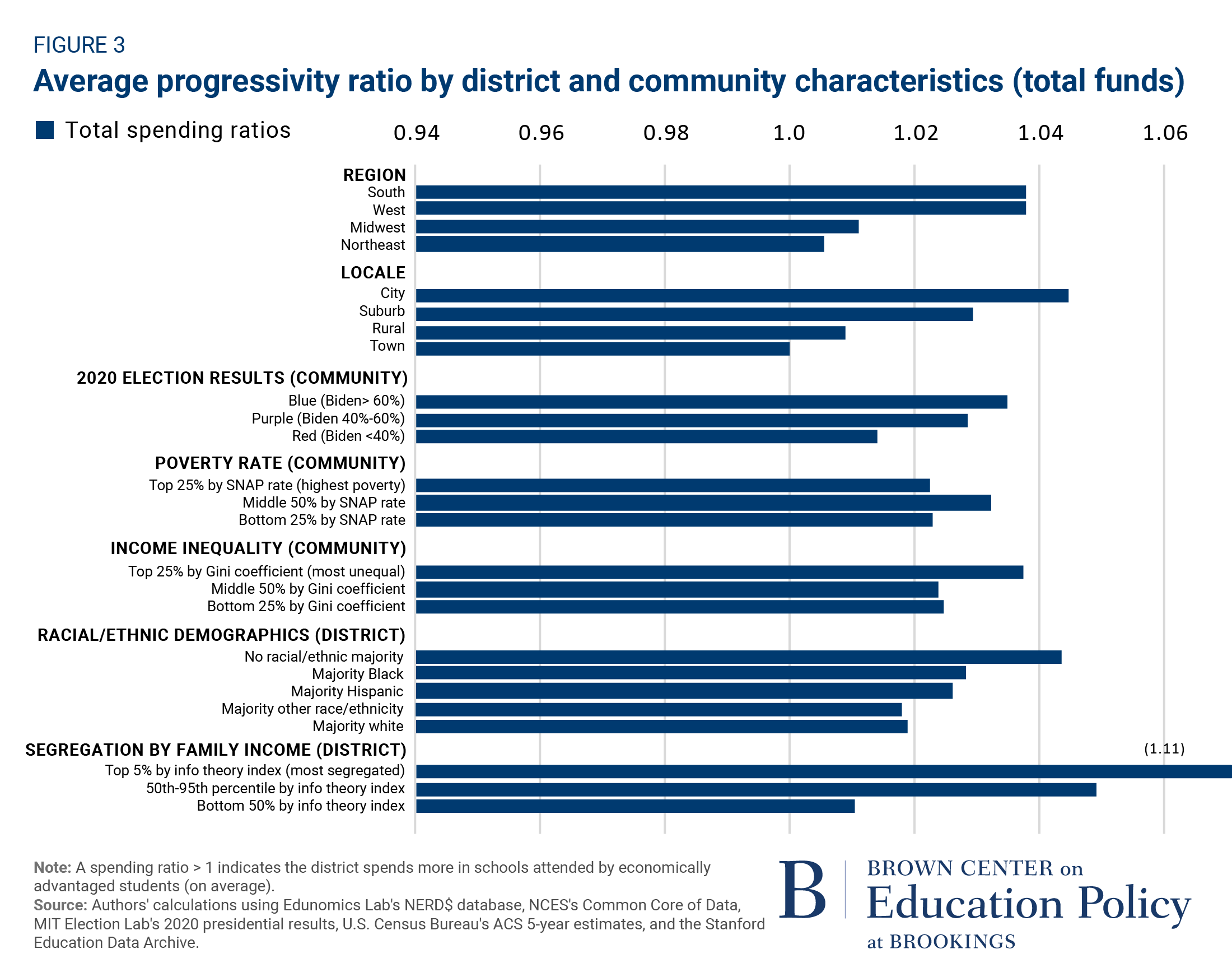
Other geographic patterns are hard to see on a U.S. map. Therefore, we next present within-district progressivity ratios that are disaggregated by characteristics of districts and the communities where they are located. We do this first for total funding (Figure 3) and, in an appendix, separately for federal and state/local funding (Appendix Figure 1). Identifying the types of places with more and less progressive allocations could help to identify areas that need additional attention—i.e., where students in need of extra resources get little, if any, more than their more economically advantaged, same-district peers.
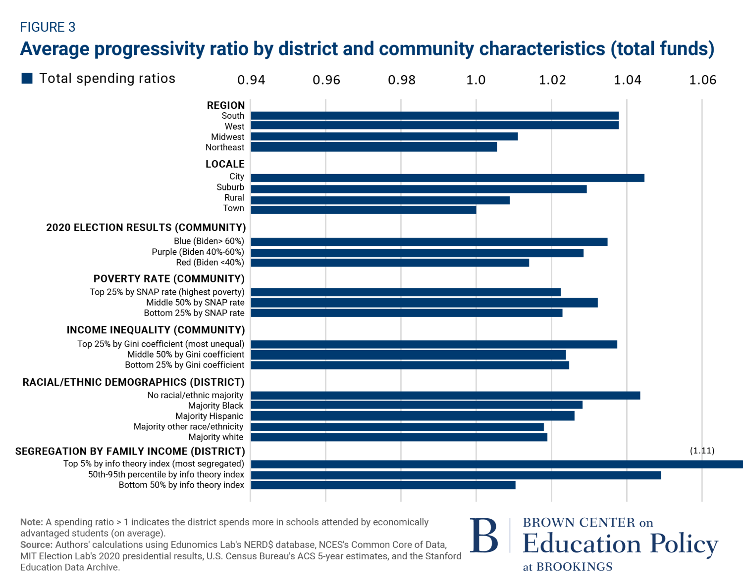
The regional differences seen in the map are evident here as well. School districts in the South (1.038) and West (1.038) have more progressive within-district allocation patterns in total funding than districts in the Midwest (1.011) and Northeast (1.006). Also notable, districts located in cities have higher progressivity ratios (1.045), on average, than districts in suburbs (1.029), rural areas (1.009), and, especially, towns (1.000). Put differently, economically disadvantaged students in cities attend schools that receive about 4.5% more per-pupil funding than the schools attended by economically advantaged students in the same district. Economically disadvantaged students in towns receive no additional funds relative to their more advantaged peers. As indicated by the appendix figures that disaggregate by funding source (Appendix Figure 1), these patterns are evident in both federal and state/local funds.
“Put differently, economically disadvantaged students in cities attend schools that receive about 4.5% more per-pupil funding than the schools attended by economically advantaged students in the same district.”
We find that school districts in counties that lean Democratic (i.e., voted 60% or more for Joe Biden in 2020) have more progressive within-district allocations (1.035), on average, than districts in “purple” (1.029) and “red” counties (1.014). Districts in counties with the highest levels of income inequality—as measured by a Gini index—have the highest progressivity ratios (1.039). We do not observe clear patterns related to community poverty rates (based on SNAP receipt). When we look at the racial demographics of public school students, we find that districts where no single race or ethnicity constitutes a majority of students enrolled have the highest progressivity ratio (1.044).
Essentially, all of the subgroup progressivity ratios in Figure 3 are between 1 and 1.05, indicating that economically disadvantaged students attend schools that receive the same or very slightly more resources, on average. However, there is one notable exception to that pattern—important for what it might reveal about what we cannot see. The most segregated districts with respect to student poverty—the 5% with the highest information theory index—have substantially higher progressivity ratios (1.111) than less segregated districts. Perhaps more and less economically segregated areas approach resource allocation differently from one another. However, we suspect this is mostly an artifact of a data challenge that persists even with school-level spending data.
The data challenge is that our ability to identify differences in the resources allocated to students of different backgrounds is intertwined with the degree of school segregation within districts. Consider two hypothetical districts, each with 50% of their students being economically disadvantaged. Let’s imagine that, at the student level, economically disadvantaged students in each district receive, on average, $1,000 less than economically advantaged students in the same district (e.g., because they are assigned to less experienced teachers with lower salaries). In one district, students are completely segregated by poverty status, with all economically disadvantaged students enrolled in one school and all economically advantaged students enrolled in the other. School-level data are well suited to identify resource allocation differences in this type of district. If economically disadvantaged students receive $1,000 less in per-pupil funding than their peers, we will observe this in school-level spending differences ($1,000 less per-pupil spending at the school that enrolls the economically disadvantaged students). Now, let’s consider an “integrated” district with two schools that each have 50% of their students economically disadvantaged and 50% economically advantaged. School-level data cannot pick up on resource differences in this district since the schools are demographically identical to one another. That is, even if disadvantaged students receive less resources than their more advantaged peers within these schools, the within-district progressivity ratio would equal 1.
This type of within-school disparity remains outside of our view. This speaks to the need to learn more about within-school resource allocation—a topic we return to later—as this reflects a real limitation of school-level data for evaluating resource equity. However, there is more we can do even with this school-level data issue. For example, we can use regression models that control for school segregation to explore what types of districts are more/less progressive when we restrict our comparisons to districts with similar values of the information theory index. For this reason, we next turn to a multivariate regression framework to continue our examination of how district and community characteristics relate to within-district progressivity rates.
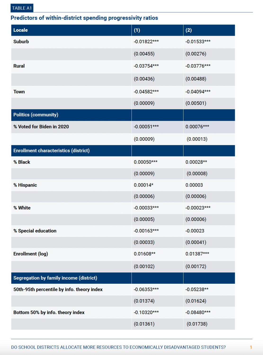
Table 1 presents results from regressions of progressivity ratios on district and community characteristics. The first column shows estimates from a model without state fixed effects, while the second column shows estimates from the same model with state fixed effects. State fixed effects show patterns of progressivity in different types of districts in the same state (i.e., control for state-level differences). The final column (column 3) restricts the sample to districts with the highest levels of segregation as measured by information theory index. We analyze these highly segregated districts separately because these are the districts in which patterns of progressivity/regressivity are least vulnerable to the data issue described above. However, findings from highly segregated districts might not generalize to other districts.
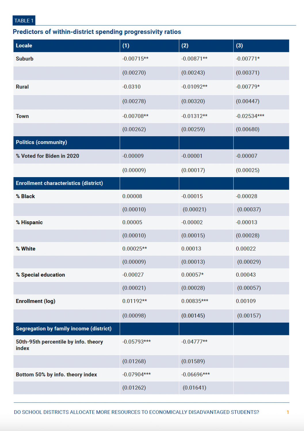
For context, Table A1 (in the appendix) shows results from bivariate models in which we regress within-district progressivity ratios on just one variable at a time. In other words, these models do not control for other variables. As expected, the bivariate results look similar to the results presented in Figure 2 (with slight differences due to the different ways that variables are constructed). The first estimate, for instance, shows that districts located in suburbs have within-district progressivity ratios that are 0.018 lower, on average, than districts located in cities (the omitted category). The continuous variables—in both Table 1 and Table A1—show the association between a one-unit increase in that variable and the district’s progressivity ratio. For example, we see that a 1 percentage point increase in the share of a community that voted for Biden is associated with a within-district progressivity rate that is 0.0005 higher in the bivariate model (without controlling for other variables). Put differently, a district with a 20 percentage point higher Biden vote share (e.g., 60% versus 40%) would be expected to allocate an additional 1% of resources to schools serving economically disadvantaged students relative to schools serving economically advantaged students.
In general, the magnitudes of our coefficient estimates shrink in multivariate models that account for differences across districts. Results from these models indicate that district urbanicity (being in a city) and size (having more students enrolled) are most strongly associated with more progressive intra-district spending after controlling for other factors. Other district characteristics, including local political affiliation, are no longer statistically significant. We stress that these are correlations—albeit carefully constructed ones—that should not be interpreted causally. For example, although the positive correlation between progressivity and enrollment persists, we do not conclude that any single district’s resource allocation will become more progressive if it enrolls more students. Rather, the bivariate estimates show the types of districts where economically disadvantaged students receive a larger share of their district pie, while the multivariate estimates give a sense of the district/community characteristics most strongly associated with these patterns.
When we limit our sample to districts most segregated by students’ economic status—and control for a continuous measure of school segregation to further address this data challenge—our results are broadly consistent with those with the full sample of districts. Here, too, districts in cities appear more progressive than other locales. This is perhaps our most consistent finding across our analyses.
“While local school board members do not have the only (or even the most influential) voices in determining ‘who gets what,’ they have a great deal of influence—and have not been the subject of much empirical research.”
While this study cannot comprehensively answer why cities have more progressive intra-district allocations, one important consideration that we explore is the role of local school boards. Local school boards make many decisions with direct or indirect implications for resource allocation. That includes decisions about capital investments and how staff are assigned across schools. While local school board members do not have the only (or even the most influential) voices in determining “who gets what,” they have a great deal of influence—and have not been the subject of much empirical research. This is the case despite a few studies noting that the structure of many local school board elections can undermine representation for disadvantaged groups. Specific concerns have been raised about “off-cycle” elections and other characteristics that limit turnout from disadvantaged groups. A recent study from California found evidence that more representation for racial/ethnic minority groups in local school board races led to more spending on students from those groups and, in turn, better academic outcomes.
When we look to the data we collected on a representative sample of local school board elections, we are struck by how varied these election structures are both within and across locale types. Table 2 displays these patterns. For example, while most local school boards are elected rather than appointed, we observe a roughly equal split in on-cycle and off-cycle elections (despite concerns about representation in off-cycle elections). City-based districts are more likely to elect members by ward (i.e., with community-specific representatives) than other districts. Few districts identify the political party of their school board candidates, though party identification may be a useful signal of candidates’ priorities in elections in which candidate information is often hard to find. Understanding how these election structures might affect whose voices are heard in school governance—and, accordingly, which students’ interests are represented in resource allocation decisions—should be a priority for education researchers.
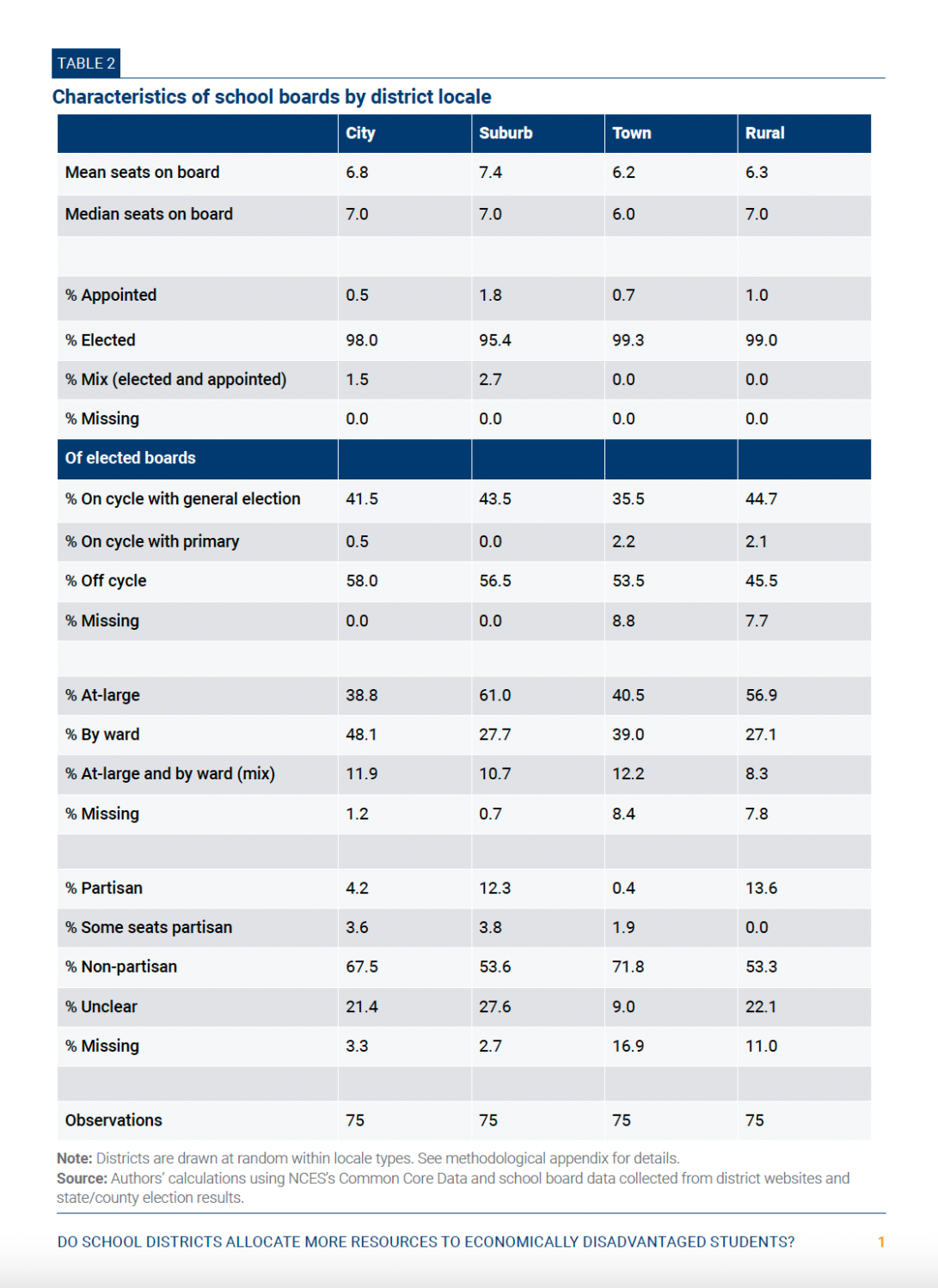
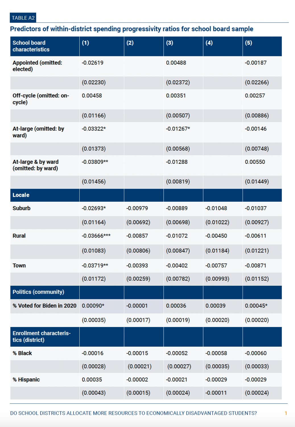
To explore whether school board characteristics might relate to district progressivity, we reran our models from Table 1 for this subset of districts and included school board characteristics as covariates. The sample of districts for which we have school board information is likely too small to pick up on anything but large differences, but any such large differences might point to promising topics for future research. The results appear in Appendix Table 2. Indeed, we do not observe notably significant differences in progressivity ratios by school board characteristics for this group (with the possible exception of differences between boards elected at-large and by ward).
Discussion
The results presented in this chapter—along with results from other analyses of within-district allocation—perhaps offer more nuanced findings and warnings about lingering data limitations than simple, headline-grabbing takeaways. The following are what we see as some of the most important lessons emerging from this work:
- Nationwide, within-district allocations tend to be more progressive than regressive with respect to economic disadvantage, but only slightly so, and many students are in districts with regressive within-district allocations. We estimate that 74% of U.S. public school students are in districts that allocate more money to schools attended by economically disadvantaged students than economically advantaged students. Based on the school-level measures available, that amounts to very slightly progressive spending patterns overall, in the range of 2% to 3% more funding for economically disadvantaged students. In other words, while we do not find evidence of widespread regressivity, we also see little reason to believe that intra-district allocations are progressive enough to address large differences in students’ opportunities and outcomes shown to arise within districts.
- Within-district progressivity ratios are generally similar across various types of districts, including those in predominantly Democratic and Republican communities. We estimate that about 90% of students attend a district with a progressivity ratio between 0.98 (slightly regressive) and 1.10 (moderately progressive). While certain types of districts tend to be more progressive than others (e.g., cities more progressive than other locales), the differences are modest. This includes districts in Democrat- and Republican-leaning areas. Students in “blue” areas experience slightly more progressive intra-district resource allocation, but the differences are small and not significant in regression models that control for other variables. Although we refrain from drawing causal inferences from our results, nothing we observe suggests that partisan orientation produces major differences in within-district progressivity.
- Funds originating from different government sources yield very different intra-district allocations. Perhaps the clearest differences we observe are that federal funds are distributed much more progressively than state/local funds within districts. This is unsurprising in that the federal government targets funds to economically disadvantaged students via Title I (albeit through flawed and inefficient allocation formulas). However, it means a good part of those funds get to the schools, not just the districts, in which students experiencing poverty enroll. This highlights the role the federal government plays in school finance, with COVID-19 recovery efforts showing its potential to do much more. It also highlights the importance of examining governance structures and the political forces that shape decision-making. U.S. public schools are governed and financed in complex, distributed ways. Understanding more about those structures—from local school boards to Title I policy—will help us answer questions about “who gets what” and how. This includes examining which communities do not have equal voice in the policymaking process and how the structures of elections and governance contribute to those inequities.
- While having school-level spending data has improved our understanding of district resource allocations, our view of within-school allocations remains cloudy. Ultimately, questions about progressivity and regressivity in school finance are about which students—not which schools—have access to which resources. School-level data provides a limited, and potentially distorted, view of what happens at the student level. For one, these data only tell us about government sources, which leaves out potentially important supplementary sources at least in some areas (e.g., via parent-teacher association contributions). And then there is the lingering data challenge that this chapter highlights regarding government funds. An analysis using school-level data is not well suited for identifying regressivity in districts where schools are demographically similar but the most advantaged students receive more resources than their less advantaged peers in the same school (e.g., because of different teacher assignments). Over time, we may be able to improve our understanding of within-school resource use nationwide through mechanisms such as the Civil Rights Data Collection. In the meantime, we can use research from individual districts and states with rich data available—e.g., the ability to link student and teacher records in administrative data—to get a sense of “who gets what” within schools.
While the national picture of within-district resource allocation offers points of clarity, some opaqueness remains, it is possible that a cross-state analysis obscures important trends within states. The next chapter looks within several states to explore that possibility further.
Footnotes
- Due to data reporting differences, New Hampshire, Ohio, and Oregon are included in the total funding calculations but not the calculations that disaggregate by federal and state/local funding sources. (Back to top)
Read Chapter 2: “Does teacher sorting contribute to financial inequalities?” →
Appendix
Authors


